
Conceptproject: huisstijlConcept project: brand identity
Molenwind
Een verzonnen installateur van warmtepompen en zonnepanelen uit de Zaanstreek krijgt een huisstijl, gemaakt zoals bij een echte klant: van een inventaris van wat er al is tot de bus, de kleding, het drukwerk en merkrichtlijnen van zestien pagina's.
A made-up installer of heat pumps and solar panels from the Zaanstreek gets a brand identity, made the way I would for a real client: from an inventory of what already exists to the van, the workwear, the print and sixteen pages of brand guidelines.
01De opdrachtThe brief
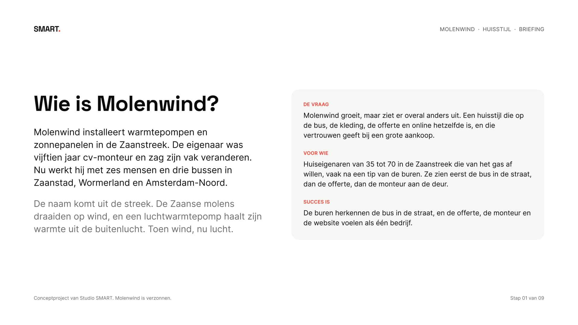
Molenwind is verzonnen, maar ik heb het aangepakt als een echte opdracht. Een installateur van warmtepompen en zonnepanelen met zes mensen en drie bussen, in Zaanstad, Wormerland en Amsterdam-Noord. De naam komt uit de streek: de Zaanse molens draaiden op wind, een luchtwarmtepomp haalt zijn warmte uit de buitenlucht. Toen wind, nu lucht.
Molenwind is made up, but I handled it like a real brief. An installer of heat pumps and solar panels with six people and three vans, in Zaanstad, Wormerland and Amsterdam-Noord. The name comes from the region: the mills along the Zaan ran on wind, an air-source heat pump takes its heat from the outside air. Then wind, now air.
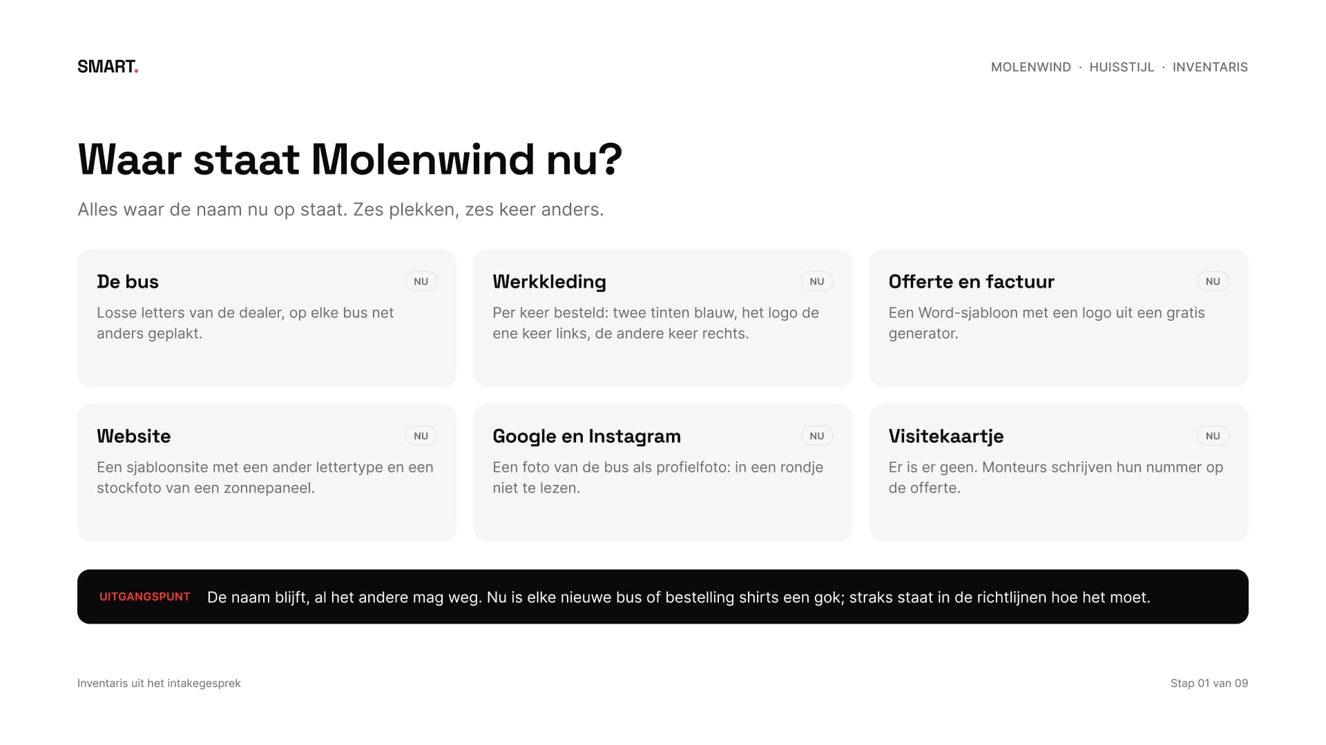
Het probleem: Molenwind groeit, maar ziet er overal anders uit. Losse letters op de bus, twee tinten blauw op de shirts, een logo uit een gratis generator op de offerte. Daarom begon de briefing met een inventaris van alles waar de naam nu op staat, en met de echte maten van de bus, de kleding en het visitekaartje.
The problem: Molenwind is growing, but looks different everywhere. Loose letters on the van, two shades of blue on the shirts, a logo from a free generator on the quote. So the brief started with an inventory of everything the name appears on now, and with the real sizes of the van, the workwear and the business card.
02Eerst kijkenLooking first
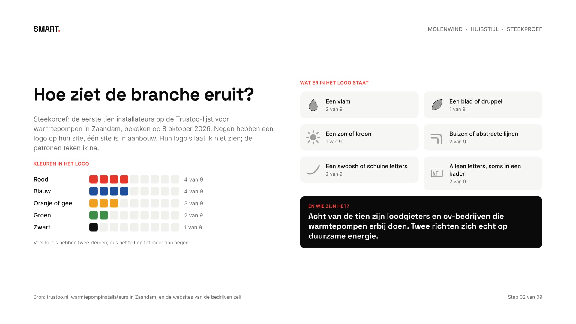
Ik keek naar de eerste tien installateurs op de Trustoo-lijst voor warmtepompen in Zaandam, op hun eigen sites. Negen hebben een logo. Rood en blauw komen het vaakst voor, elk vier keer, en in de logo's staan vlammen, een blad, een zon, buizen en swooshes. Acht van de tien zijn loodgieters en cv-bedrijven die warmtepompen erbij doen.
I looked at the first ten installers on the Trustoo list for heat pumps in Zaandam, on their own sites. Nine have a logo. Red and blue appear most, four times each, and the logos show flames, a leaf, a sun, pipes and swooshes. Eight of the ten are plumbers and central heating firms that do heat pumps on the side.
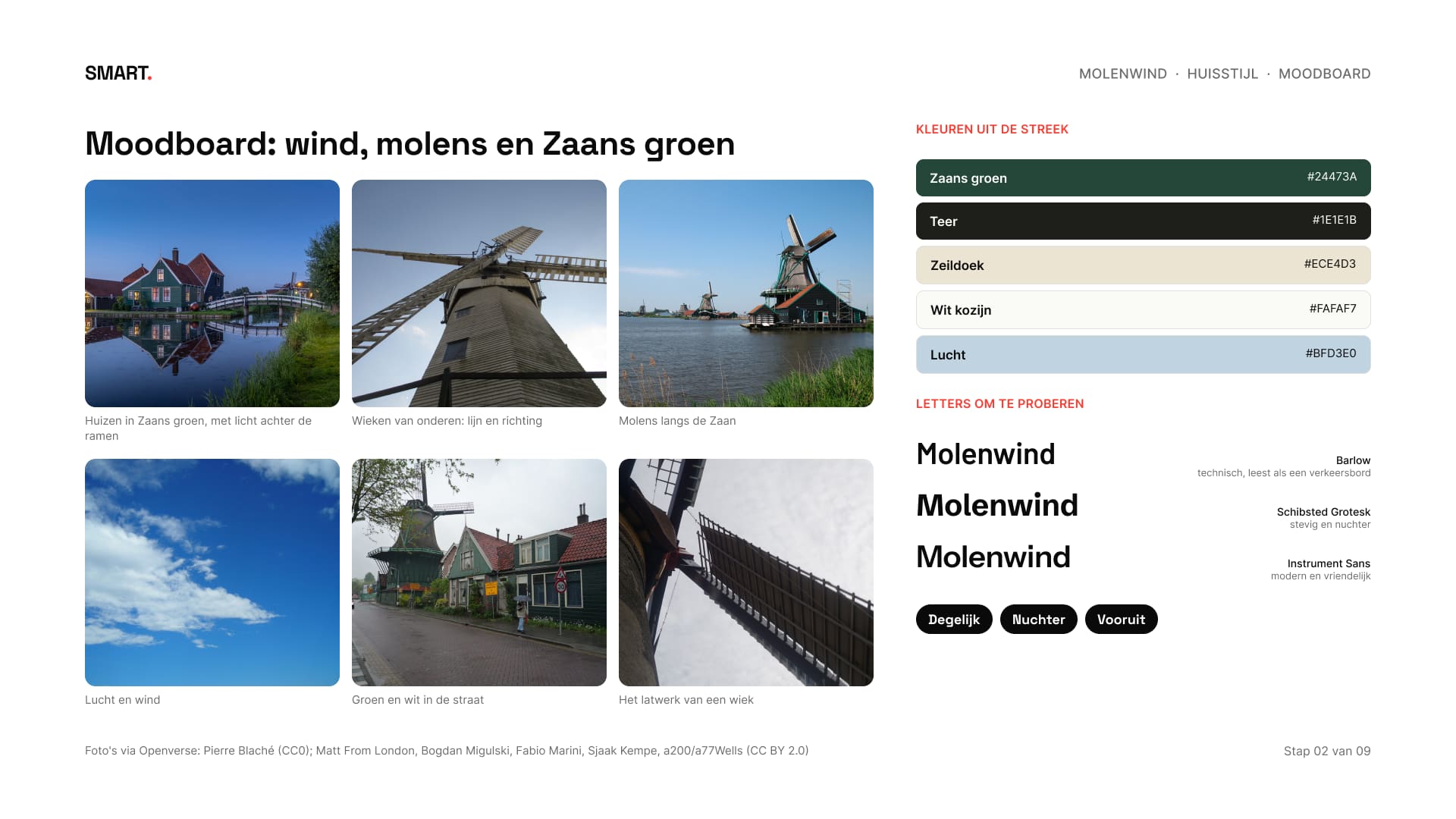
Daar lag de kans: een kleur die in de regio bij niemand staat, een beeld dat vertelt waar Molenwind vandaan komt in plaats van wat het doet, en een bus met weinig tekst. Het moodboard kwam uit de streek: molens, wind en de groene Zaanse huizen.
That was the opening: a colour nobody in the region uses, an image that says where Molenwind comes from rather than what it does, and a van with little text. The moodboard came from the region: mills, wind and the green Zaan houses.
03Twee richtingenTwo directions
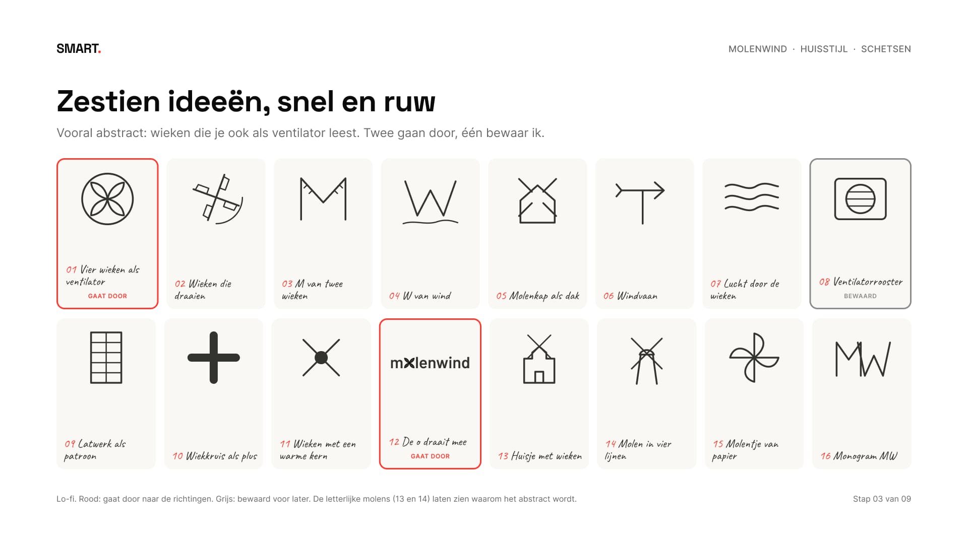
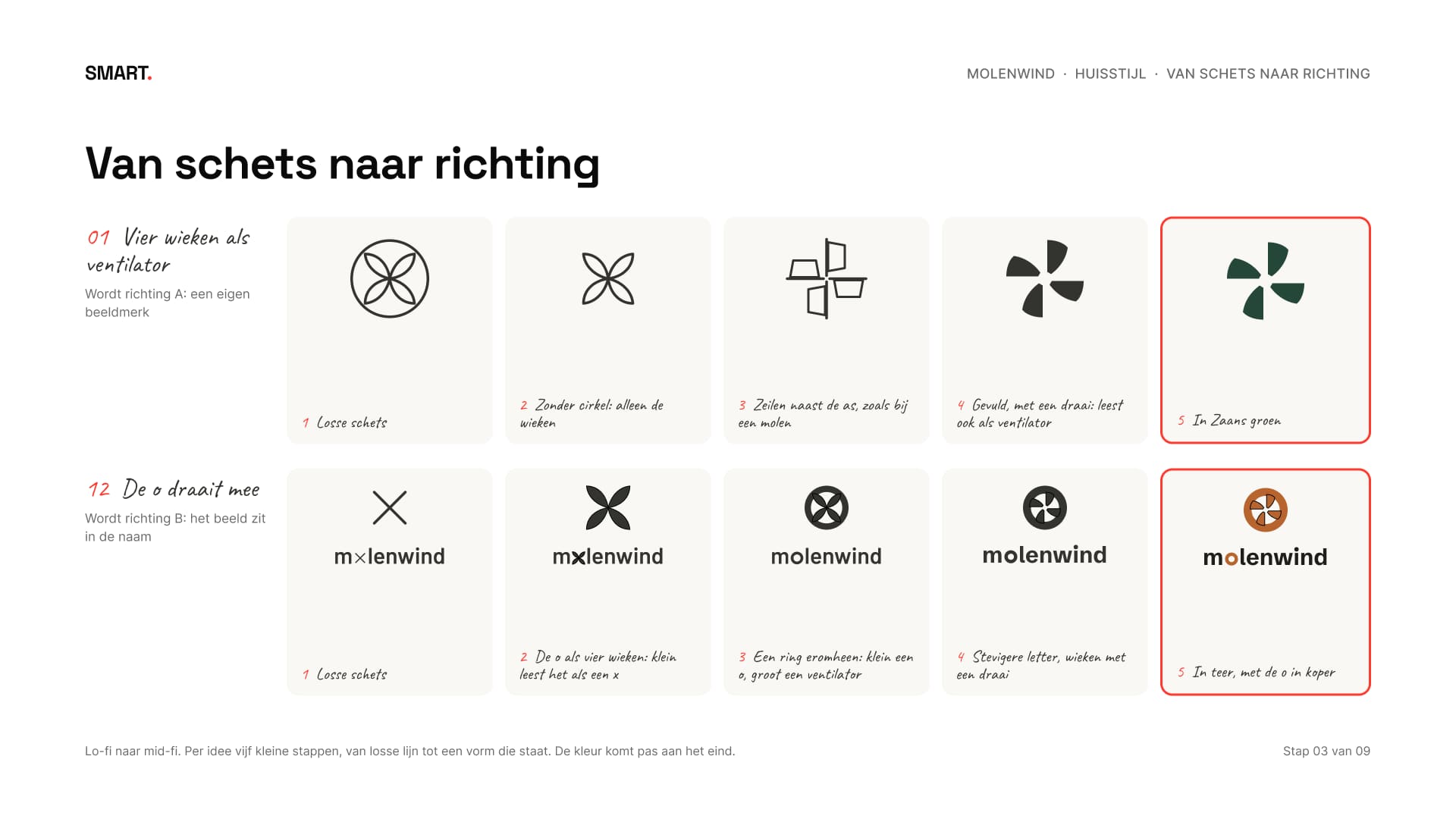
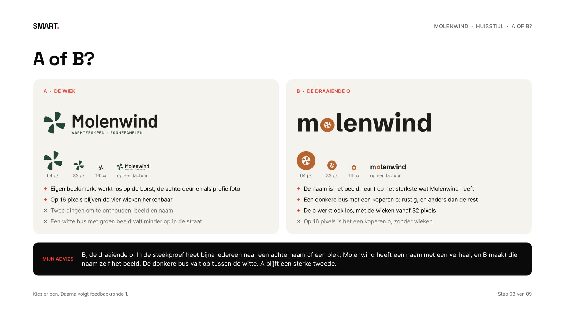
Zestien schetsen, vooral abstract: wieken die je ook als de ventilator van een warmtepomp leest. Twee gingen door. Onderweg viel er een les: vier losse wieken lezen op tekstgrootte als een x. Met een ring eromheen lees je klein een o en groot een ventilator.
Sixteen sketches, mostly abstract: blades you can also read as the fan of a heat pump. Two went on. Along the way came a lesson: four loose blades read as an x at text size. With a ring around them you read an o when small and a fan when large.
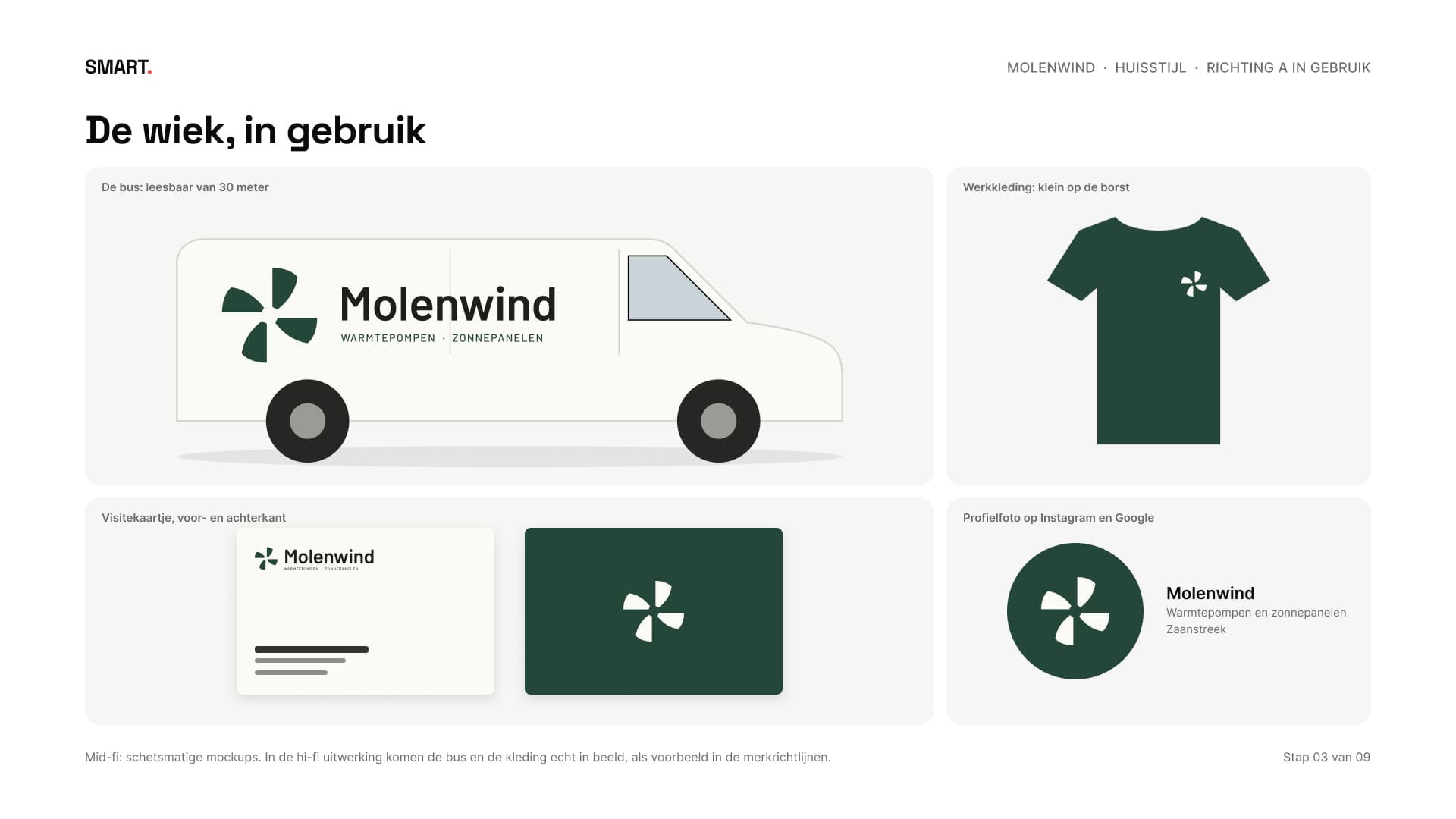
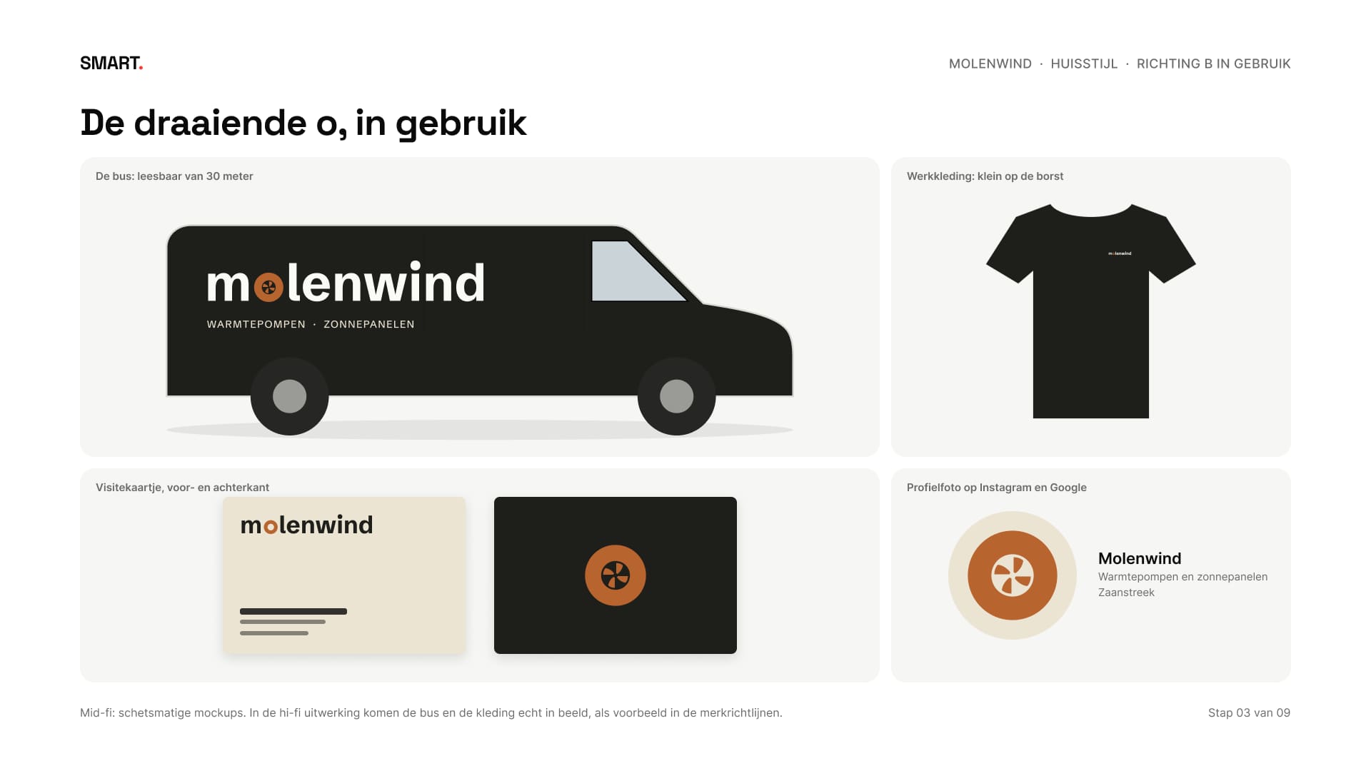
Zo ontstonden twee richtingen, allebei getoond op de bus, een shirt, een visitekaartje en als profielfoto. A, de wiek: een eigen beeldmerk in Zaans groen. B, de draaiende o: de o in de naam is een koperen ring met wieken, in teer en koper. Mijn advies was B, omdat Molenwind een naam met een verhaal heeft en de donkere bus opvalt tussen de witte. Het werd B.
That gave two directions, each shown on the van, a shirt, a business card and as a profile picture. A, the blade: a mark of its own in Zaan green. B, the turning o: the o in the name is a copper ring with blades, in tar and copper. My advice was B, because Molenwind has a name with a story and the dark van stands out among the white ones. B it was.
04Een o die echt een o isAn o that really is an o
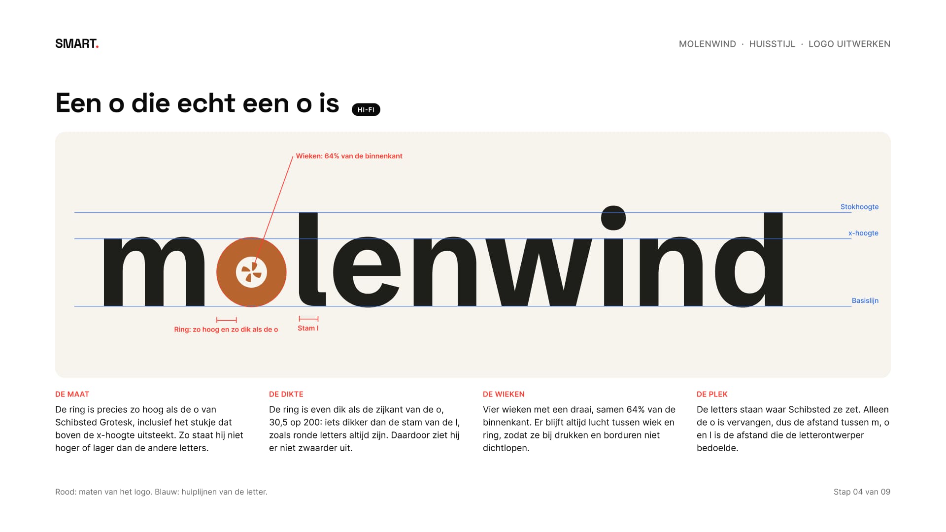
In de uitwerking zijn de letters van Schibsted Grotesk omgezet naar vormen en is alleen de o vervangen. De ring is precies zo hoog en zo dik als de echte o van de letter, zodat hij niet hoger of zwaarder staat dan de rest. De wieken vullen 64% van de binnenkant; er blijft altijd lucht, ook bij drukken en borduren.
In the refinement the letters of Schibsted Grotesk were converted to shapes and only the o was replaced. The ring is exactly as tall and as thick as the real o of the typeface, so it doesn't sit higher or heavier than the rest. The blades fill 64% of the inside; there's always air around them, in print and in embroidery too.
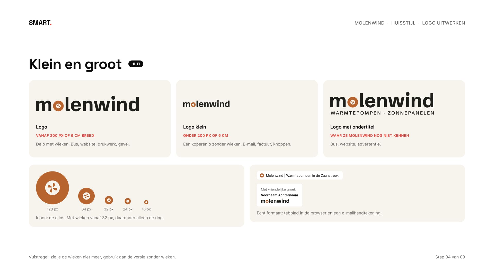
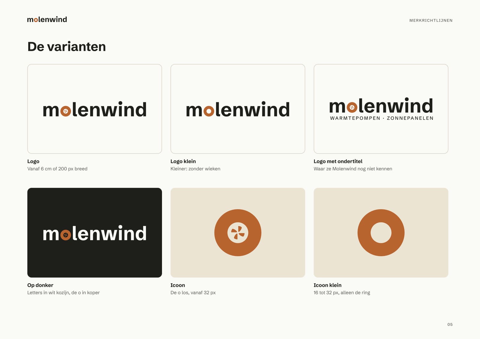
Er kwamen vijf versies: het logo met wieken, een kleine versie zonder wieken voor alles onder 200 pixels, het logo met ondertitel en het icoon in twee maten. Zie je de wieken niet meer, dan gebruik je de versie zonder.
That gave five versions: the logo with blades, a small version without blades for anything under 200 pixels, the logo with descriptor, and the icon in two sizes. If you can't see the blades anymore, you use the version without.
05Kleur en letterColour and type
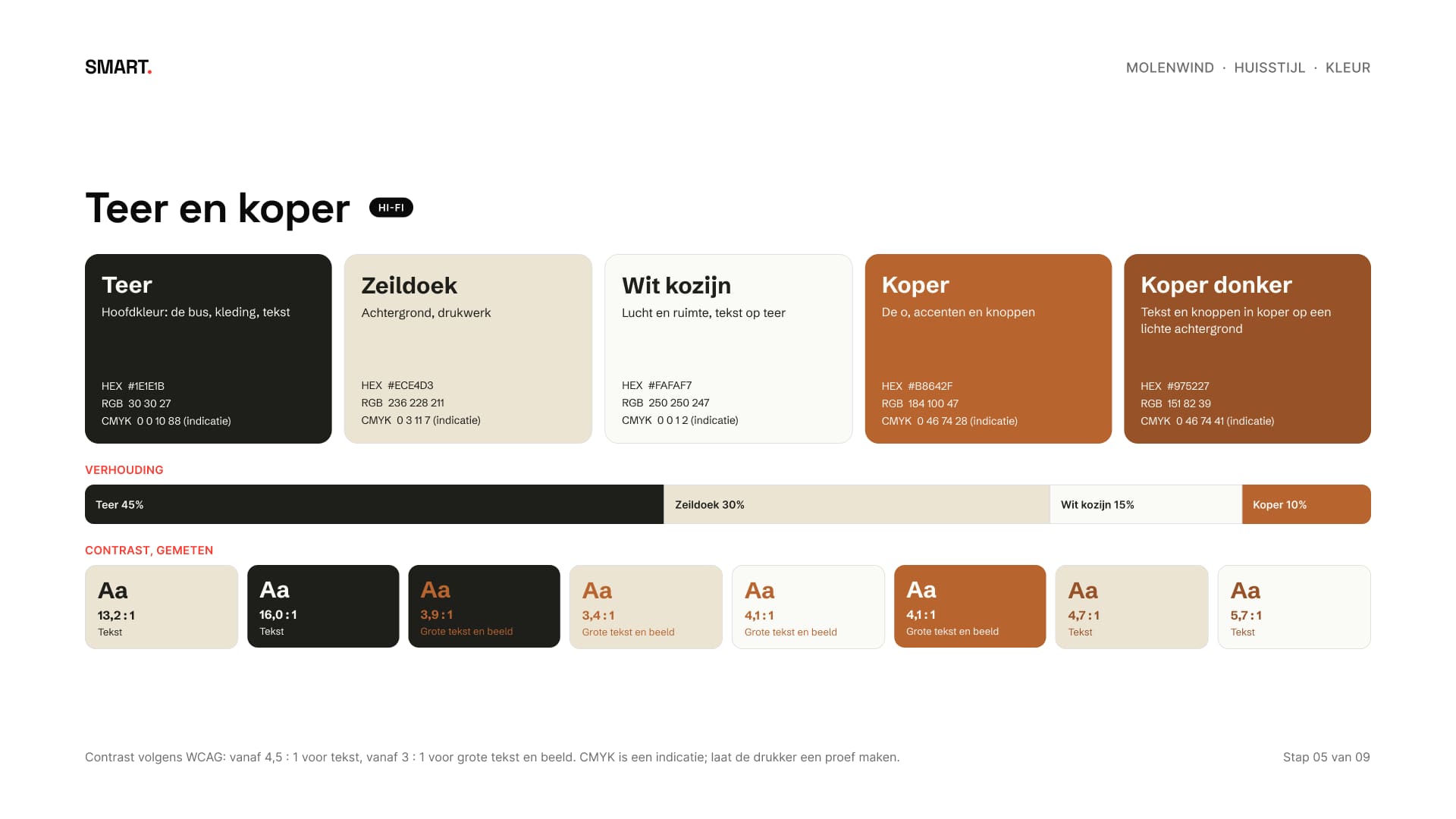
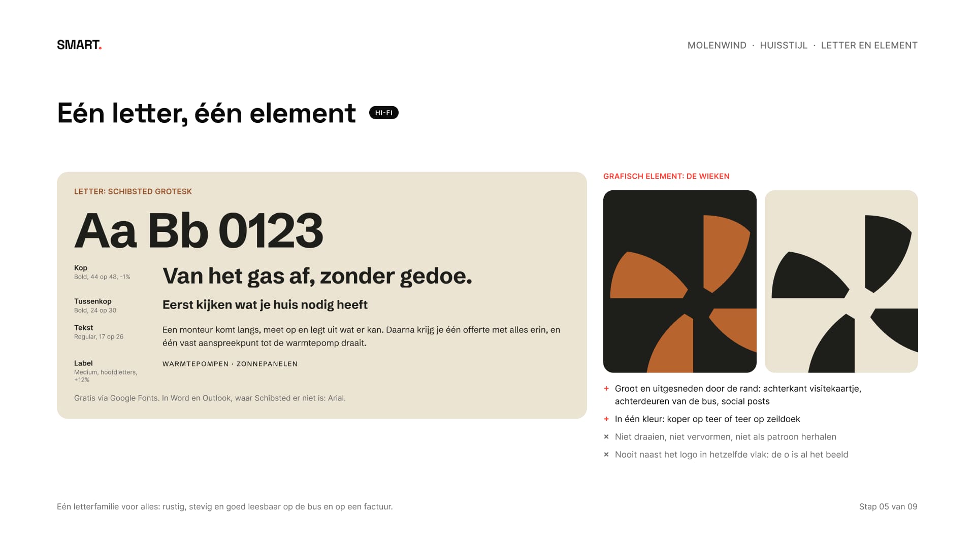
Teer en zeildoek doen het meeste werk, koper is het accent. Van elke combinatie is het contrast gemeten. Koper haalde nergens 4,5 : 1, de grens voor gewone tekst, dus kwam er een donkerdere koper bij voor tekst en knoppen: 4,7 : 1 op zeildoek en 5,7 : 1 op wit. Alles staat in één letterfamilie, Schibsted Grotesk, met Arial in Word en e-mail.
Tar and sailcloth do most of the work, copper is the accent. Every combination's contrast was measured. Copper didn't reach 4.5:1, the threshold for normal text, anywhere, so a darker copper was added for text and buttons: 4.7:1 on sailcloth and 5.7:1 on white. Everything uses one type family, Schibsted Grotesk, with Arial in Word and e-mail.
06Alles samen testenTesting it all together
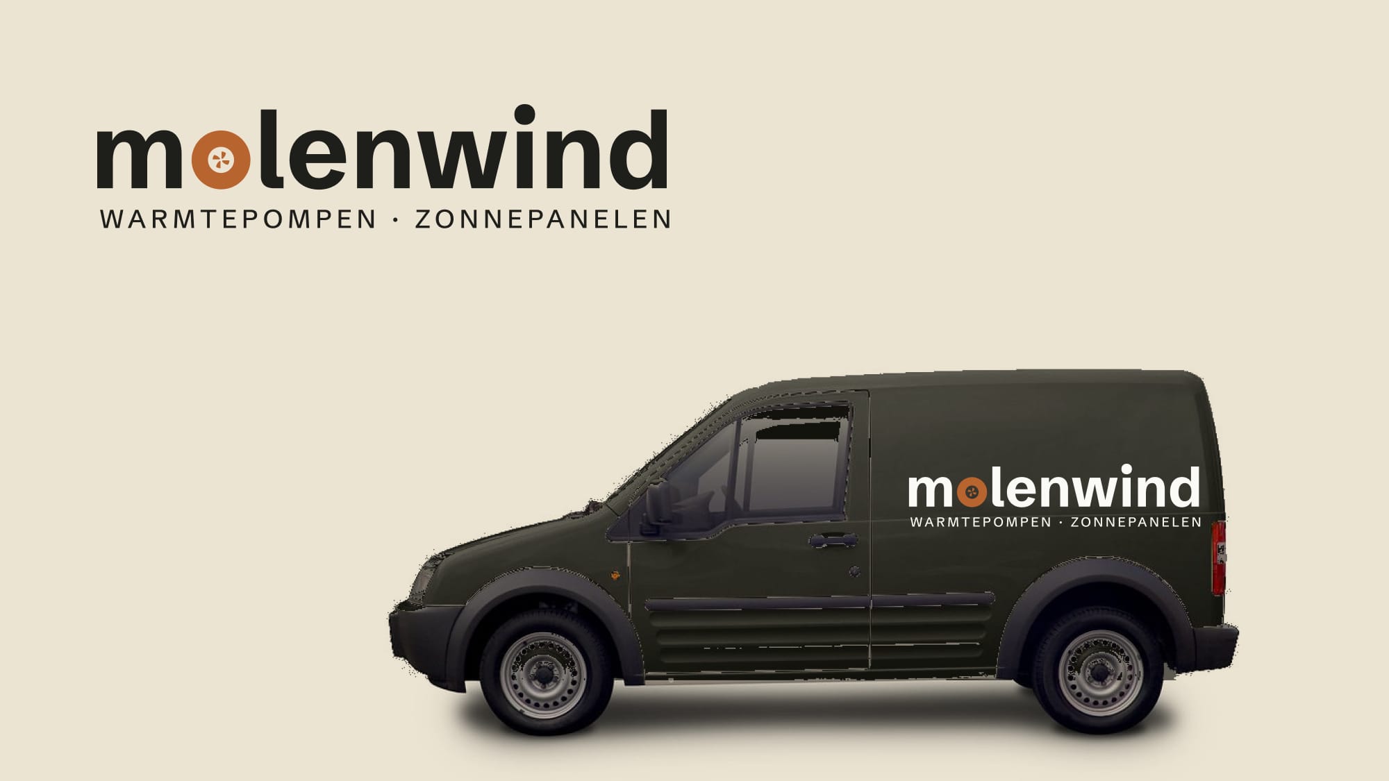
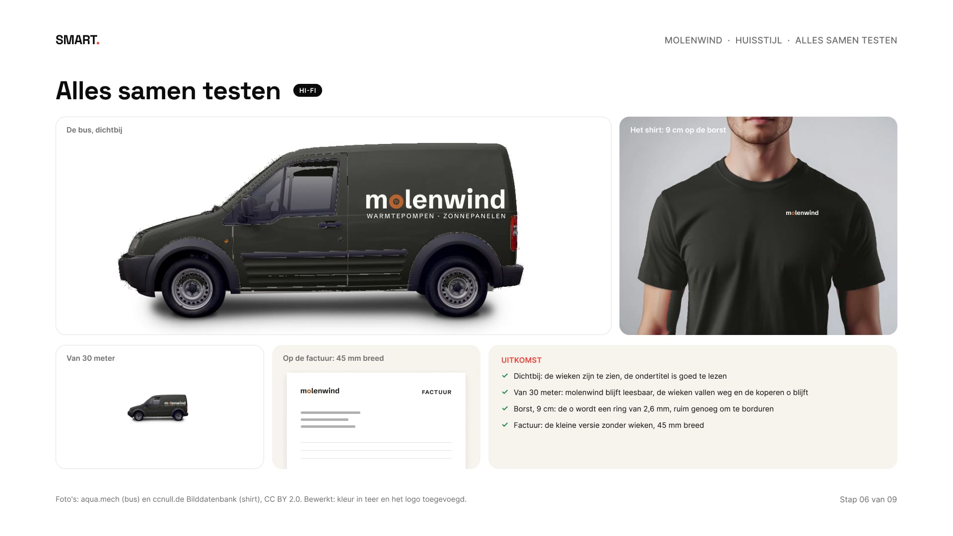
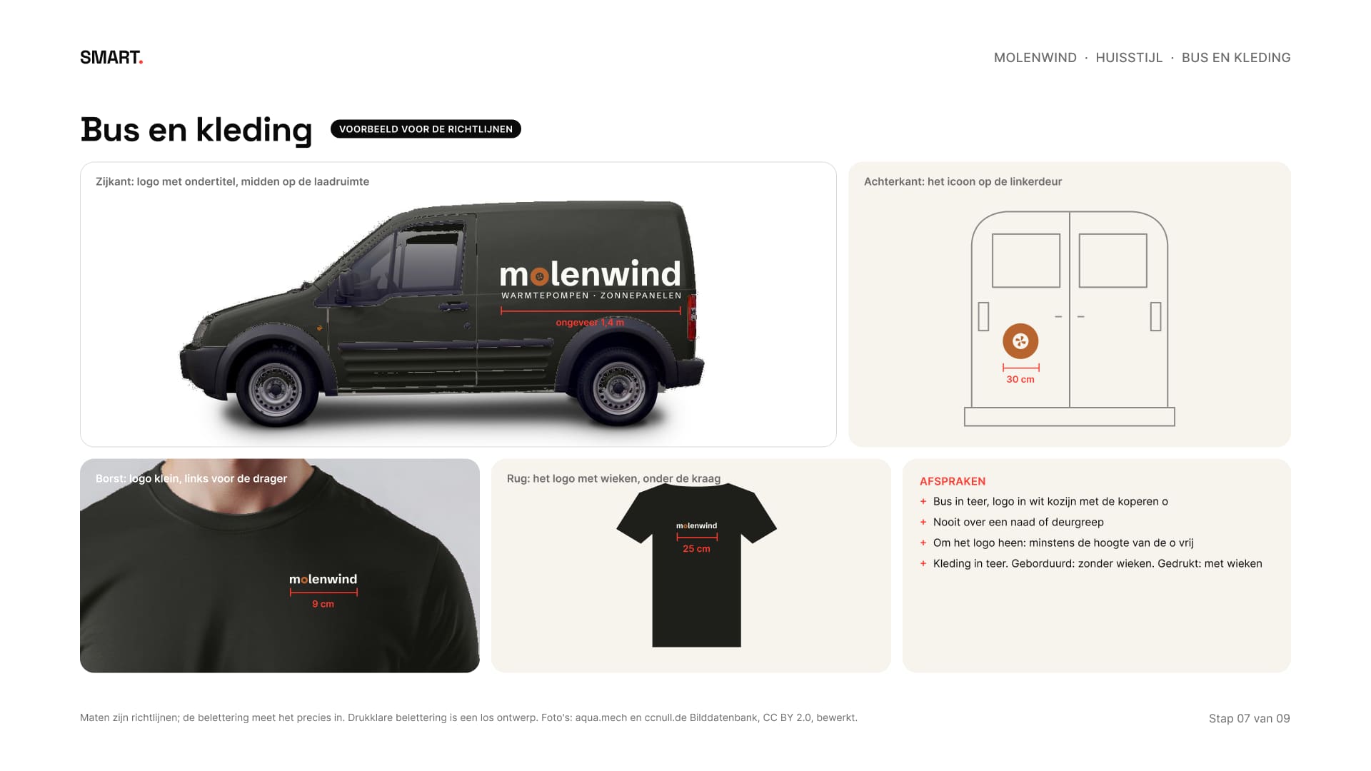
Voor de tweede feedbackronde zette ik alles in hi-fi op echte foto's: een bus en een shirt, in teer gekleurd met de lak, de schaduw en de plooien erin. Van dichtbij zie je de wieken, van dertig meter blijft molenwind leesbaar en wordt de o een koperen ring. Op de borst is het logo 9 centimeter, op de factuur 45 millimeter.
For the second feedback round I put everything into hi-fi on real photos: a van and a shirt, coloured tar with the paint, the shadow and the folds intact. Up close you see the blades, from thirty metres molenwind stays readable and the o becomes a copper ring. On the chest the logo is 9 centimetres, on the invoice 45 millimetres.
07ToepassenApplying it
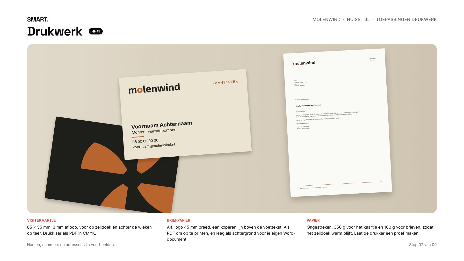
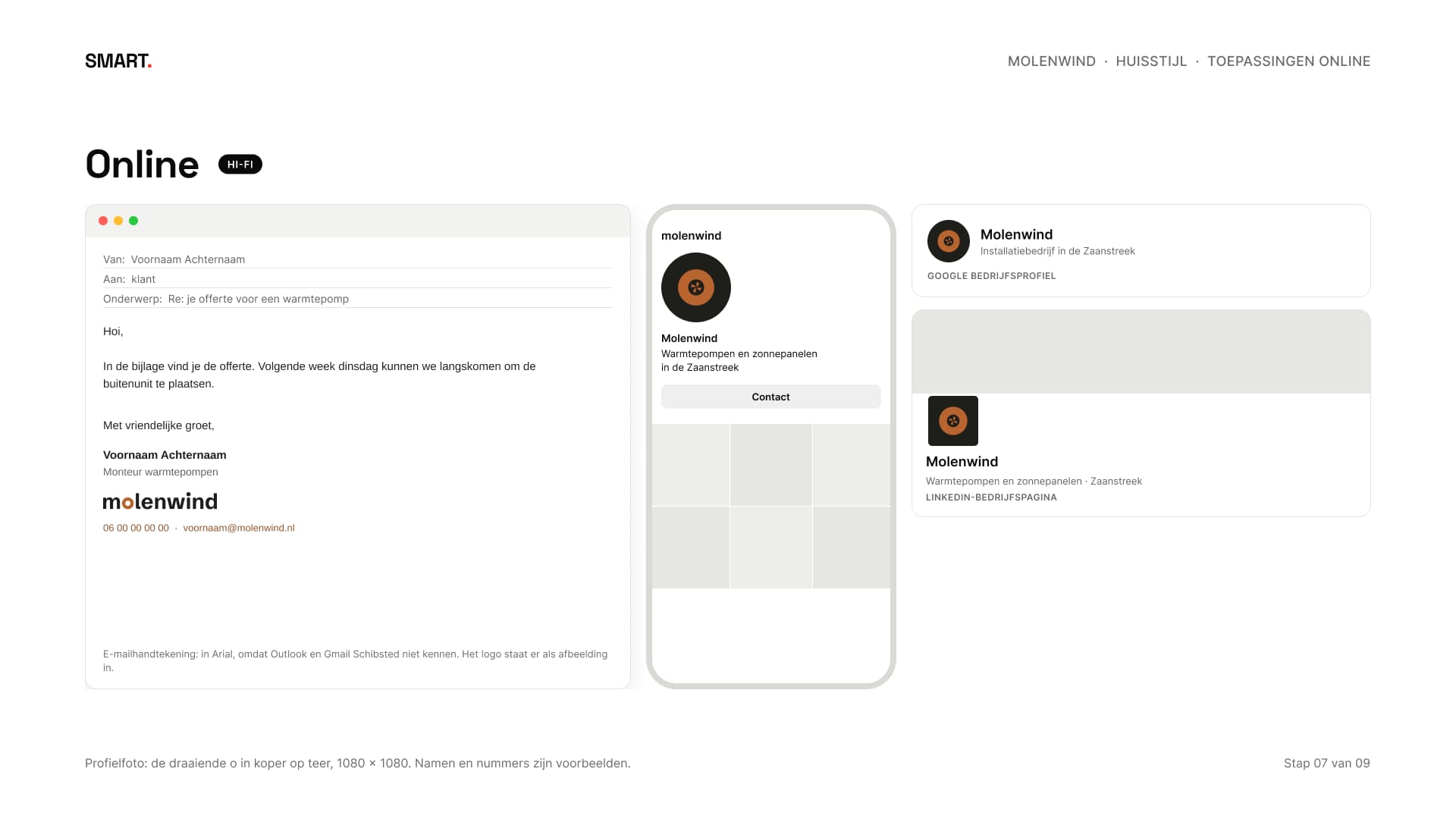
Het pakket Huisstijl krijgt een visitekaartje, briefpapier, een e-mailhandtekening en profielfoto's. Het kaartje is drukklaar met afloop, het briefpapier bestaat ook als achtergrond voor Word, en de handtekening staat in Arial omdat Outlook en Gmail Schibsted niet kennen.
The Brand identity package comes with a business card, letterhead, an e-mail signature and profile pictures. The card is print-ready with bleed, the letterhead also exists as a background for Word, and the signature uses Arial because Outlook and Gmail don't know Schibsted.
De bus en de kleding staan als voorbeeld in de richtlijnen, met maten, zodat de belettering en de leverancier weten wat de bedoeling is.
The van and the workwear are in the guidelines as an example, with sizes, so the sign maker and the supplier know what's intended.
08Vastleggen en opleverenRecording and delivering
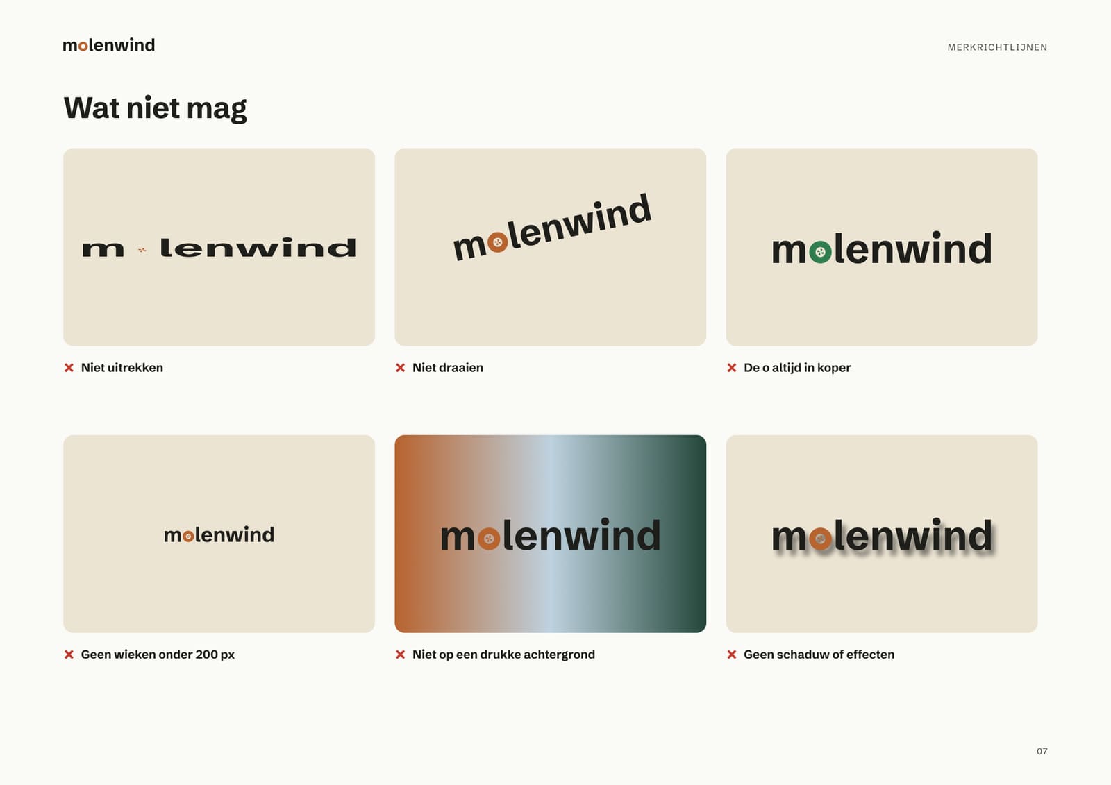
Alles staat in merkrichtlijnen van zestien pagina's, in de huisstijl van Molenwind zelf: het verhaal, het logo en zijn versies, vrije ruimte en minimale maten, wat niet mag, de kleuren, de letter, de wieken, het drukwerk, online, de bus, de kleding en welk bestand waarvoor.
Everything is in sixteen pages of brand guidelines, in Molenwind's own style: the story, the logo and its versions, clear space and minimum sizes, what not to do, the colours, the type, the blades, print, online, the van, the clothing and which file to use where.
De oplevering is een map van zeventig bestanden: achttien logoversies in SVG, PNG en PDF, het drukwerk, de bestanden voor online, de richtlijnen en de presentatie van het hele proces.
The delivery is a folder of seventy files: eighteen logo versions in SVG, PNG and PDF, the print files, the files for online, the guidelines and the presentation of the whole process.
09ResultaatResult
Een huisstijl die hetzelfde zegt op een bus van dertig meter afstand en op een favicon van zestien pixels: toen wind, nu lucht. Molenwind bestaat niet, de huisstijl en de bestanden wel. Zo ziet het pakket Huisstijl eruit: negen stappen, van lo-fi schetsen via mid-fi richtingen naar een hi-fi uitwerking. De foto's van de bus en het shirt zijn van aqua.mech en ccnull.de Bilddatenbank (CC BY 2.0, bewerkt), het moodboard gebruikt foto's van Openverse.
A brand identity that says the same thing on a van thirty metres away and on a sixteen-pixel favicon: then wind, now air. Molenwind doesn't exist, the brand identity and the files do. This is what the Brand identity package looks like: nine steps, from lo-fi sketches via mid-fi directions to a hi-fi result. The photos of the van and the shirt are by aqua.mech and ccnull.de Bilddatenbank (CC BY 2.0, edited), the moodboard uses photos from Openverse.
Groeit je bedrijf en ziet het er overal anders uit? In een gratis kennismaking kijken we wat jouw huisstijl nodig heeft.
Is your business growing and does it look different everywhere? In a free intro call we look at what your brand identity needs.