
Conceptproject: logoConcept project: logo
Rugwind
Een verzonnen fysiotherapeut in Utrecht krijgt een logo, gemaakt zoals bij een echte klant: briefing, onderzoek, zestien schetsen, twee concepten en alle bestanden voor het bordje, de polo en Instagram.
A made-up physiotherapist in Utrecht gets a logo, made the way I would for a real client: brief, research, sixteen sketches, two concepts and every file for the door plate, the polo and Instagram.
01De opdrachtThe brief
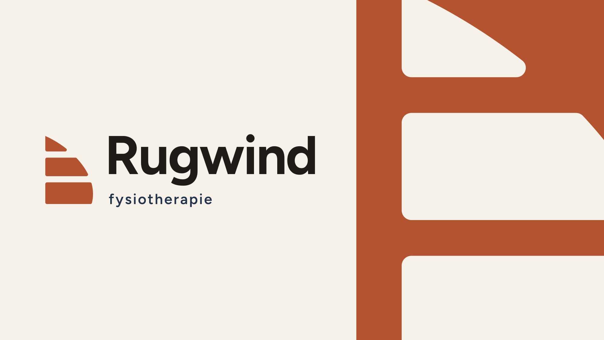
Rugwind is verzonnen, maar ik heb het aangepakt als een echte opdracht. Een fysiotherapeut met acht jaar ervaring in een groepspraktijk begint voor zichzelf in Utrecht, met een kleine behandelruimte en afspraken bij mensen op kantoor. Ze behandelt niet alleen, ze legt uit en geeft oefeningen mee. Je gaat de deur uit met een plan. Daar komt de naam vandaan: wind in de rug.
Rugwind is made up, but I handled it like a real brief. A physiotherapist with eight years in a group practice starts out on her own in Utrecht, with a small treatment room and appointments at people's offices. She doesn't just treat, she explains and gives you exercises to take home. You leave with a plan. That's where the name comes from: rugwind is Dutch for tailwind, literally wind in your back.
De vraag: een logo dat vertrouwen geeft zonder ziekenhuisgevoel. Het moet werken op het bordje naast de deur, de website, een geborduurde polo, de factuur en als rond Instagram-icoon. Geslaagd is het als een patiënt het bordje meteen herkent en een huisarts de naam na één keer horen onthoudt. Het kleinste gebruik bepaalt het ontwerp: op 16 pixels in een browsertabblad of in borduursel verdwijnt elk fijn detail.
The question: a logo that inspires trust without feeling like a hospital. It has to work on the plate by the door, the website, an embroidered polo, the invoice and as a round Instagram icon. It succeeds when a patient recognises the plate straight away and a GP remembers the name after hearing it once. The smallest use sets the rules: at 16 pixels in a browser tab, or in embroidery, every fine detail disappears.

02Eerst kijkenLooking first
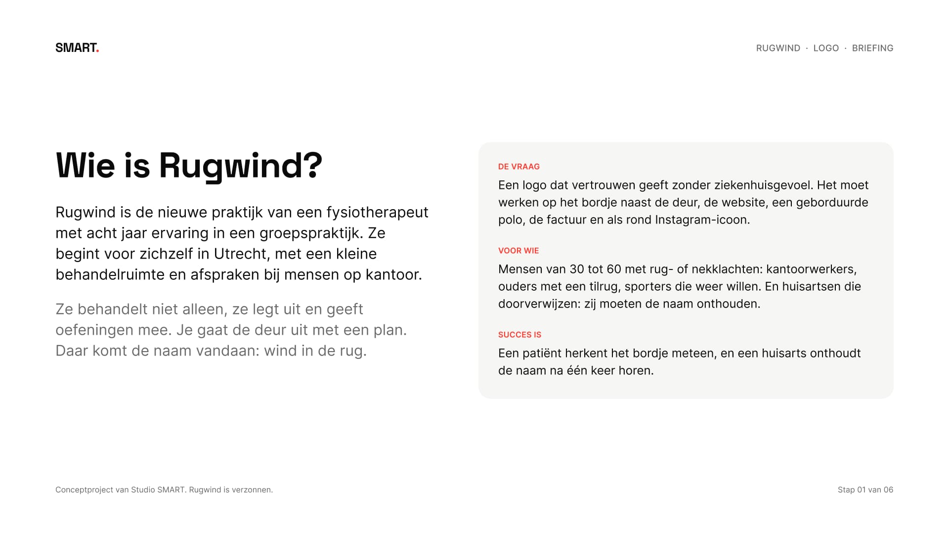
Voor ik ging schetsen, keek ik wat er al is: de websites van tien fysiopraktijken uit de Utrechtse lijst op ZorgkaartNederland. Oranje zit in vier van de tien logo's, groen, blauw en geel elk in drie. In de logo's zelf zie je poppetjes en handen, letters in een cirkel of schild, schuine letters en swooshes. En alle tien hebben “fysio” in hun naam.
Before sketching, I looked at what's already out there: the websites of ten physiotherapy practices from the Utrecht list on ZorgkaartNederland. Orange appears in four of the ten logos, green, blue and yellow in three each. The logos themselves show figures and hands, letters in a circle or shield, slanted type and swooshes. And all ten have “fysio” in their name.
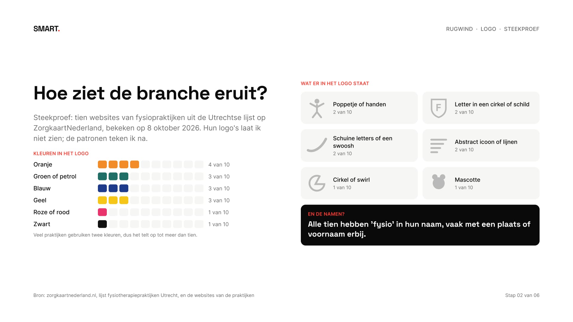
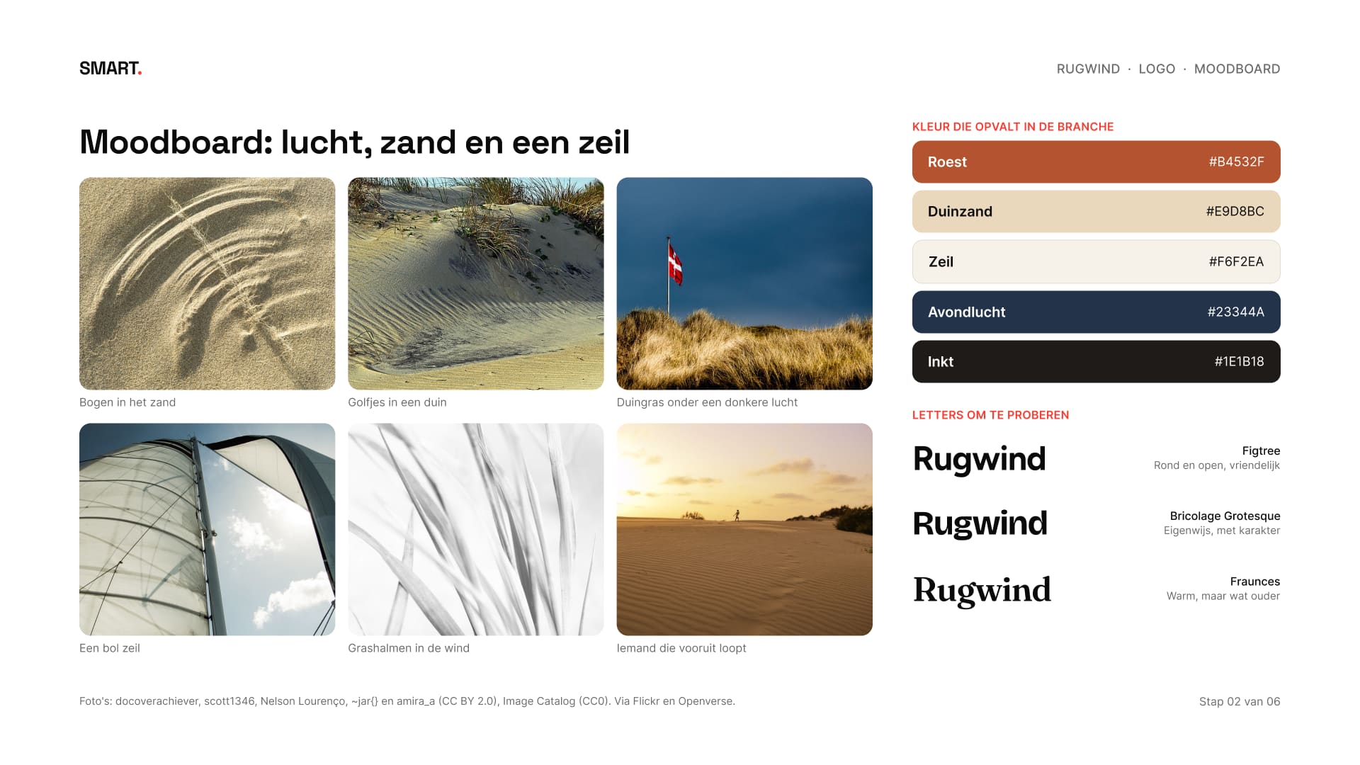
Daar zit de kans. Rugwind valt al op door de naam, dus het beeld hoeft niet te zeggen dat het om fysiotherapie gaat: dat doet het woord eronder. Het moodboard kwam uit de naam zelf: lucht, duinzand en een zeil in de wind. Daaruit haalde ik de kleuren en drie letters om te proberen.
That's the opening. Rugwind already stands out by its name, so the image doesn't have to say physiotherapy: the word underneath does that. The moodboard came from the name itself: sky, dune sand and a sail in the wind. From it I took the colours and three typefaces to try.
03Zestien schetsenSixteen sketches
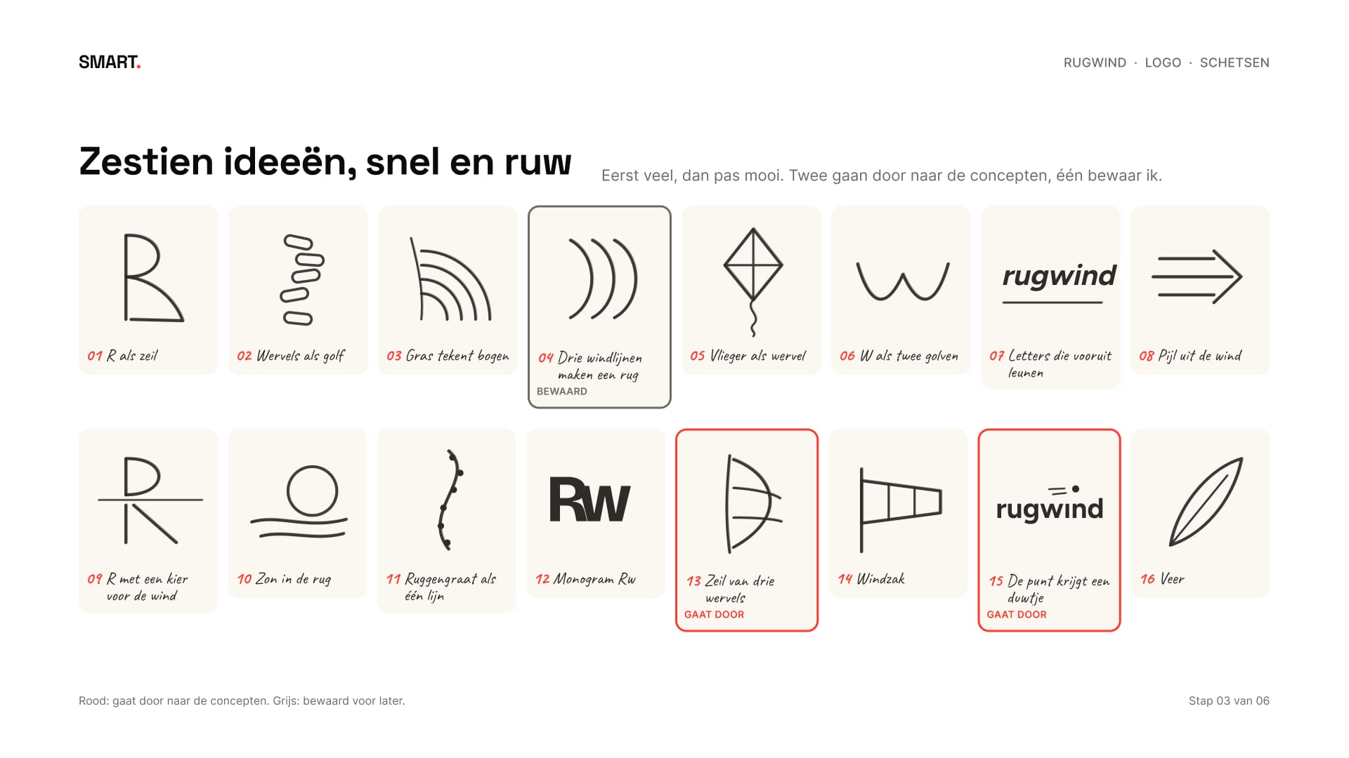
Eerst veel, dan pas mooi. Ik schetste zestien ideeën, snel en ruw: een R als zeil, wervels als golf, een vlieger, een windzak, een monogram. Twee gingen door naar de concepten: een zeil van drie wervels en een i waarvan de punt een duwtje krijgt. Eén bewaarde ik voor later.
Quantity first, polish later. I sketched sixteen ideas, quick and rough: an R as a sail, vertebrae as a wave, a kite, a windsock, a monogram. Two went on to the concepts: a sail made of three vertebrae and an i whose dot gets a nudge. One I kept for later.
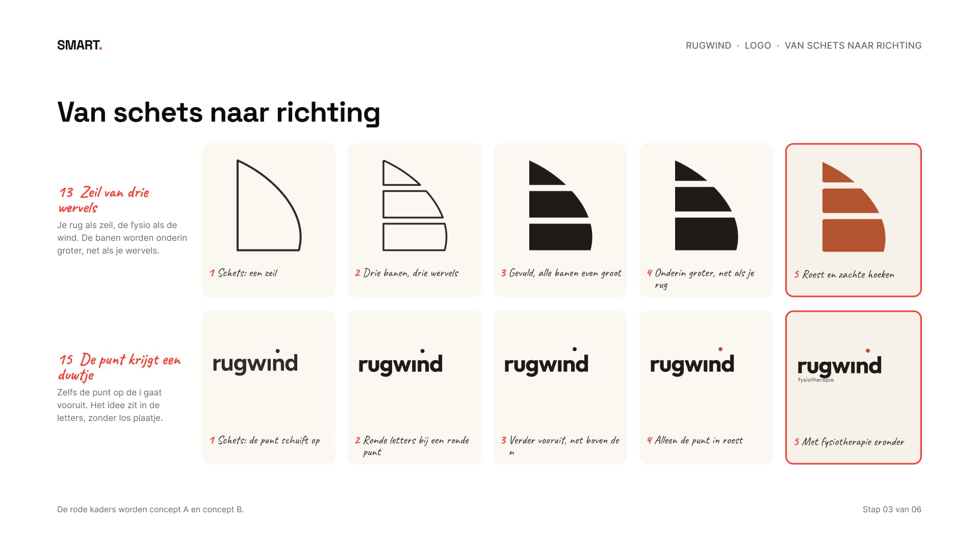
Daarna werkte ik beide uit in vijf kleine stappen, van losse lijn tot een vorm die staat.
Then I developed both in five small steps, from a loose line to a shape that holds.
04Twee conceptenTwo concepts
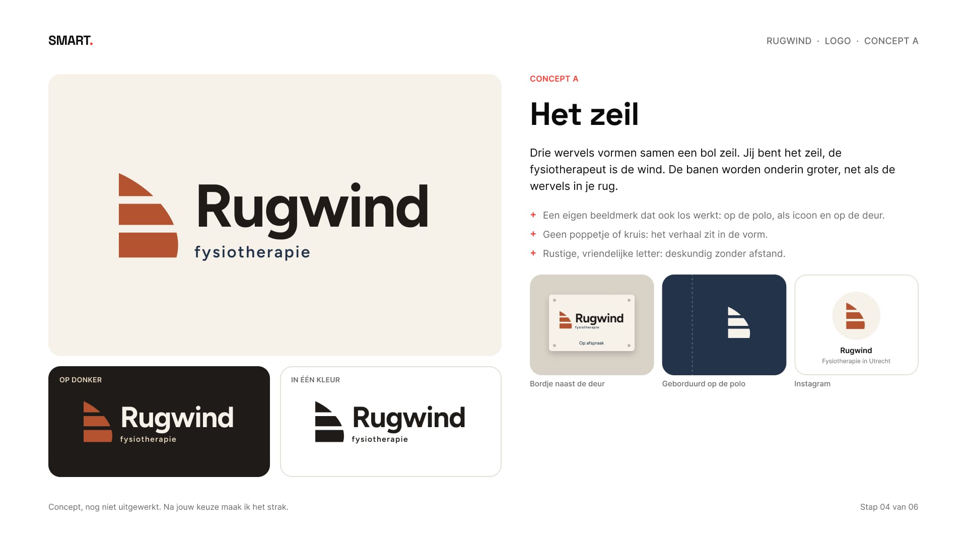
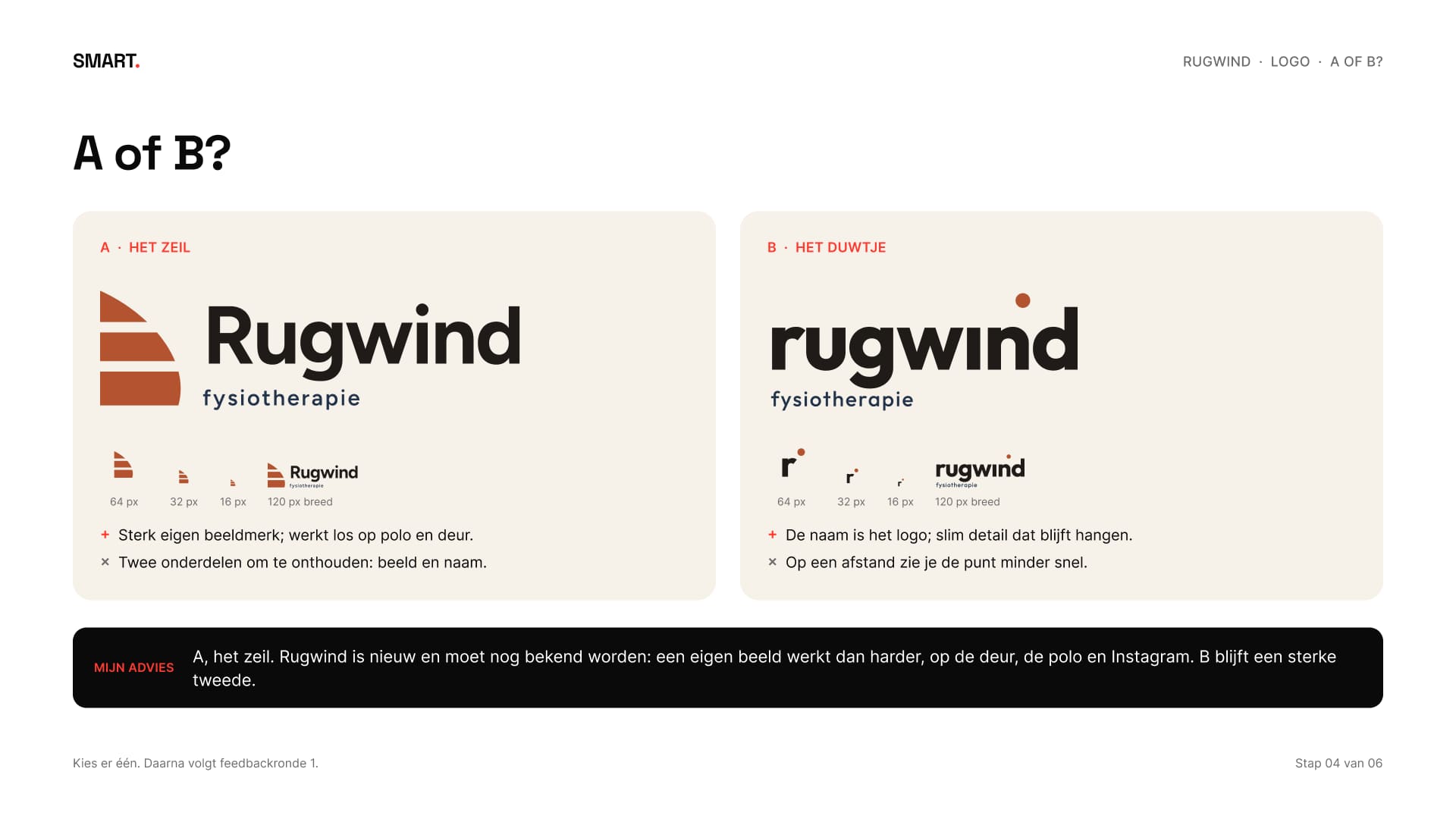
Het logopakket heeft twee concepten, dus Rugwind kreeg er twee, allebei op het bordje, de polo en Instagram, zodat je ziet hoe ze echt werken. Concept A, het zeil: drie wervels vormen samen een bol zeil. Jij bent het zeil, de fysiotherapeut is de wind. De banen worden onderin groter, net als de wervels in je rug.
The logo package has two concepts, so Rugwind got two, each shown on the plate, the polo and Instagram, so you see how they actually work. Concept A, the sail: three vertebrae together form a full sail. You are the sail, the physiotherapist is the wind. The bands get bigger towards the bottom, like the vertebrae in your back.
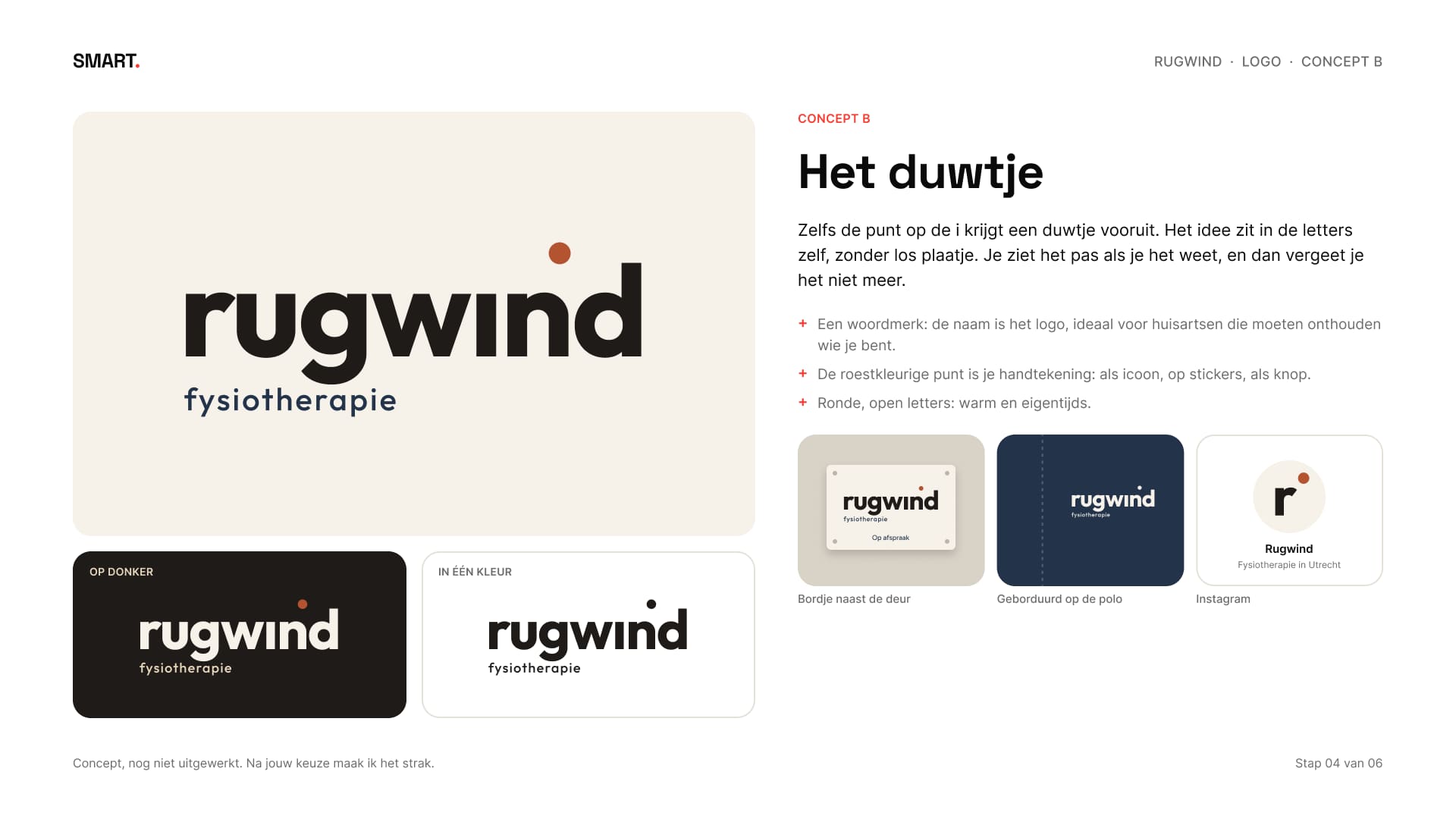
Concept B, het duwtje: de punt op de i krijgt een zetje vooruit. Het idee zit in de letters zelf, zonder los plaatje. Mijn advies was A: een nieuwe praktijk moet nog bekend worden, en een eigen beeld werkt dan harder, op de deur, de polo en Instagram. De keuze viel op A, met één opmerking: maak het strak.
Concept B, the nudge: the dot on the i gets a push forward. The idea sits in the letters themselves, with no separate image. My advice was A: a new practice still has to become known, and an image of its own works harder then, on the door, the polo and Instagram. A was chosen, with one note: make it tight.
05Strak makenMaking it tight
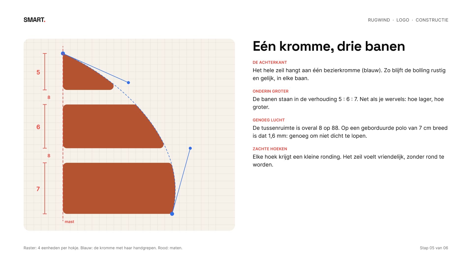
Bij het uitwerken krijgt elke maat een reden. Het hele zeil hangt aan één kromme, zodat de bolling in elke baan even rustig loopt. De banen staan in de verhouding 5:6:7, hoe lager hoe groter, net als je wervels. De openingen zijn overal even breed en elke hoek kreeg een kleine ronding: het zeil voelt vriendelijk zonder zacht te worden.
In the refinement every measurement gets a reason. The whole sail hangs from one curve, so the bulge runs equally calm in every band. The bands are in a 5:6:7 ratio, bigger towards the bottom, like your vertebrae. The gaps are equally wide everywhere and every corner got a small rounding: the sail feels friendly without turning soft.
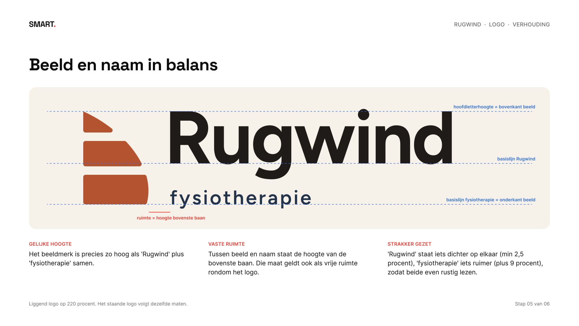
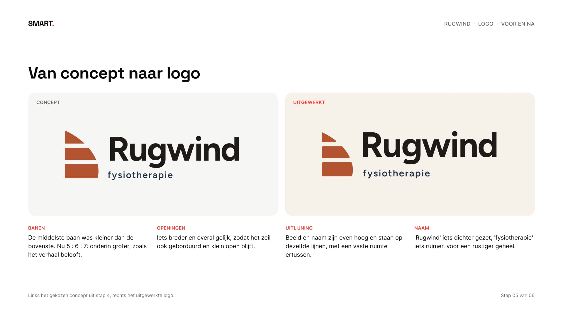
Daarna de balans tussen beeld en naam: het beeldmerk is precies zo hoog als “Rugwind” en “fysiotherapie” samen, en de naam staat iets dichter op elkaar. Naast elkaar zie je wat er veranderd is tussen concept en logo.
Then the balance between image and name: the mark is exactly as tall as “Rugwind” and “fysiotherapie” together, and the name is set a little tighter. Side by side you see what changed between concept and logo.
06Klein en in kleurSmall and in colour
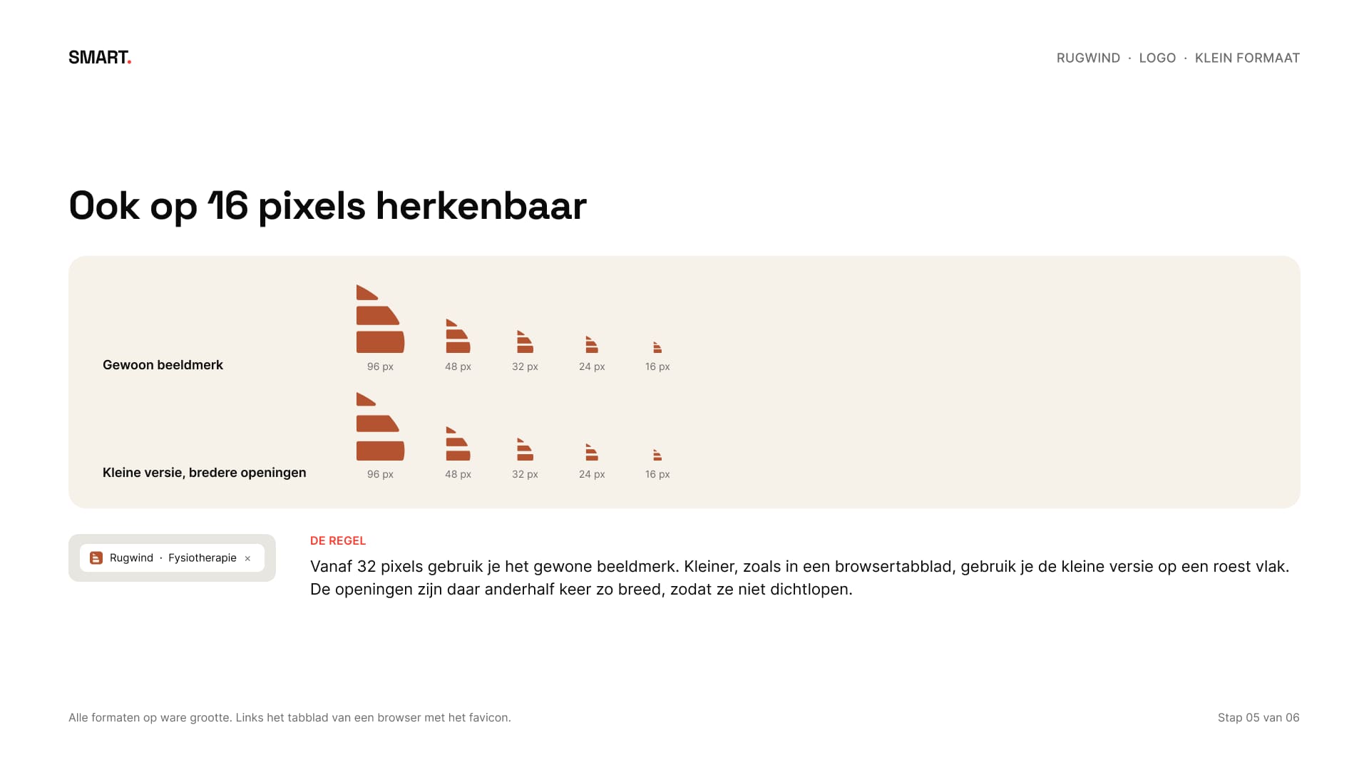
Een logo moet ook werken waar het klein is. Vanaf 32 pixels gebruik je het gewone beeldmerk. Daaronder, zoals in een browsertabblad, is er een kleine versie met iets bredere openingen, zodat ze niet dichtlopen.
A logo has to work where it's small too. From 32 pixels up you use the regular mark. Below that, like in a browser tab, there's a small version with slightly wider gaps, so they don't fill in.
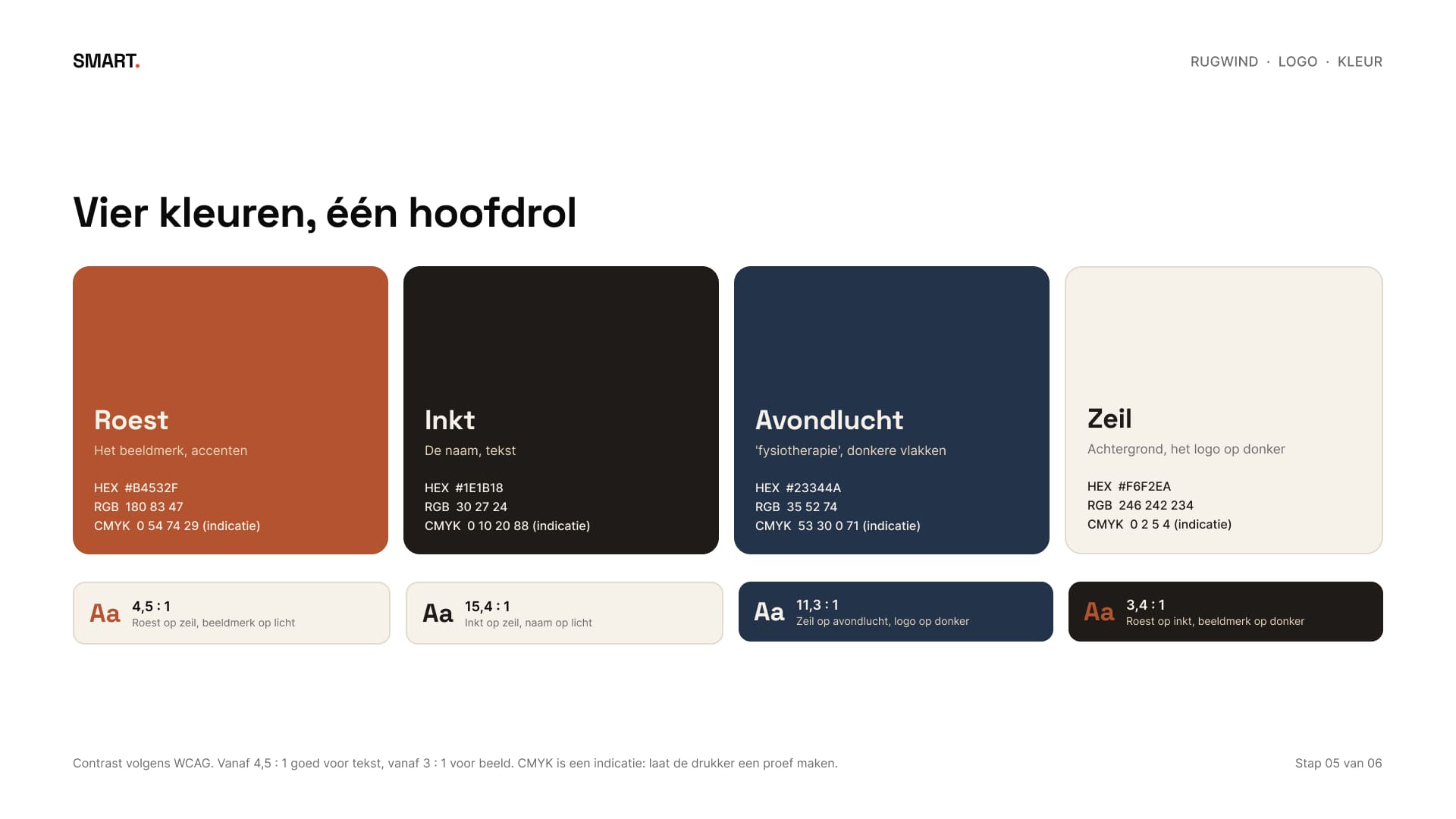
De kleuren komen uit het moodboard: roest voor het beeldmerk, inkt voor de naam, avondlucht voor donkere vlakken en zeil als achtergrond. Van elke combinatie is het contrast gemeten, zodat je weet wat je voor tekst gebruikt en wat alleen voor beeld.
The colours come from the moodboard: rust for the mark, ink for the name, evening sky for dark areas and sail as the background. Every combination has a measured contrast, so you know which ones work for text and which only for images.
07De opleveringThe delivery
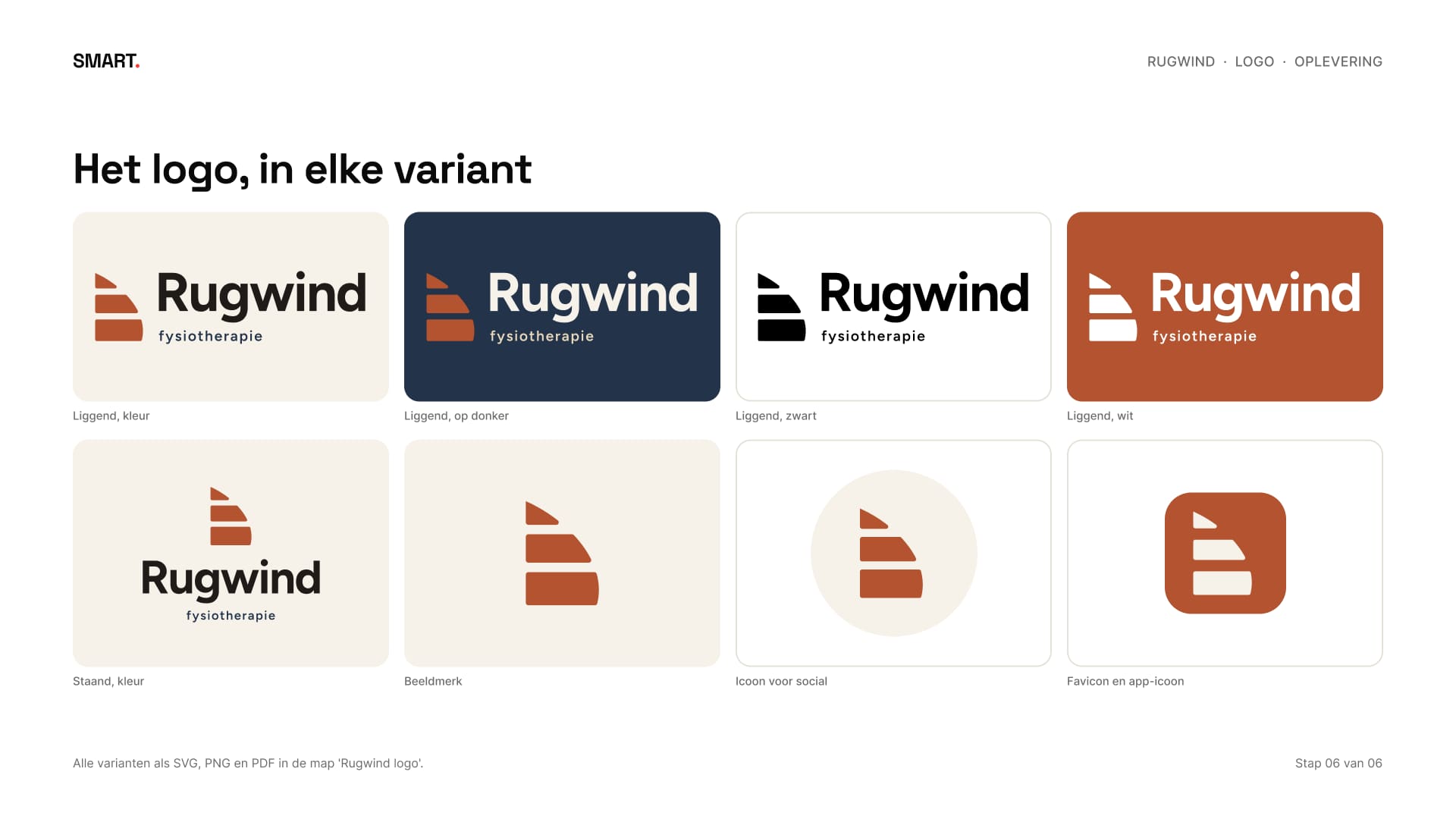
Rugwind krijgt het logo in veertien varianten: liggend en staand in kleur, op donker, zwart en wit, het beeldmerk los, een kleine versie, een rond icoon voor social en een favicon. Samen 57 bestanden in SVG, PNG en PDF, met de letters omgezet naar vormen, zodat je het lettertype niet nodig hebt.
Rugwind gets the logo in fourteen variants: horizontal and stacked in colour, on dark, black and white, the mark on its own, a small version, a round icon for social and a favicon. That's 57 files in SVG, PNG and PDF, with the letters converted to shapes, so you don't need the typeface.
Daarbij hoort een presentatie van 23 pagina's met het hele proces, en een korte uitleg: hoeveel ruimte er rond het logo moet, hoe klein het mag en welk bestand je pakt voor de website, de polo of het bordje.
It comes with a 23-page presentation of the whole process, and a short guide: how much space the logo needs around it, how small it can go and which file to use for the website, the polo or the plate.
08ResultaatResult
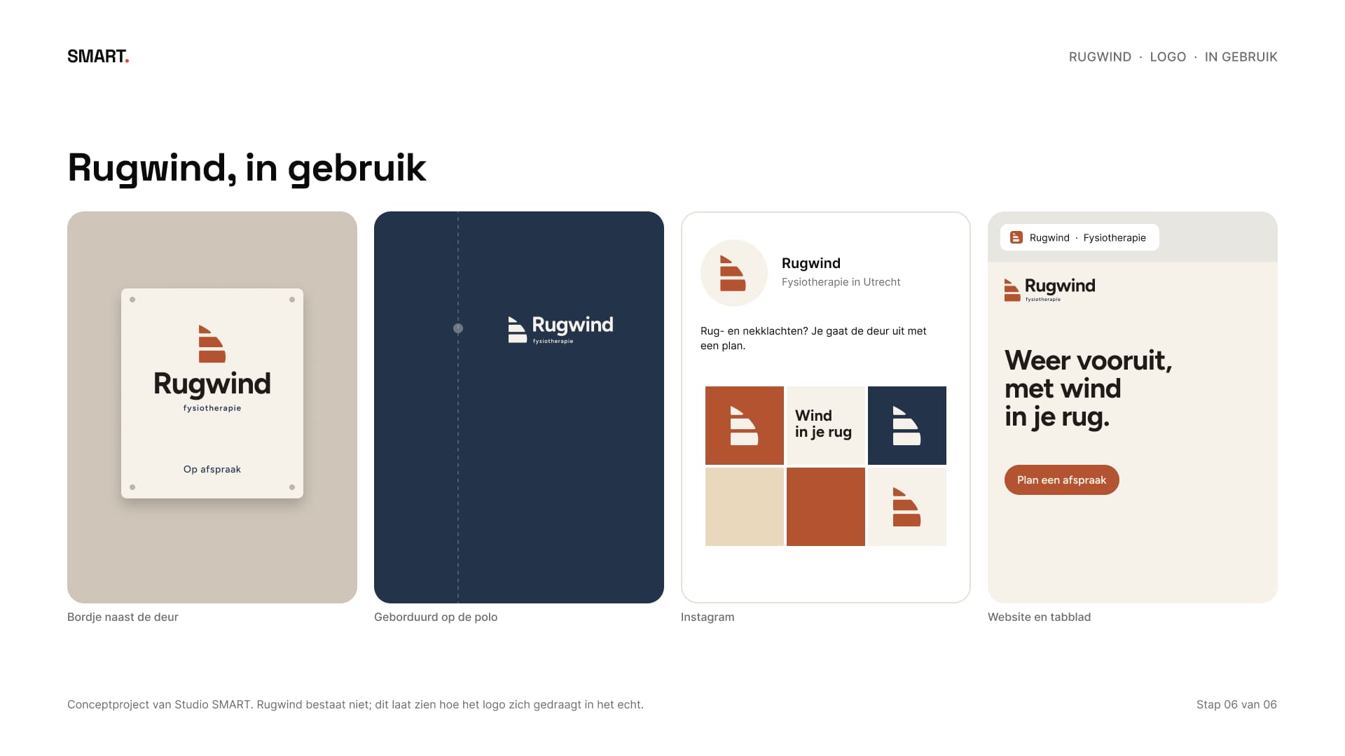
Een logo dat werkt van een browsertabblad tot een bordje van 30 bij 20 centimeter, met een verhaal in één zin: jij bent het zeil, de fysiotherapeut is de wind. Rugwind bestaat niet, het logo en de bestanden wel. Zo ziet het logopakket eruit: twee concepten, één uitgewerkt, varianten in kleur en zwart-wit en bestanden voor web en print.
A logo that works from a browser tab to a 30 by 20 centimetre plate, with a story in one sentence: you are the sail, the physiotherapist is the wind. Rugwind doesn't exist, the logo and the files do. This is what the logo package looks like: two concepts, one worked out, colour and black-and-white versions and files for web and print.
Begin je voor jezelf en heb je een logo nodig dat overal werkt? In een gratis kennismaking kijken we wat jouw naam en je verhaal nodig hebben.
Starting out on your own and need a logo that works everywhere? In a free intro call we look at what your name and your story need.