
Conceptproject: compleet merkConcept project: complete brand
Bijrijder
Een verzonnen rijschool in Haarlem krijgt een compleet merk, gemaakt zoals bij een echte klant: van een merksessie en een klantreis via vijf richtingen en een doelgroeptest tot de lesauto, een lesplanner, een lanceringsplan en een merkgids van negenentwintig pagina's.
A made-up driving school in Haarlem gets a complete brand, made the way I would for a real client: from a brand session and a customer journey via five directions and an audience test to the lesson car, a lesson planner, a launch plan and a twenty-nine-page brand guide.
01De opdrachtThe brief
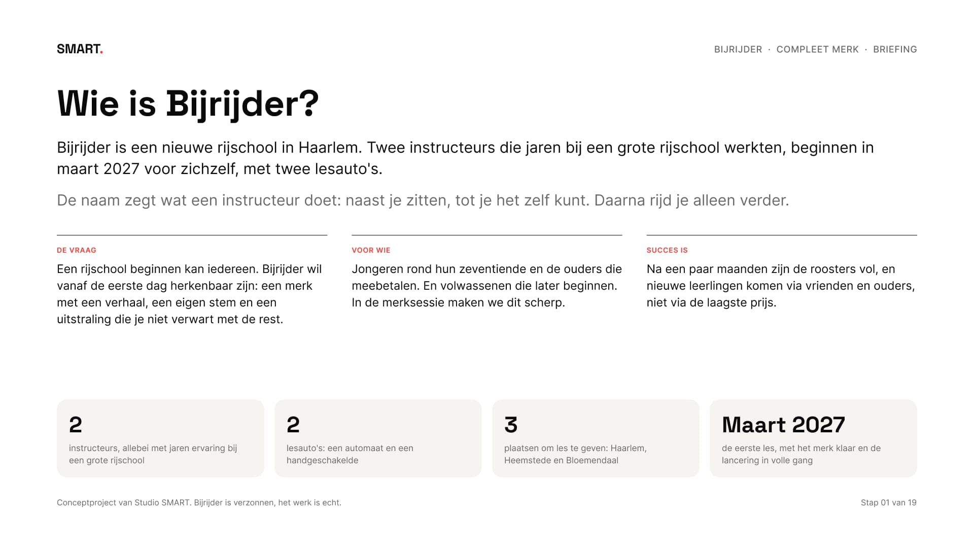
Bijrijder is verzonnen, maar ik heb het aangepakt als een echte opdracht. Twee instructeurs die jaren bij een grote rijschool werkten, beginnen in maart 2027 voor zichzelf in Haarlem. Ze hebben een automaat en een handgeschakelde auto en geven les in Haarlem, Heemstede en Bloemendaal. De naam zegt wat een instructeur doet: naast je zitten, tot je het zelf kunt.
Bijrijder is made up, but I handled it like a real brief. Two instructors who worked at a large driving school for years start out on their own in Haarlem in March 2027. They have an automatic and a manual car and teach in Haarlem, Heemstede and Bloemendaal. The name, Dutch for the person in the passenger seat, says what an instructor does: sit next to you until you can do it yourself.
Compleet merk is het grootste merkpakket. Een logo begint bij het teken, een huisstijl bij het systeem, en dit pakket begint bij het verhaal: voor wie ben je er en wat beloof je. Daarom zijn het negentien stappen in zes weken, met zes momenten waarop de klant beslist.
Complete brand is the largest brand package. A logo starts with the mark, a brand identity with the system, and this package starts with the story: who you're for and what you promise. That's why it has nineteen steps in six weeks, with six moments where the client decides.
02De merksessieThe brand session
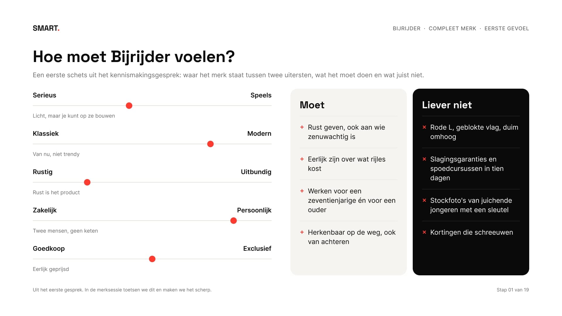
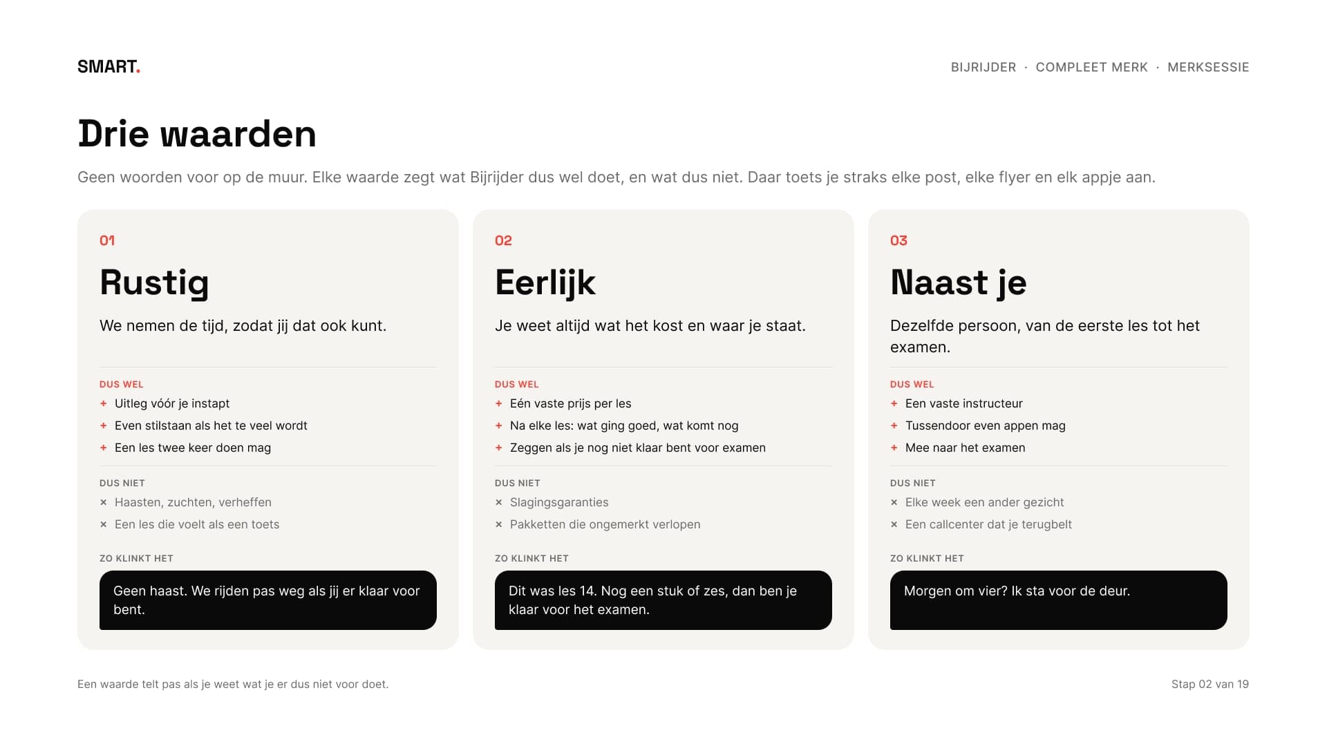
De eerste week draait om woorden. In de merksessie kwam het waarom op tafel: rijden leer je niet onder druk. Daar volgden drie waarden uit, rustig, eerlijk en naast je, een belofte en vijf grenzen: geen spoedcursus in tien dagen, geen slagingsgarantie, geen kortingsacties, geen wisselende instructeurs en geen pakketten die je moet volmaken.
The first week is about words. In the brand session the why came up: you don't learn to drive under pressure. That led to three values, calm, honest and beside you, a promise and five limits: no crash course in ten days, no pass guarantee, no discounts, no changing instructors and no packages you have to use up.
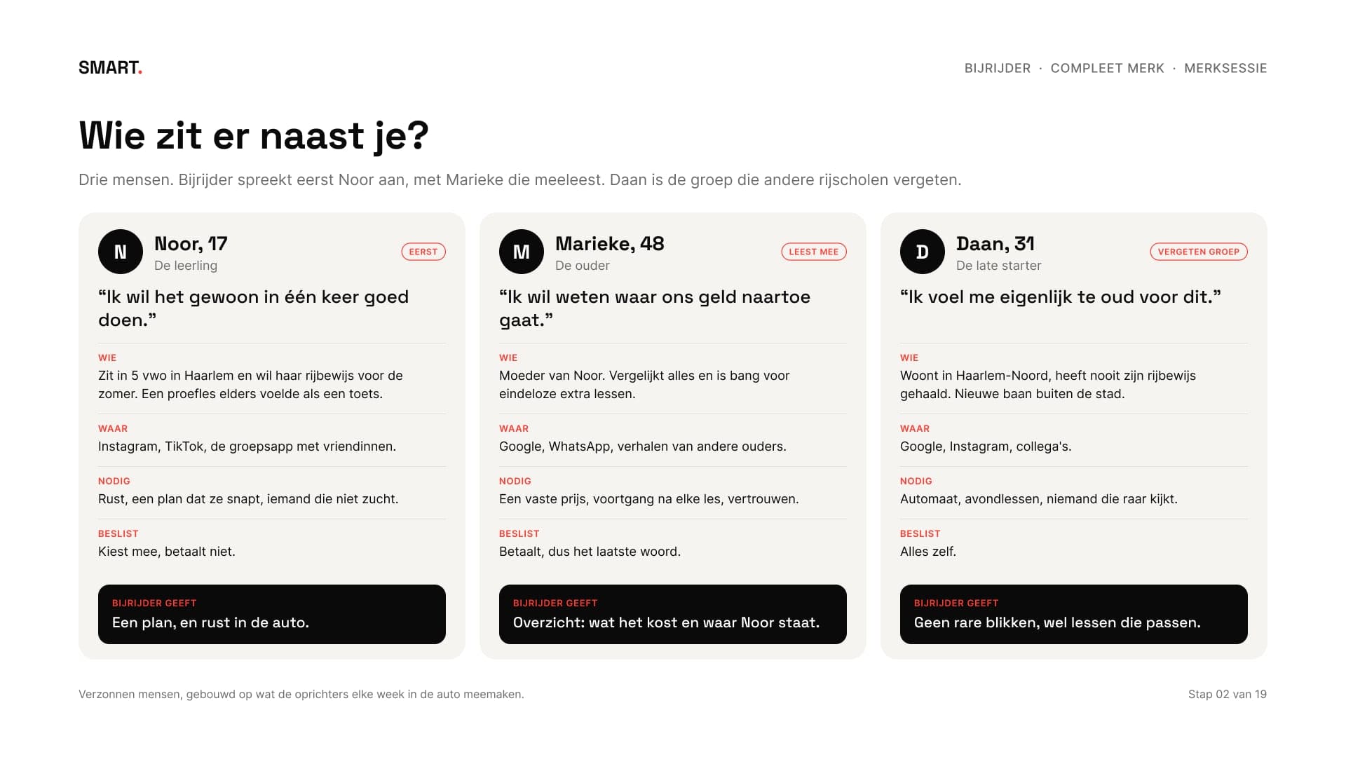
Voor wie het merk is, staat in drie persona's: Noor van 17 die haar rijbewijs wil, Marieke van 48 die meebetaalt, en Daan van 31 die het nooit haalde. Elke tekst en elk beeld wordt later aan hen getoetst.
Who the brand is for is captured in three personas: Noor, 17, who wants her licence, Marieke, 48, who helps pay, and Daan, 31, who never got his. Every text and image is later checked against them.
03Eerst kijkenLooking first
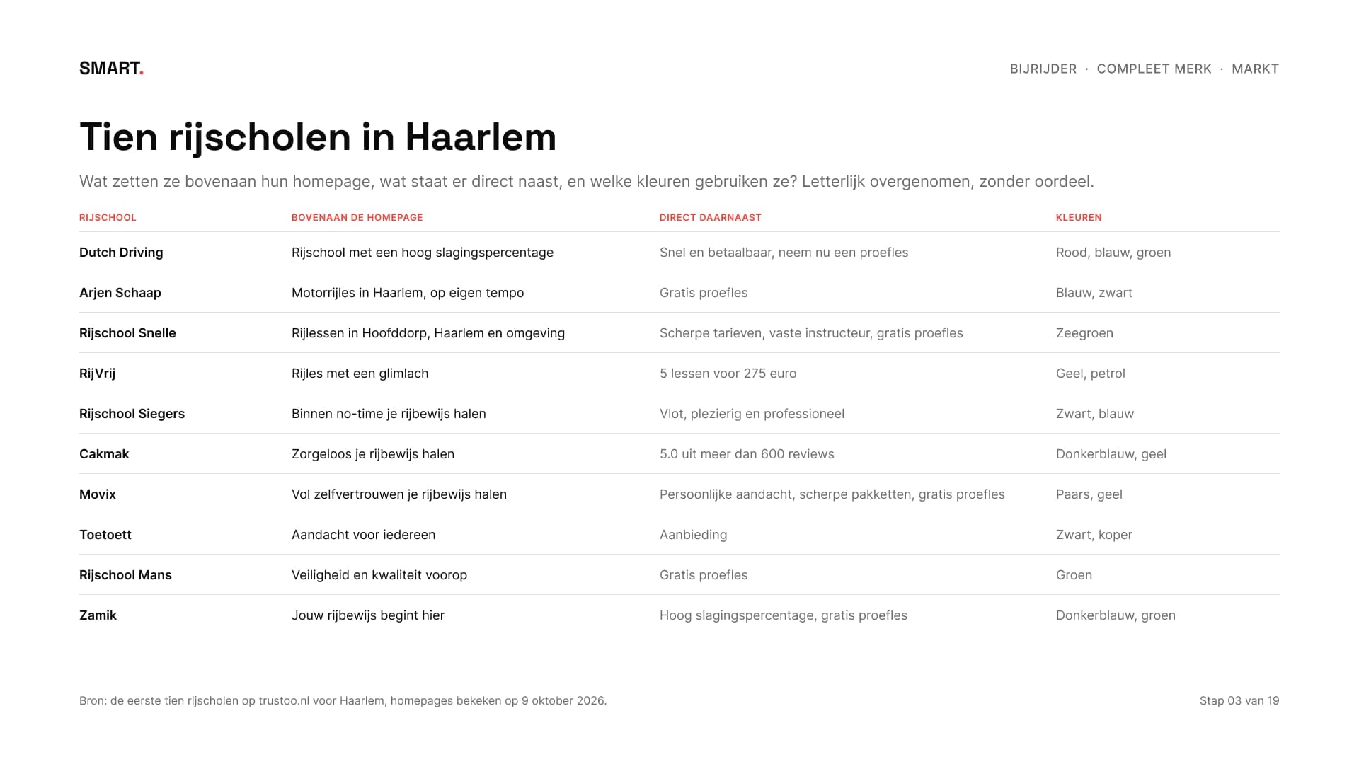
Ik keek naar de eerste tien rijscholen op Trustoo voor Haarlem, op 9 oktober 2026. Zes beloven een gratis proefles, vijf werven met een prijs of actie en vijf met rust, aandacht of vertrouwen. Blauw is de vaakste kleur, bij zes van de tien, en vier laten een lachende jonge bestuurder met een sleutel of een L-bord zien.
I looked at the first ten driving schools on Trustoo for Haarlem, on 9 October 2026. Six promise a free trial lesson, five advertise a price or deal and five calm, attention or trust. Blue is the most common colour, at six of the ten, and four show a smiling young driver with a key or an L-plate.
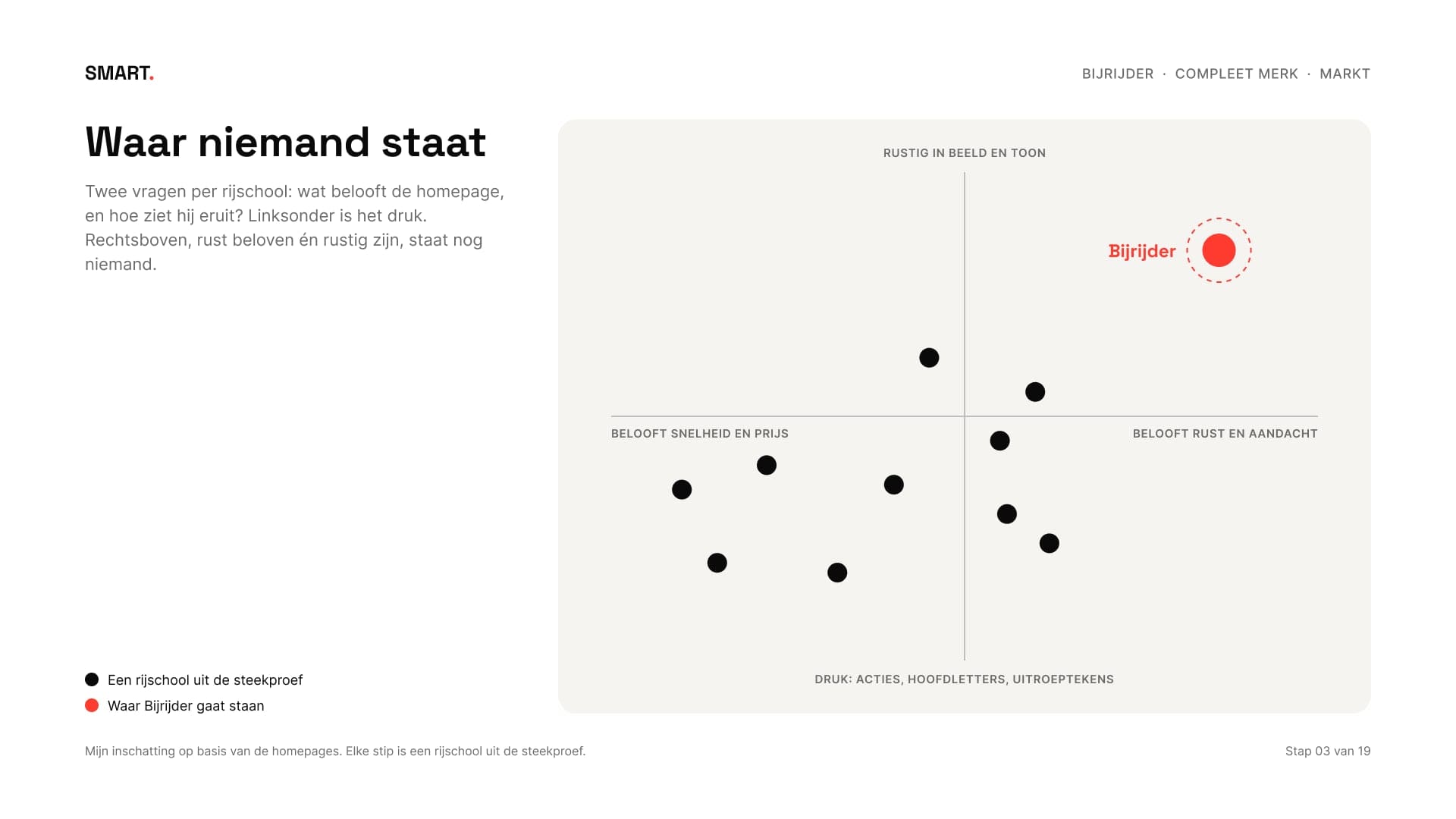
Rust is dus niet nieuw. Wat ontbreekt is een rijschool die er ook rustig uitziet en zo klinkt. Daar ligt de plek voor Bijrijder: de rijschool zonder druk.
So calm isn't new. What's missing is a driving school that also looks and sounds calm. That's Bijrijder's place: the driving school without pressure.
04Klantreis en interviewsCustomer journey and interviews
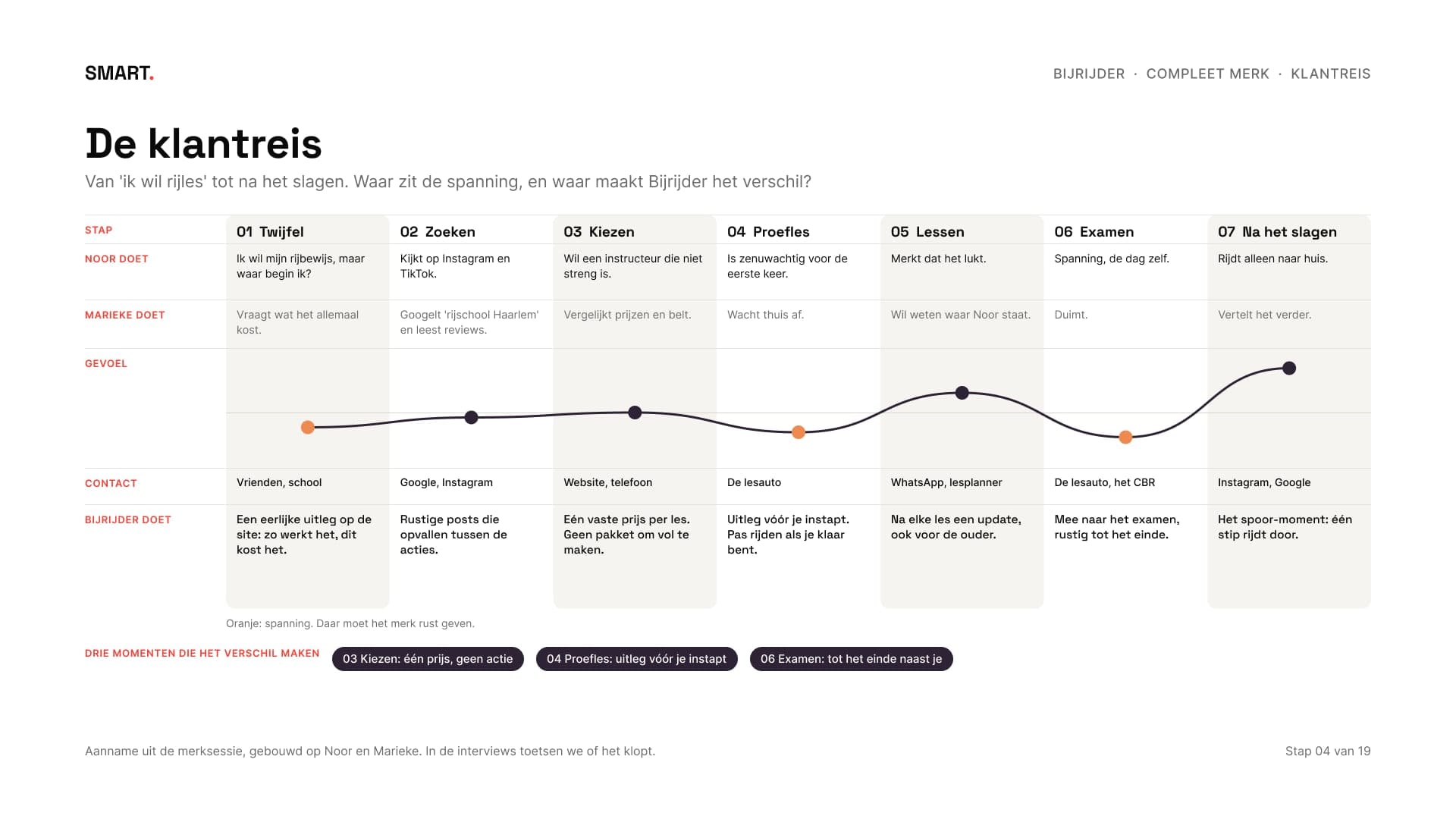
Een compleet merk kijkt verder dan het logo. De klantreis loopt van 'ik wil rijles' tot na het slagen, met per stap wat Noor en Marieke doen, waar ze spanning voelen en wat Bijrijder dan doet. Drie momenten maken het verschil: kiezen, de proefles en het examen.
A complete brand looks beyond the logo. The customer journey runs from 'I want driving lessons' to after passing, with what Noor and Marieke do at each step, where they feel tension and what Bijrijder does then. Three moments make the difference: choosing, the trial lesson and the exam.
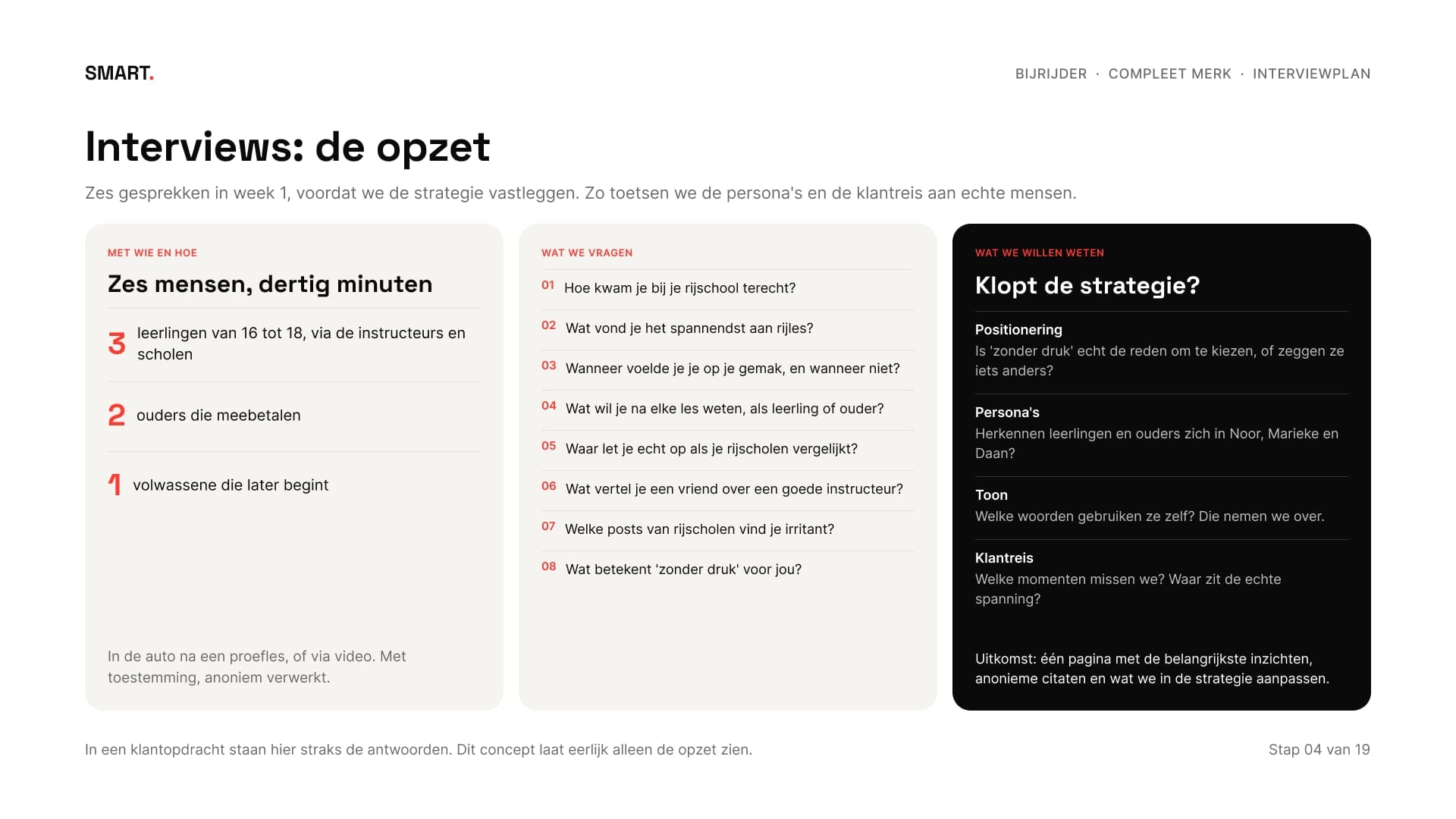
Die reis is een aanname uit de merksessie. Daarom staat er een interviewplan naast: zes gesprekken van dertig minuten met leerlingen, ouders en een late starter, met de vragen en wat we ermee willen weten. Bij een echte klant voer ik die gesprekken in week 1. In dit concept laat ik eerlijk alleen de opzet zien.
That journey is an assumption from the brand session. So there's an interview plan next to it: six thirty-minute conversations with students, parents and a late starter, with the questions and what we want to learn from them. With a real client I hold those conversations in week 1. In this concept I honestly show only the set-up.
05Verhaal, toon en taglineStory, tone and tagline
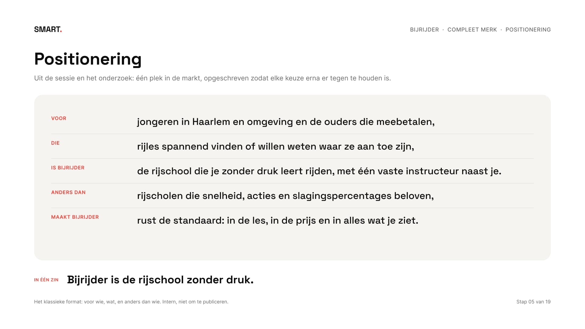
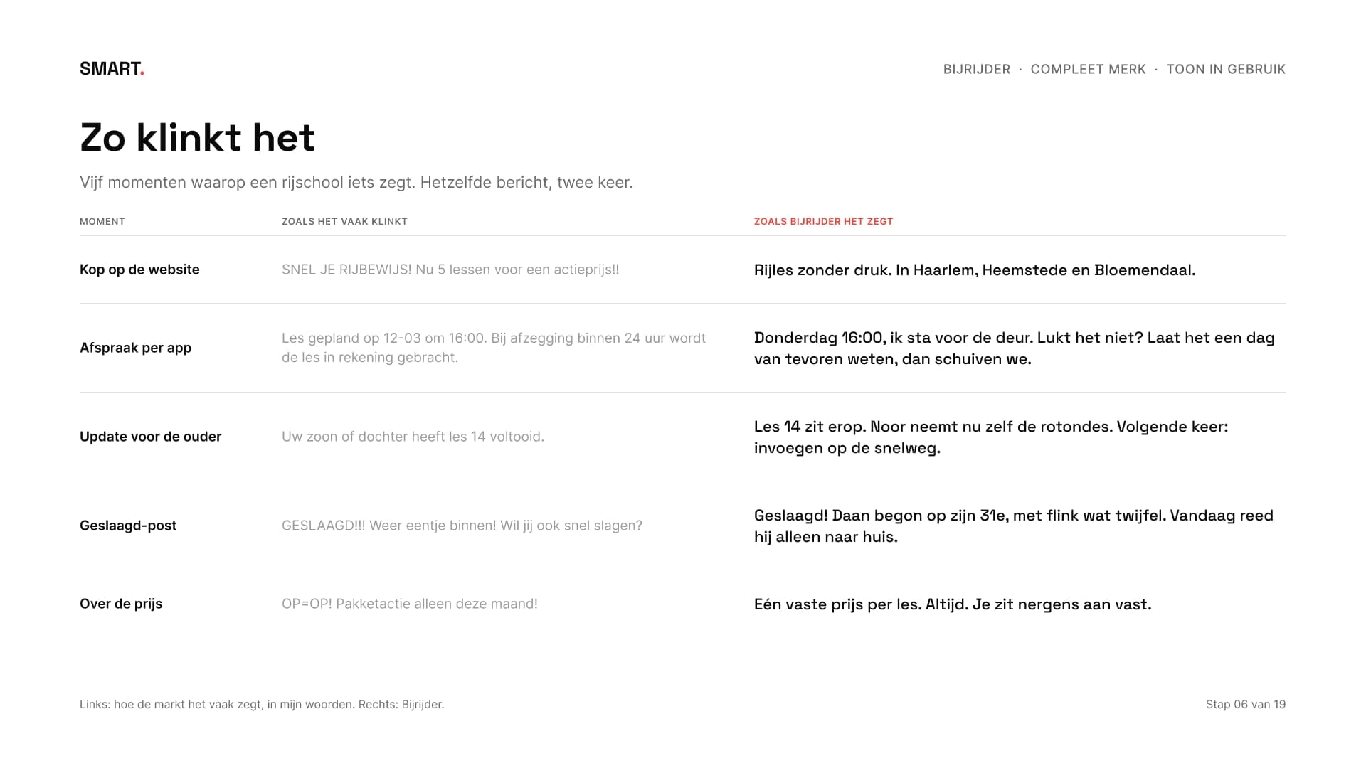
Uit de strategie kwamen een positionering, een merkverhaal en vier regels voor de toon: kalm maar niet saai, kort en duidelijk, eerlijk, en een glimlach maar nooit een grap ten koste van iemand. Elke regel staat er met een voorbeeld van hoe het wel en niet klinkt, zodat de instructeurs hun eigen appjes en posts ernaast kunnen leggen.
The strategy produced a positioning, a brand story and four rules for the tone: calm but not dull, short and clear, honest, and a smile but never a joke at someone's expense. Each rule has an example of how it does and doesn't sound, so the instructors can hold their own messages and posts up against it.
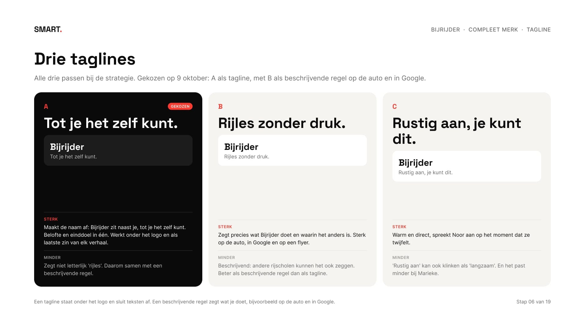
Van drie taglines werd het 'Tot je het zelf kunt.', met de beschrijvende regel 'Rijles zonder druk.' voor de lesauto, Google en flyers.
Out of three taglines it became 'Tot je het zelf kunt.' (until you can do it yourself), with the descriptor 'Rijles zonder druk.' (driving lessons without pressure) for the lesson car, Google and flyers.
06Van woorden naar beeldFrom words to images
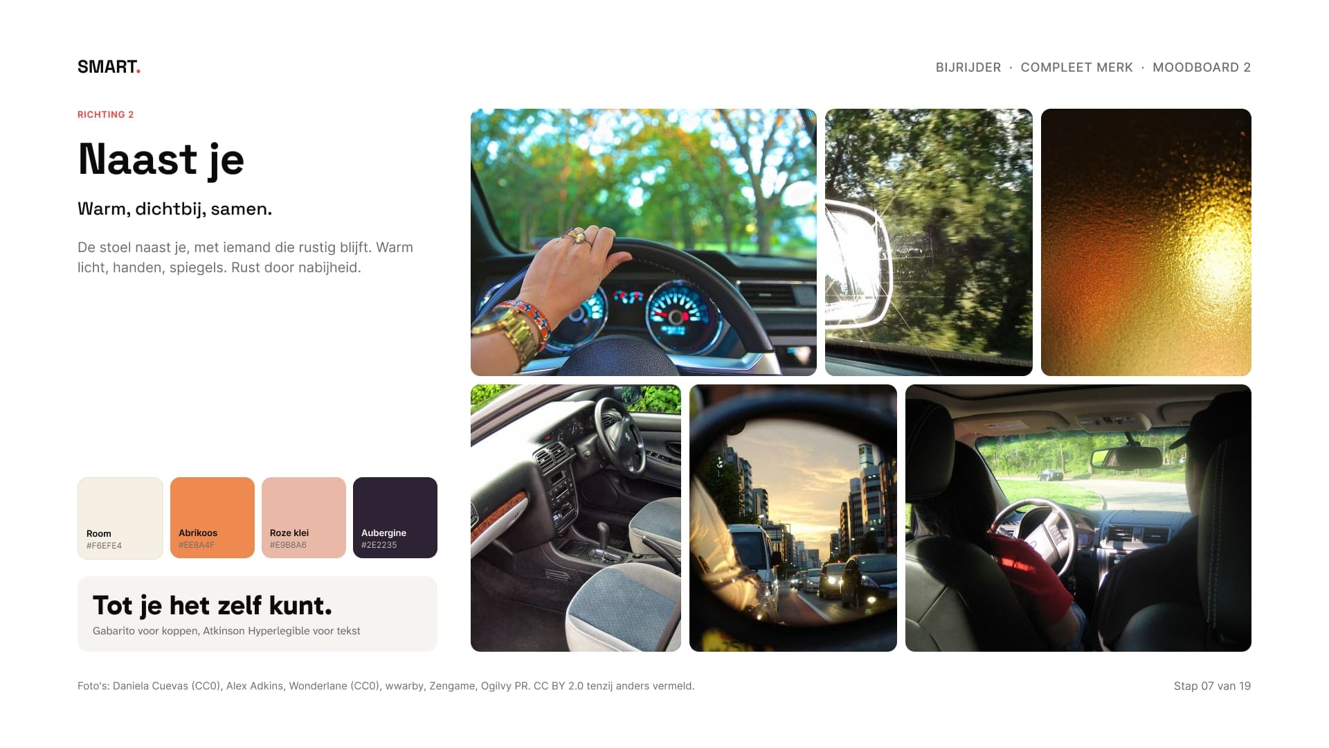
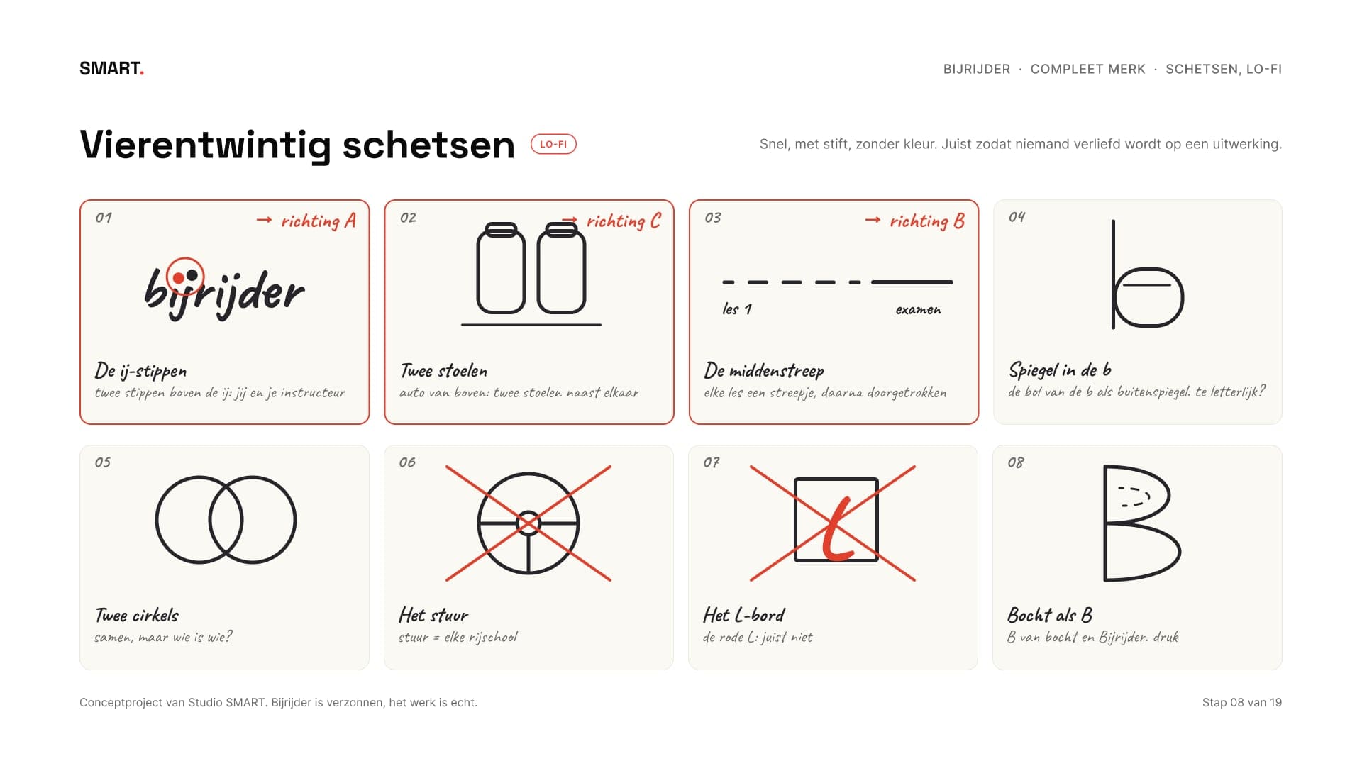
Pas na het akkoord op de strategie begon het beeld. Twee moodboards vertaalden de woorden: Ruimte, met nevel en salie, en Naast je, met room, abrikoos en aubergine. Daarna volgden vierentwintig schetsen met stift, lo-fi, van stoelen van boven tot een horizon en een praatwolk.
Only after the strategy was approved did the visuals start. Two moodboards translated the words: Space, with mist and sage, and Beside you, with cream, apricot and aubergine. Then came twenty-four marker sketches, lo-fi, from seats seen from above to a horizon and a speech bubble.
07Vijf richtingen, één testFive directions, one test
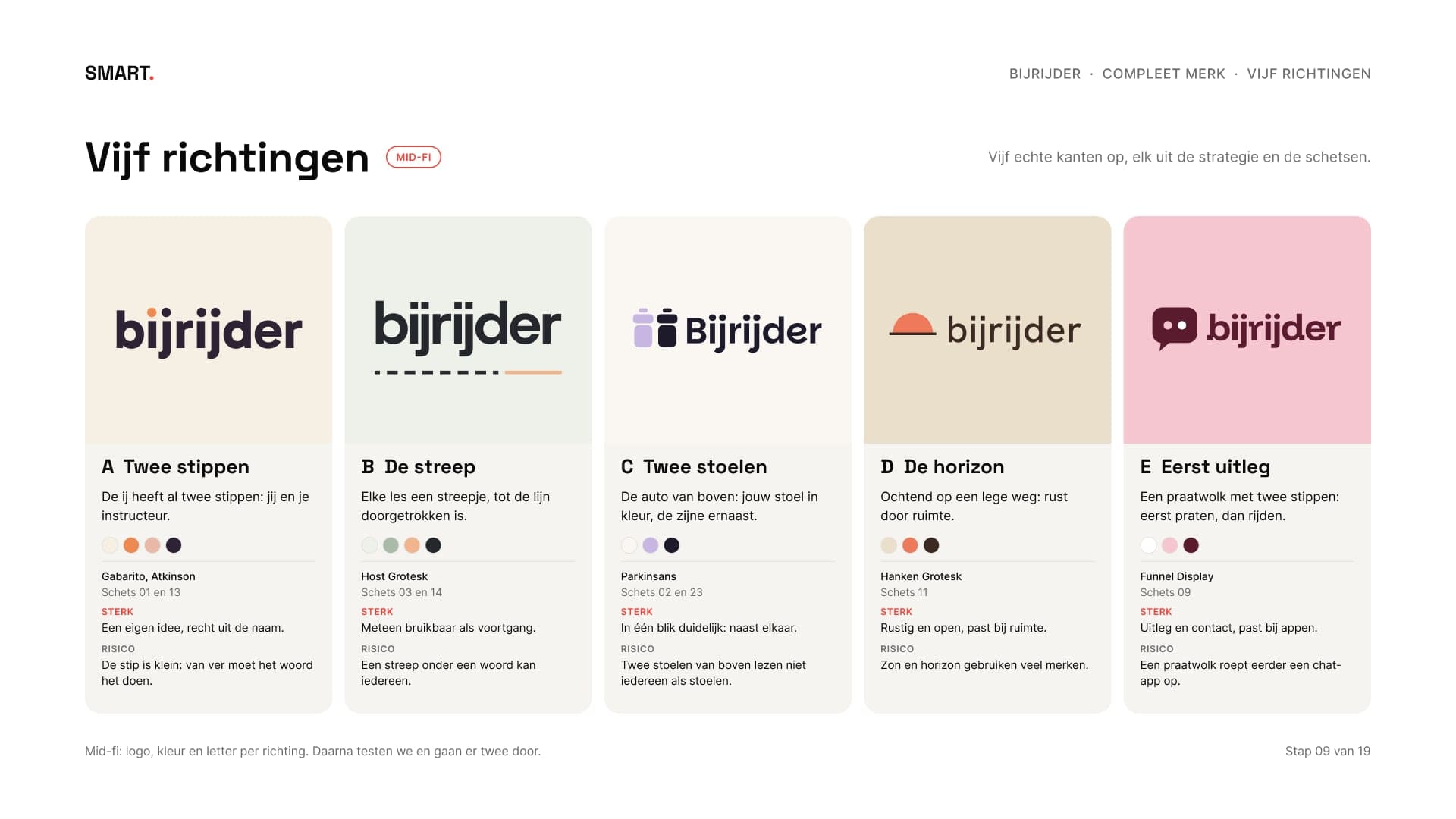
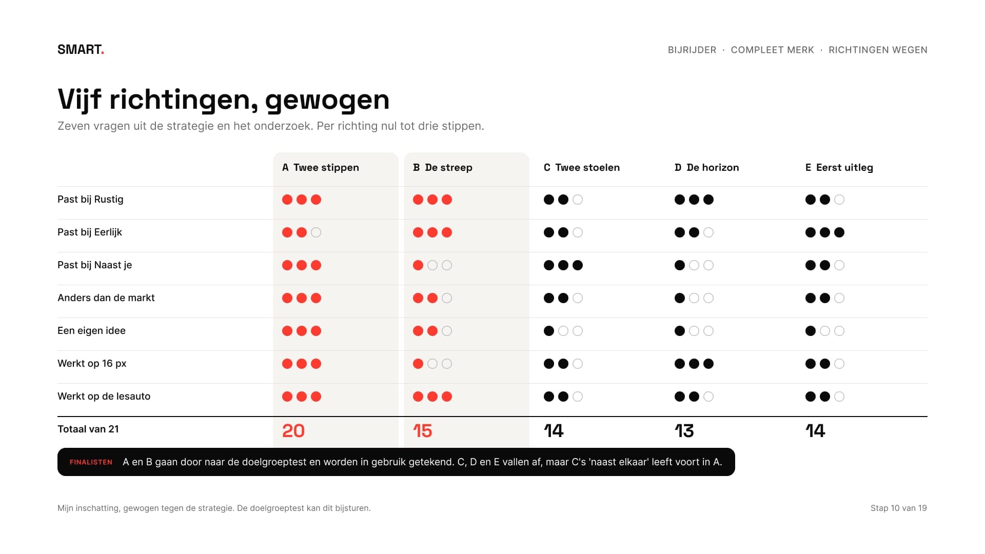
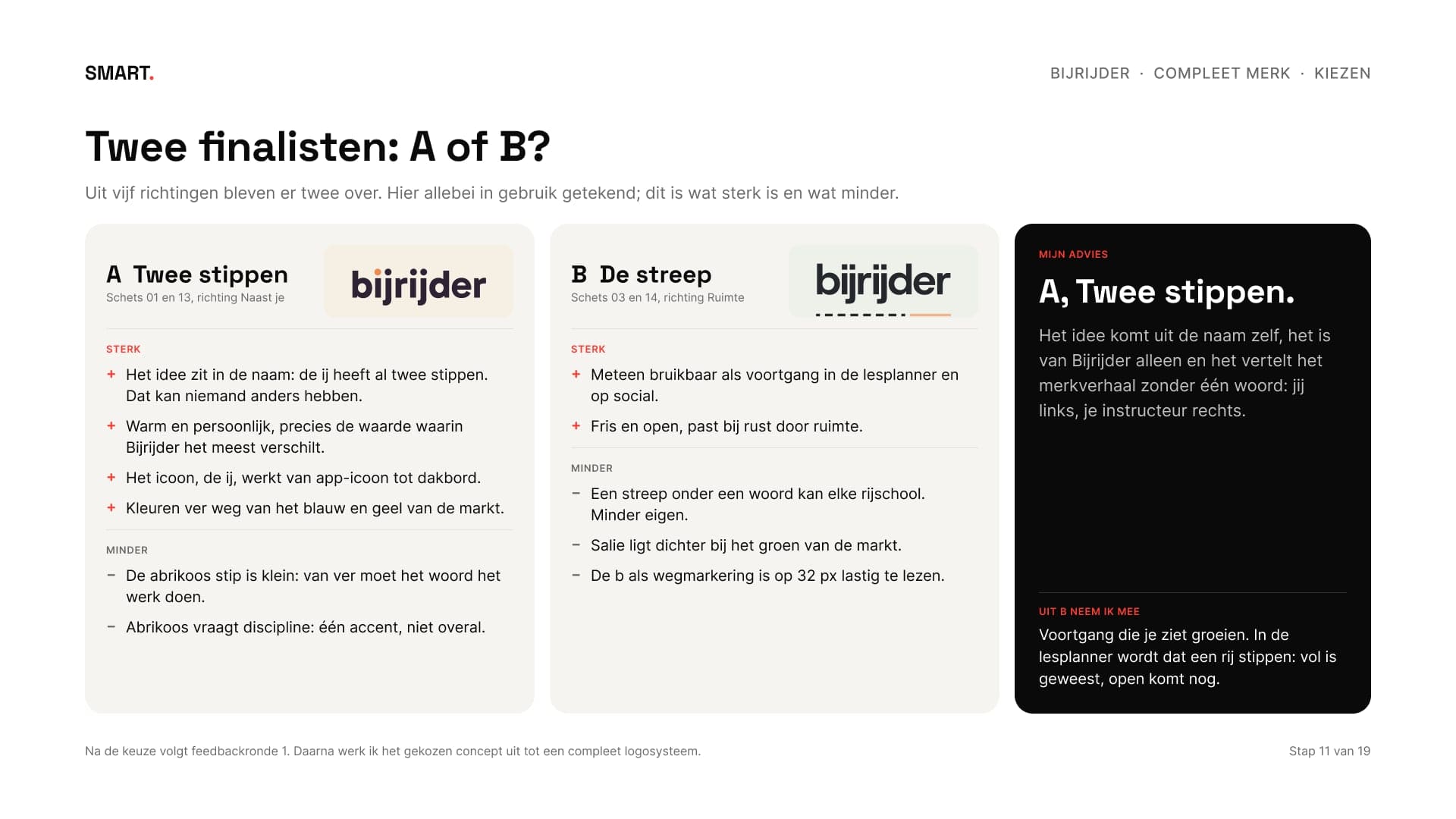
Uit de schetsen kwamen vijf richtingen, elk mid-fi met een logo, een kleur en een letter: twee stippen, de streep, twee stoelen, de horizon en eerst uitleg. Ik woog ze op zeven vragen uit de strategie, zoals past het bij rustig, is het anders dan de markt en werkt het op 16 pixels. Twee gingen door: A, twee stippen, en B, de streep.
The sketches led to five directions, each mid-fi with a logo, a colour and a typeface: two dots, the line, two seats, the horizon and explain first. I weighed them on seven questions from the strategy, such as does it fit calm, is it different from the market and does it work at 16 pixels. Two went on: A, two dots, and B, the line.
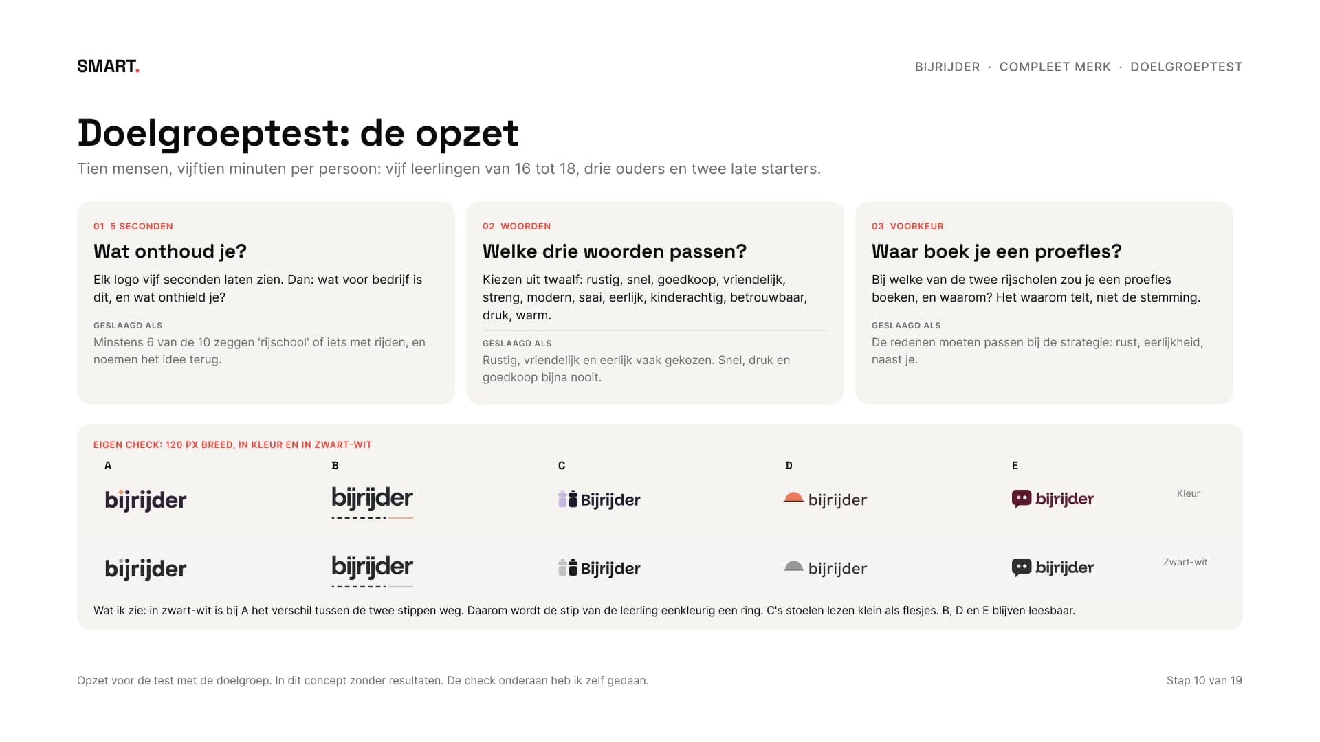
Daarna komt een doelgroeptest: tien mensen, een vijfsecondentest, een woordkeuze en een voorkeursvraag, met vooraf vastgelegd wanneer een richting slaagt. Ook hier toon ik in dit concept alleen de opzet. De check die ik zelf kon doen staat er wel bij: in zwart-wit viel bij A het verschil tussen de twee stippen weg, dus wordt de stip van de leerling eenkleurig een ring. Mijn advies was A, omdat het idee uit de naam zelf komt. Het werd A.
Then comes an audience test: ten people, a five-second test, a word choice and a preference question, with the pass criteria set in advance. Here too, this concept shows only the set-up. The check I could do myself is included: in black and white, A lost the difference between its two dots, so in one colour the student's dot becomes a ring. My advice was A, because the idea comes from the name itself. A it was.
08Het logoThe logo
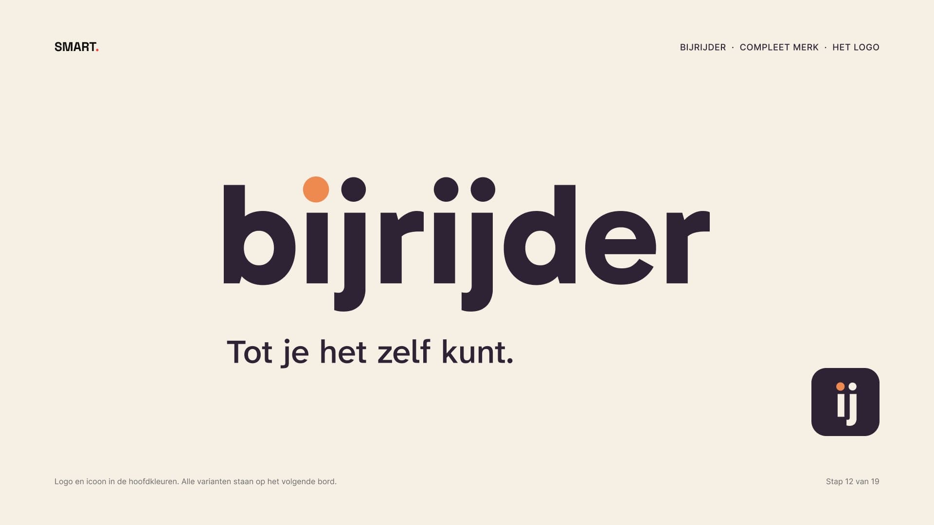
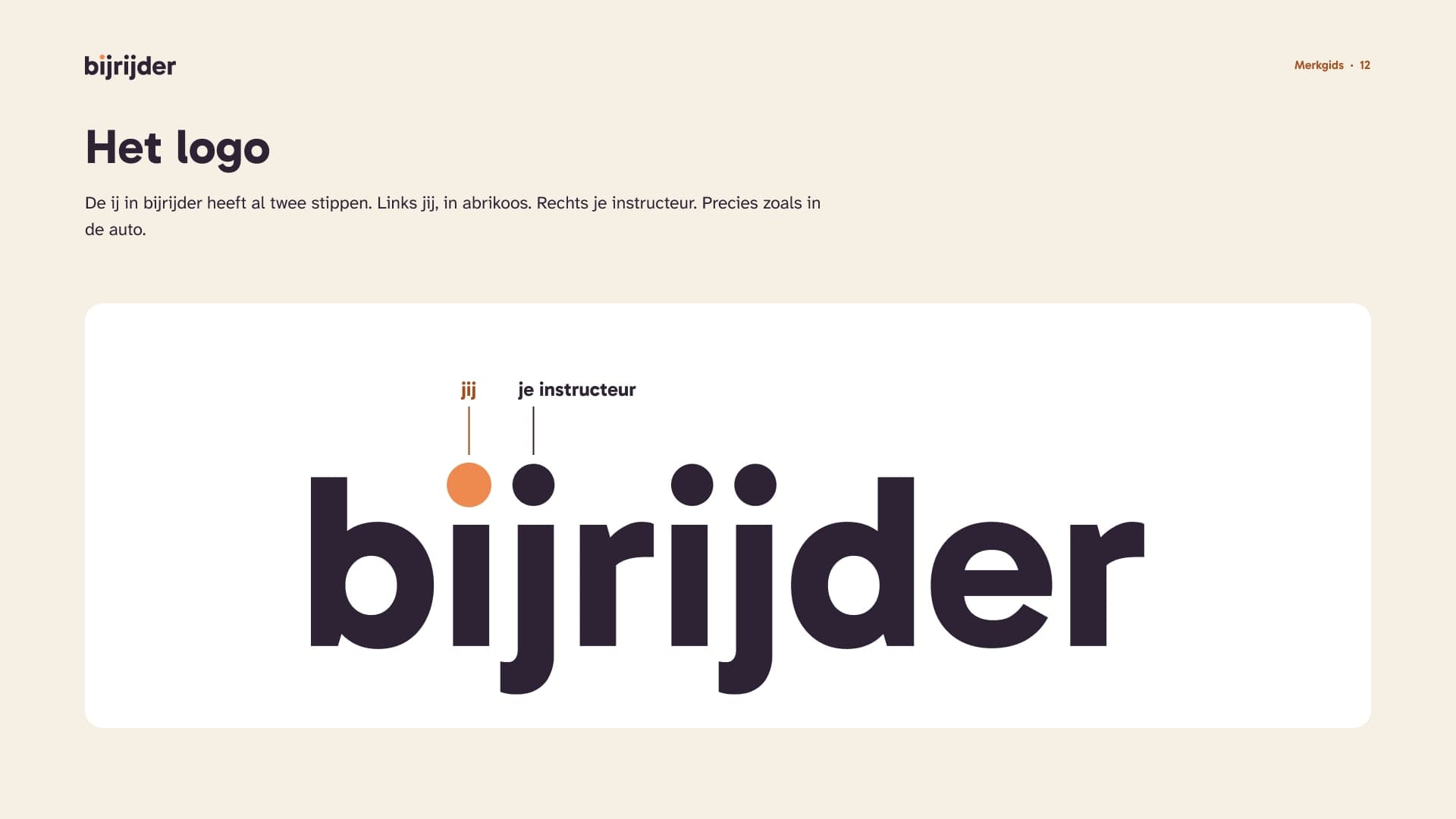
De ij in bijrijder heeft al twee stippen. In het logo is de linker de leerling, in abrikoos, en de rechter de instructeur. Het woord staat in Gabarito, de letters zijn omgezet naar vormen en de stip van de leerling is iets groter, zodat hij ook klein blijft opvallen.
The ij in bijrijder already has two dots. In the logo the left one is the student, in apricot, and the right one the instructor. The word is set in Gabarito, the letters are converted to shapes and the student's dot is slightly larger, so it still stands out when small.
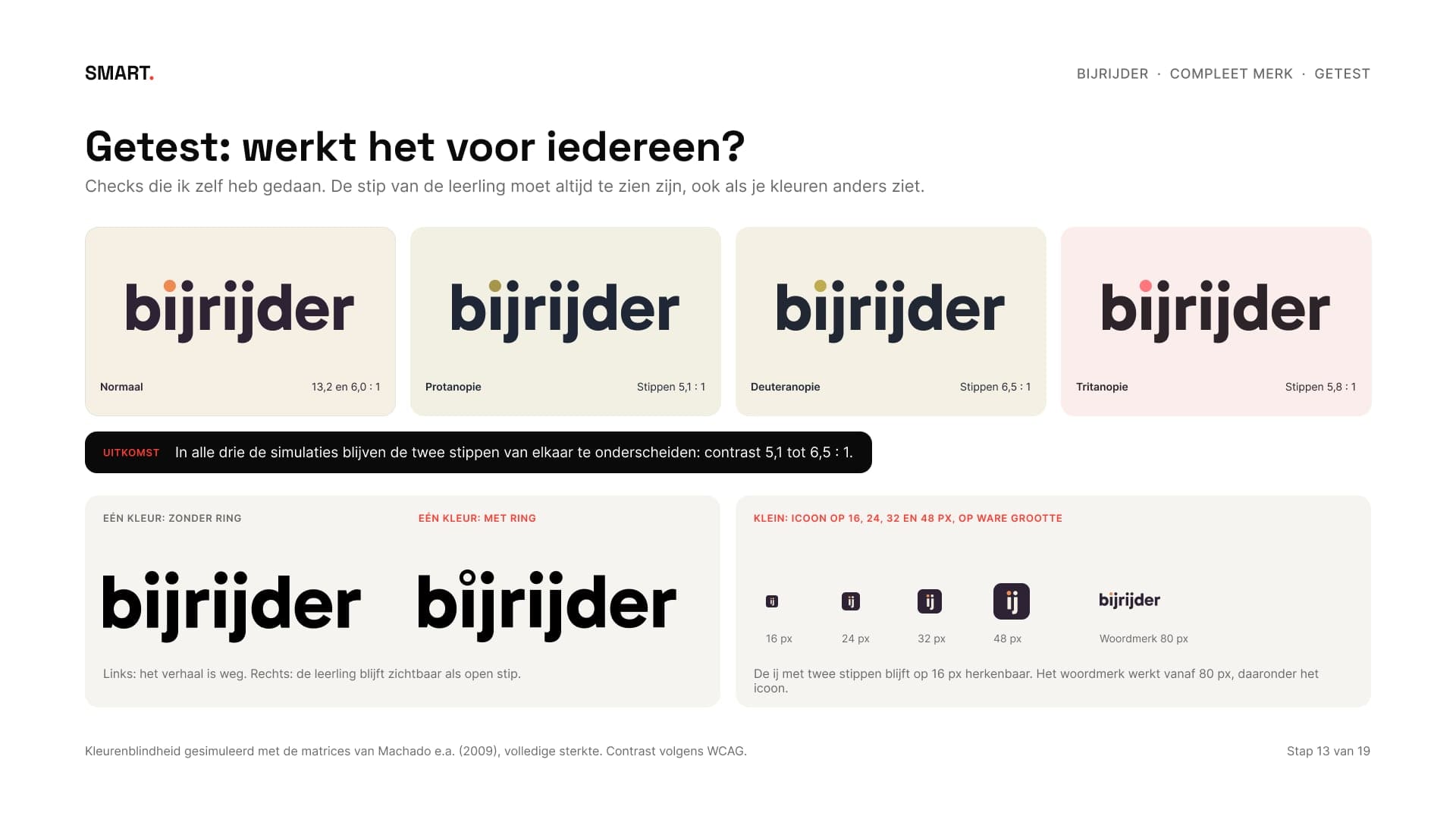
Ik testte het op een paar dingen die ik zelf kan nameten. In simulaties van drie soorten kleurenblindheid blijven de twee stippen te onderscheiden, met een contrast van 5,1 tot 6,5 : 1. Het icoon, de ij met twee stippen, is op 16 pixels nog herkenbaar; het woordmerk gebruik je vanaf 80 pixels.
I tested it on a few things I can measure myself. In simulations of three types of colour blindness the two dots stay distinguishable, with a contrast of 5.1 to 6.5:1. The icon, the ij with two dots, is still recognisable at 16 pixels; the wordmark is used from 80 pixels up.
09Kleur, letter en de stippenColour, type and the dots
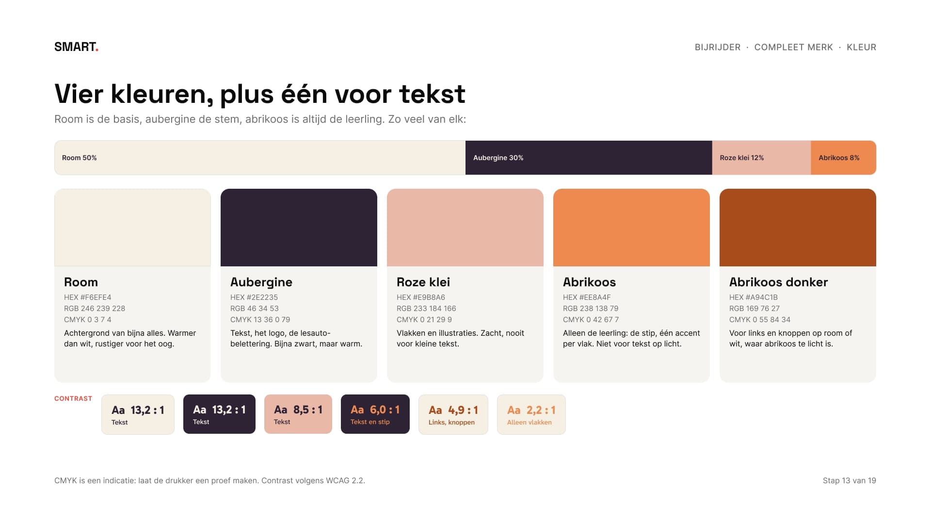
Room is de basis, aubergine de stem en abrikoos is altijd de leerling. Van elke combinatie is het contrast gemeten. Abrikoos op room haalt maar 2,2 : 1, dus is het alleen voor vlakken en de stip, en kwam er een donkere abrikoos bij voor links en knoppen: 4,9 : 1. Voor tekst koos ik Atkinson Hyperlegible Next van het Braille Institute, gemaakt zodat letters die op elkaar lijken uit elkaar te houden zijn. Wie zenuwachtig is, moet een tekst in één keer kunnen lezen.
Cream is the base, aubergine the voice and apricot is always the student. Every combination's contrast was measured. Apricot on cream only reaches 2.2:1, so it's only for areas and the dot, and a dark apricot was added for links and buttons: 4.9:1. For text I chose Atkinson Hyperlegible Next by the Braille Institute, designed so letters that look alike are easy to tell apart. Someone who's nervous should be able to read a text in one go.
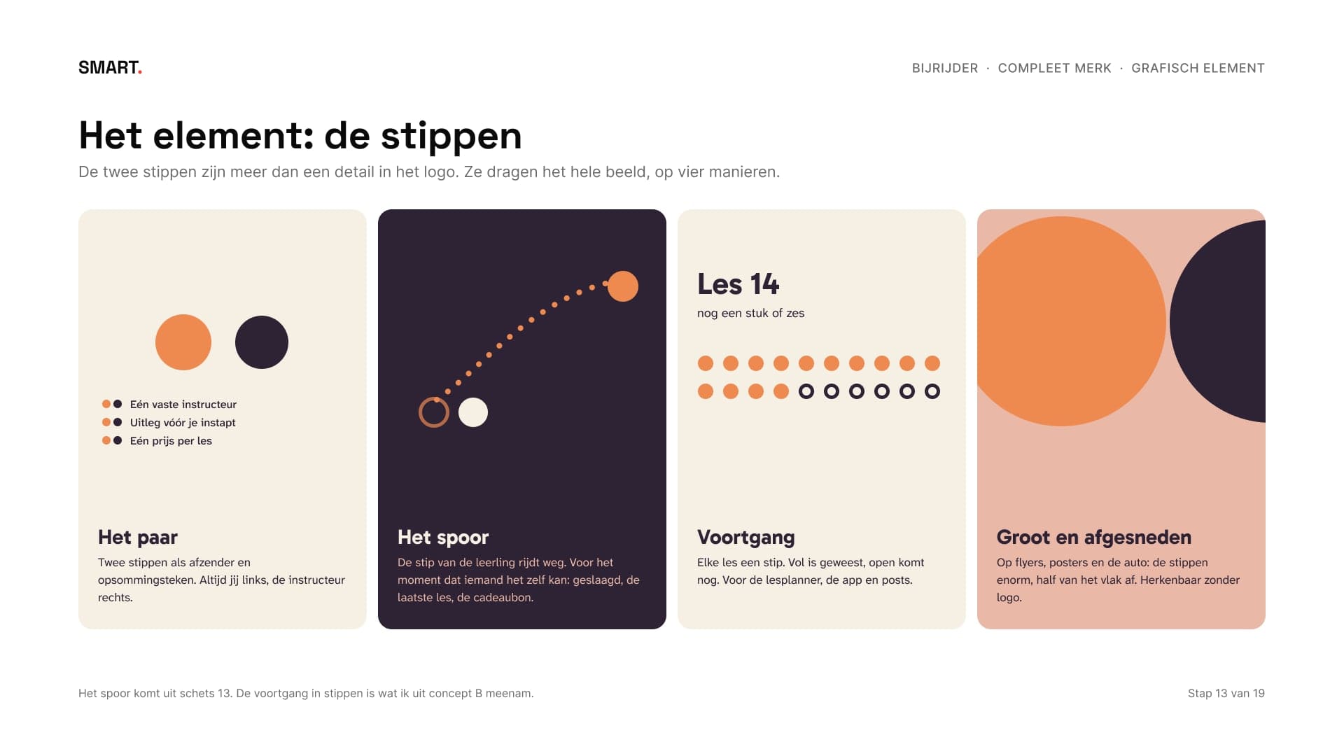
Het grafische element zijn de stippen: als paar, als spoor van iemand die het zelf kan, als voortgang van les tot les, en groot en afgesneden op flyers en de auto.
The graphic element is the dots: as a pair, as the trail of someone who can do it alone, as progress from lesson to lesson, and large and cropped on flyers and the car.
10BeeldtaalVisual language
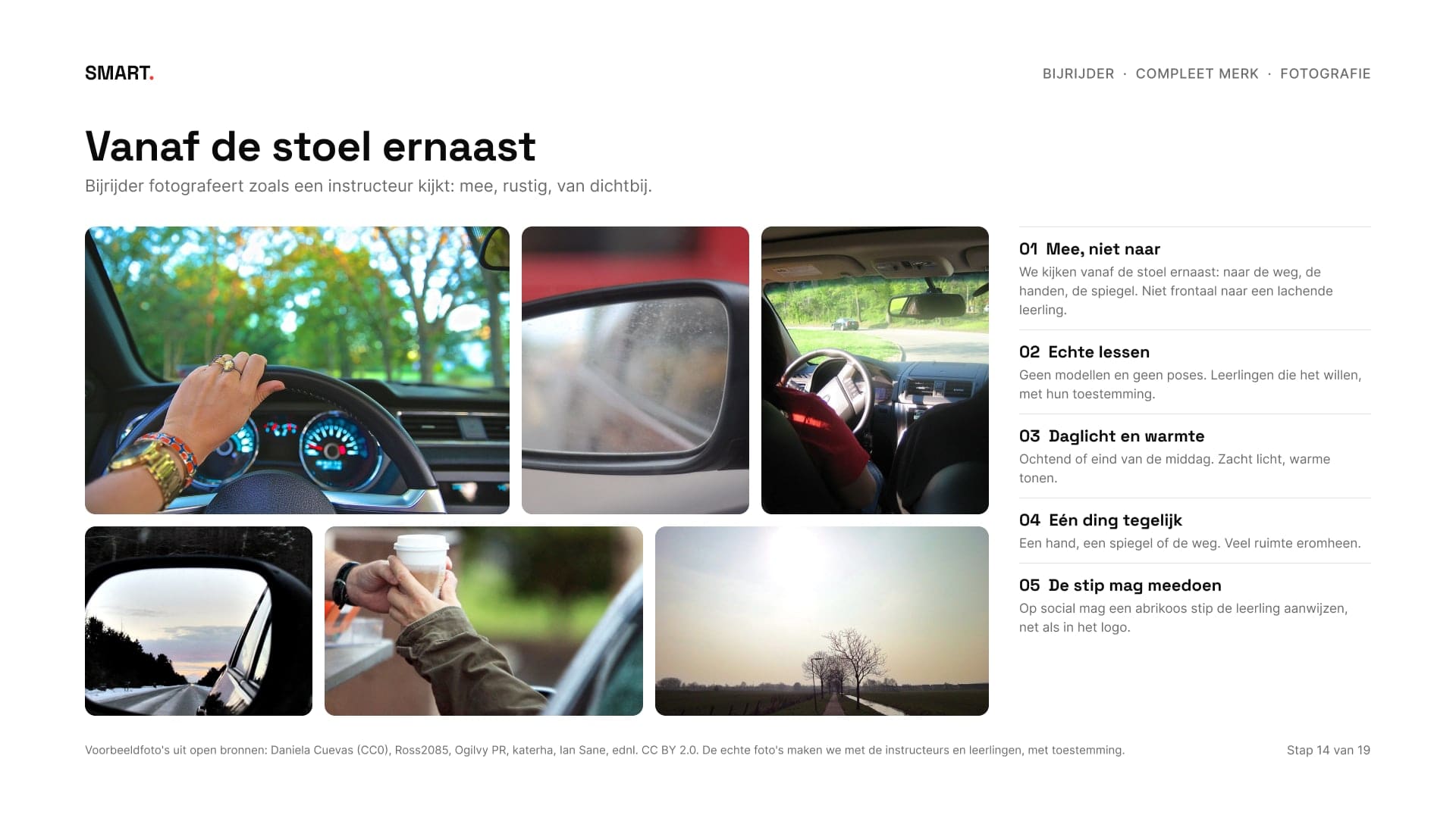
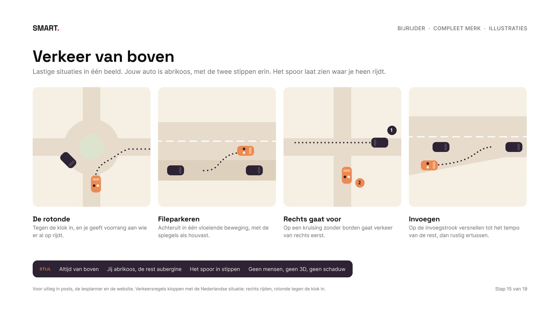
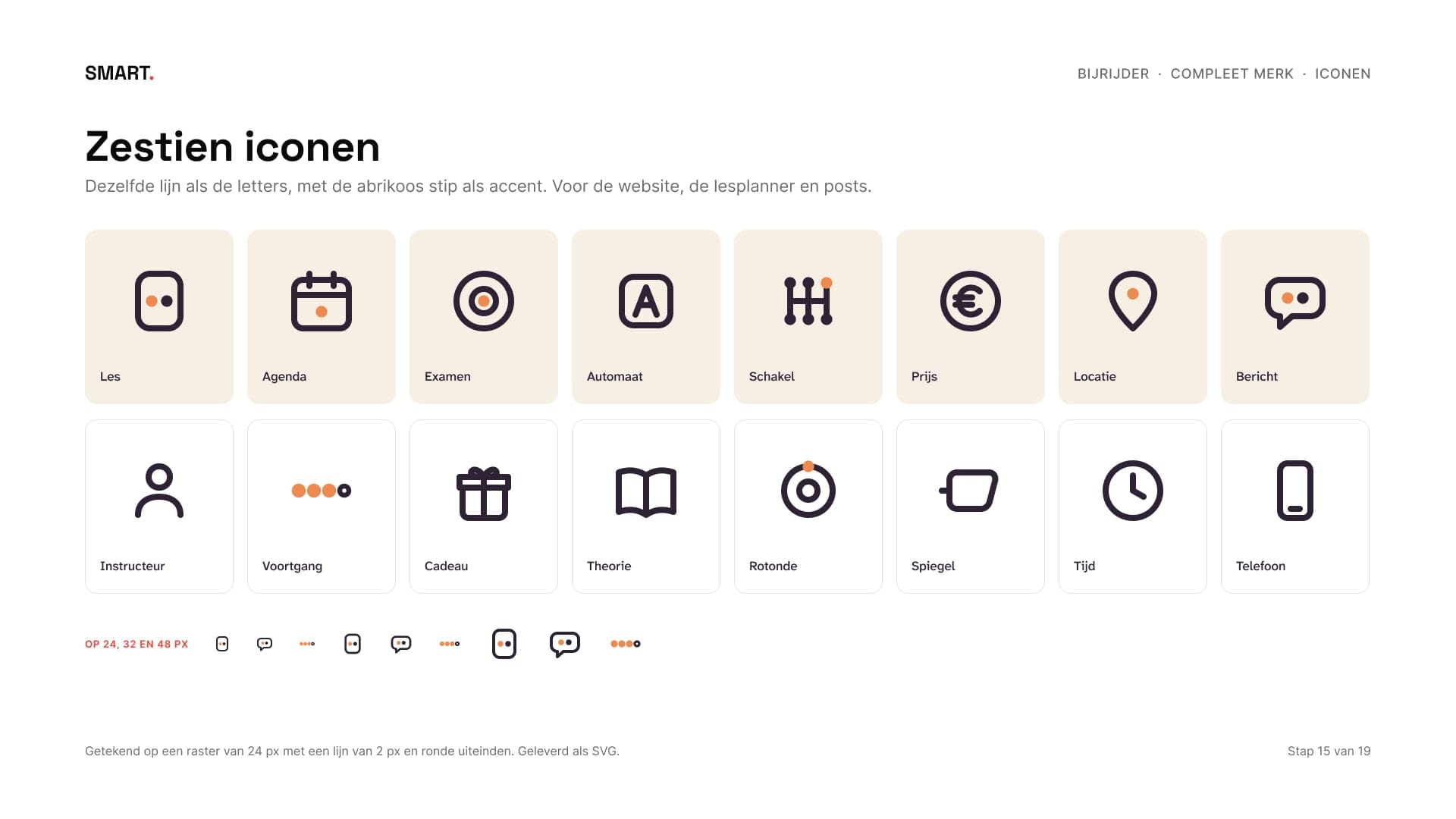
Bijrijder fotografeert zoals een instructeur kijkt: vanaf de stoel ernaast, rustig en van dichtbij. Er is een lijst met wat wel en niet, een bewerking en een shotlijst voor de eerste fotodag. De illustraties laten lastige situaties van boven zien, met jouw auto in abrikoos en het spoor in stippen, en de zestien iconen hebben dezelfde lijn als de letters.
Bijrijder photographs the way an instructor looks: from the seat beside you, calm and up close. There's a list of dos and don'ts, an edit and a shot list for the first photo day. The illustrations show tricky situations from above, with your car in apricot and the trail in dots, and the sixteen icons share the line of the typeface.
11Templates en toepassingenTemplates and applications
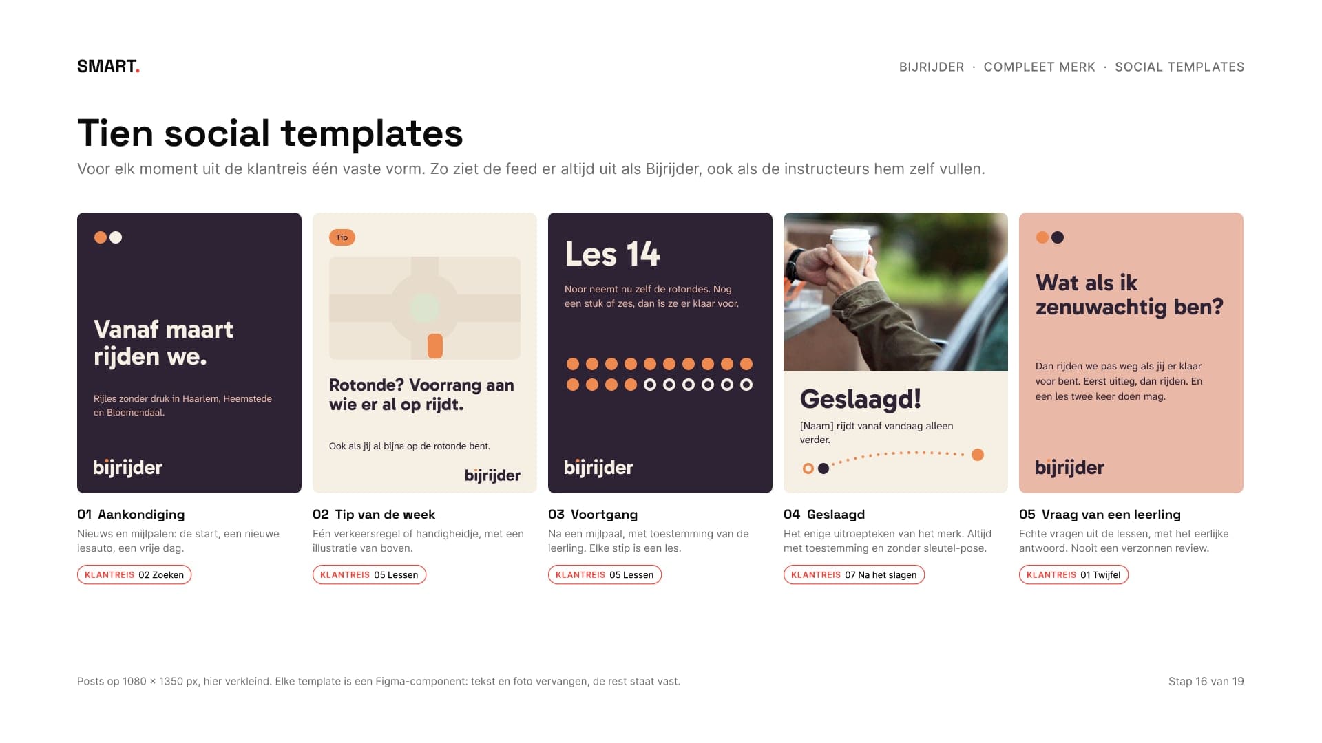
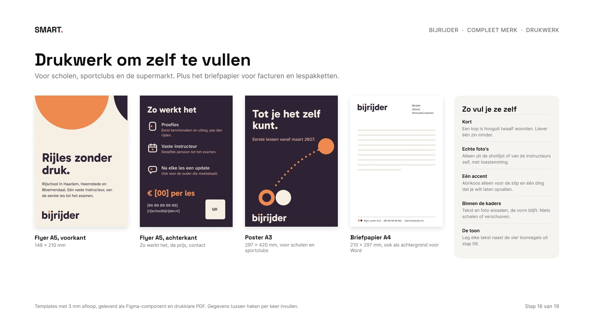
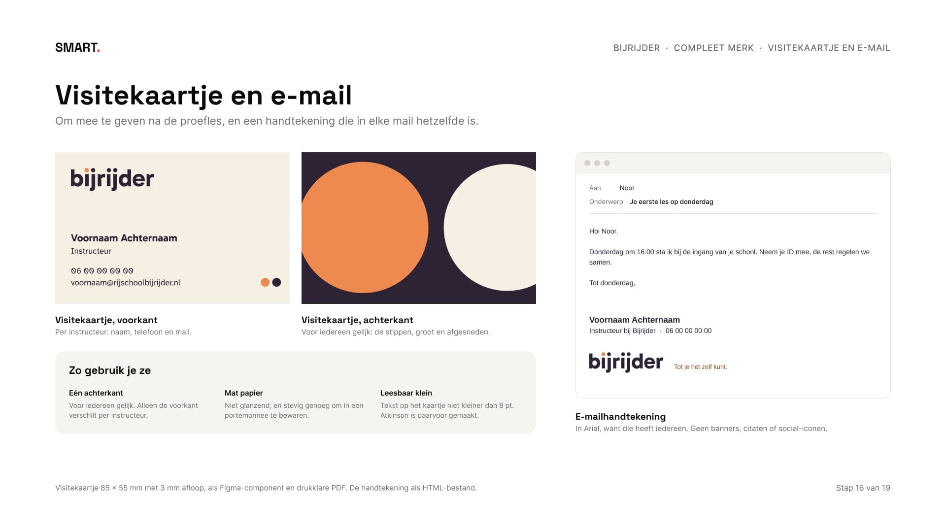
Een merk werkt pas als de klant het zelf kan gebruiken. Daarom zijn er tien social templates, één voor elk moment uit de klantreis, en drukwerk om zelf te vullen: een flyer, een poster en briefpapier. Net als bij Huisstijl horen er een visitekaartje, een e-mailhandtekening en profielfoto's bij.
A brand only works once the client can use it themselves. That's why there are ten social templates, one for each moment in the customer journey, and print to fill in yourself: a flyer, a poster and letterhead. As with Brand identity, a business card, an e-mail signature and profile pictures are included.
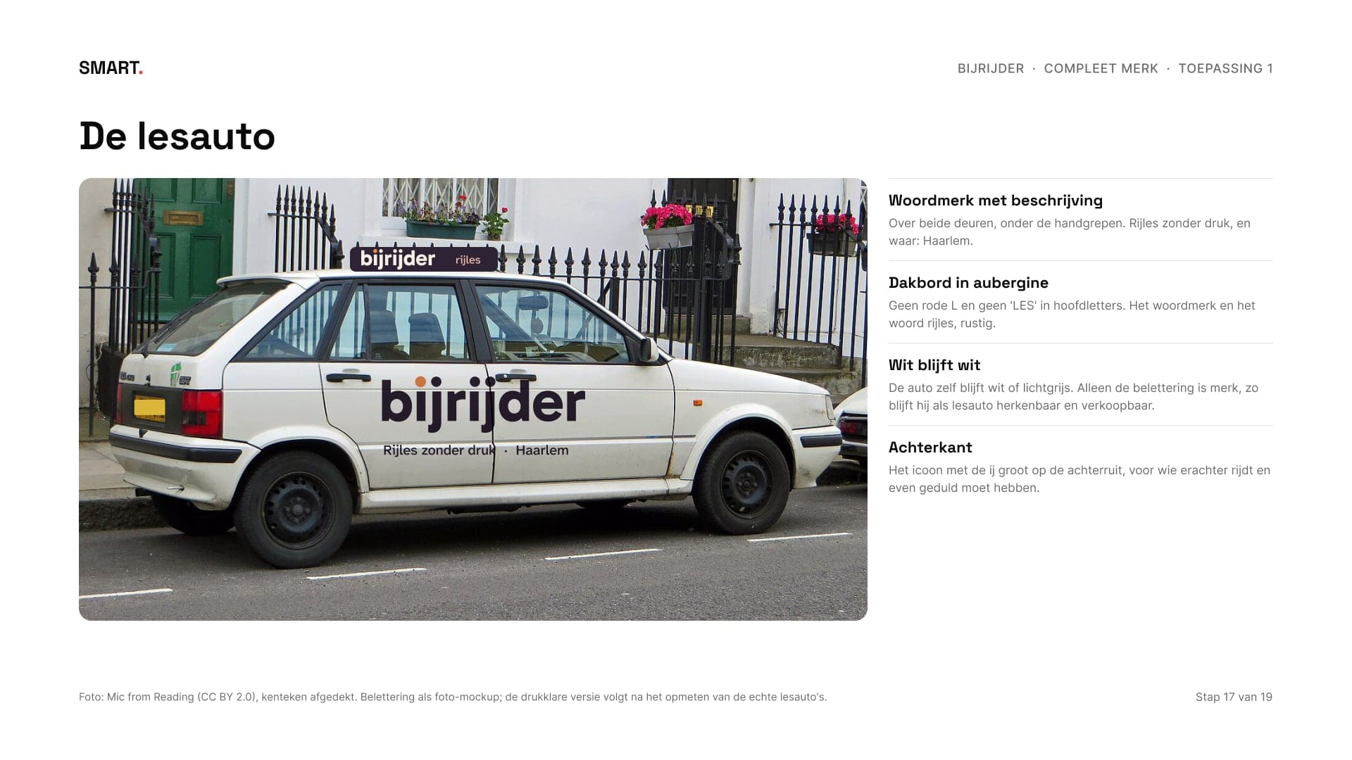
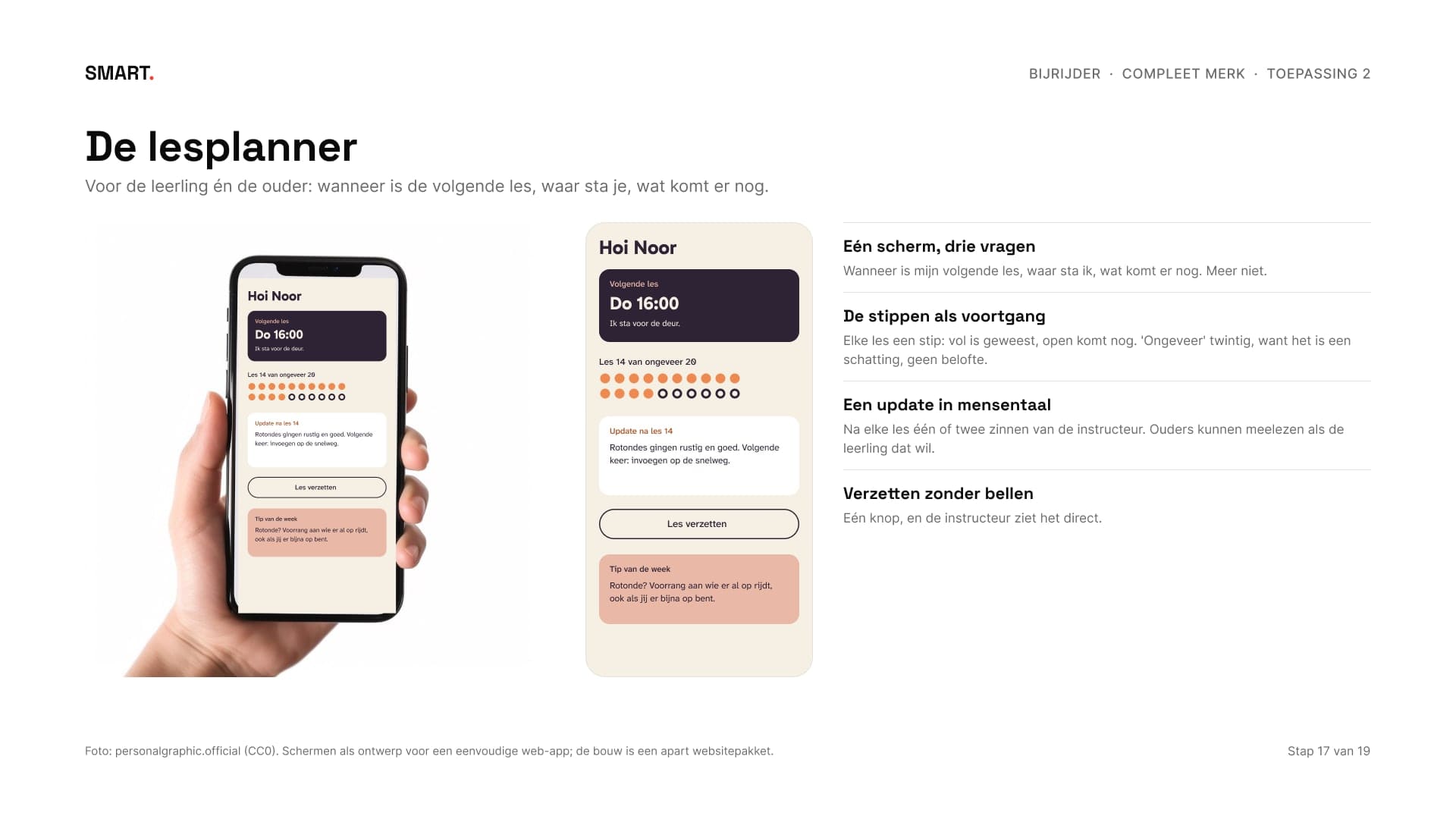
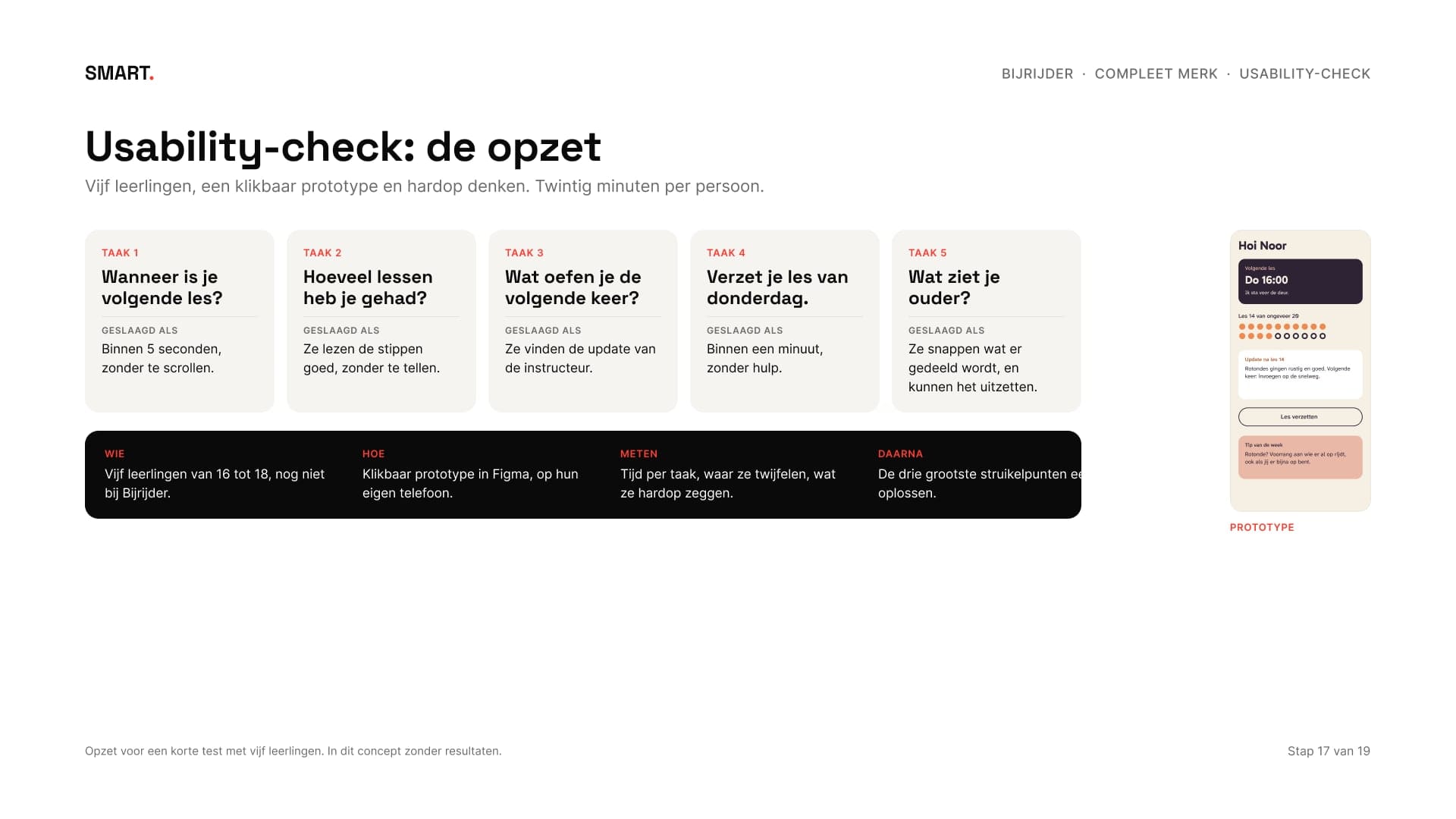
De toepassingen zijn hi-fi op echte foto's: de lesauto met het woordmerk op de deuren en een rustig dakbord zonder rode L, een lesplanner die drie vragen beantwoordt, kleding, een cadeaubon en een voortgangskaart. Voor de lesplanner staat er een usability-check klaar: vijf leerlingen, vijf taken en vooraf bepaald wanneer een taak gelukt is. Ook daar zonder verzonnen uitkomsten.
The applications are hi-fi on real photos: the lesson car with the wordmark on the doors and a calm roof sign without a red L, a lesson planner that answers three questions, clothing, a gift voucher and a progress card. For the lesson planner there's a usability check ready: five students, five tasks and success criteria set in advance. There too, without invented results.
12Lanceren en metenLaunching and measuring
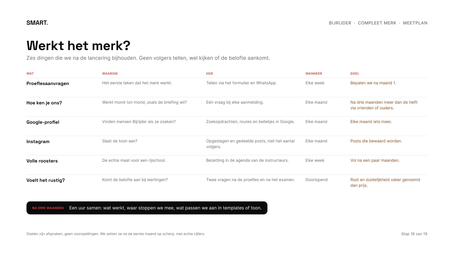
De lancering loopt van twee weken voor de eerste les tot vier weken erna, zonder aftellen en zonder openingsactie: zes posts, flyers bij scholen en sportclubs, de lesauto's met belettering en het Google-profiel. Daarna een meetplan van zes punten. Geen volgers tellen, wel kijken of de belofte aankomt: hoe nieuwe leerlingen Bijrijder vinden, of de roosters vollopen en of leerlingen rust vaker noemen dan prijs.
The launch runs from two weeks before the first lesson to four weeks after, with no countdown and no opening deal: six posts, flyers at schools and sports clubs, the lesson cars with lettering and the Google profile. Then a measuring plan of six points. Not counting followers, but checking whether the promise lands: how new students find Bijrijder, whether the schedules fill up and whether students mention calm more often than price.

13Merkgids en opleveringBrand guide and delivery
Alles staat in een merkgids van negenentwintig pagina's, in de stijl van Bijrijder zelf: waarom het merk bestaat, voor wie, hoe het praat, het logo en wat niet mag, kleur, contrast, letters, de stippen, beeld, alle toepassingen en welk bestand waarvoor.
Everything is in a twenty-nine-page brand guide, in Bijrijder's own style: why the brand exists, for whom, how it talks, the logo and what not to do, colour, contrast, type, the dots, imagery, every application and which file to use where.
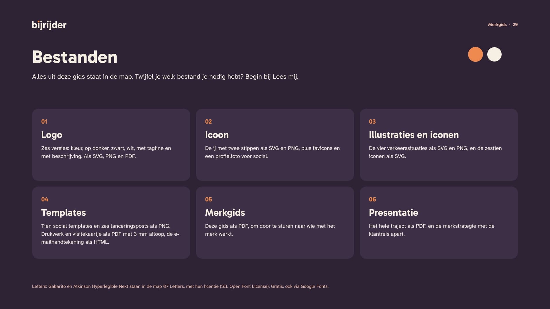
De oplevering is een map van negentig bestanden: zes logoversies in SVG, PNG en PDF, het icoon met favicons, illustraties en iconen, de templates, drukwerk met afloop, de e-mailhandtekening, de lanceringsposts met hun teksten, de merkgids, de merkstrategie, de presentatie van het hele traject en de twee letters met hun licentie.
The delivery is a folder of ninety files: six logo versions in SVG, PNG and PDF, the icon with favicons, illustrations and icons, the templates, print with bleed, the e-mail signature, the launch posts with their copy, the brand guide, the brand strategy, the presentation of the whole process and the two typefaces with their licence.
14ResultaatResult
Een merk dat op een lesauto, een appje en een favicon hetzelfde zegt: tot je het zelf kunt. Bijrijder bestaat niet, het merk en de bestanden wel. Zo ziet het pakket Compleet merk eruit: negentien stappen, van woorden via lo-fi schetsen en mid-fi richtingen naar een hi-fi merk dat klaar is voor de start. De foto van de lesauto is van Mic from Reading (CC BY 2.0, kenteken afgedekt), die van de telefoon van personalgraphic.official (CC0) en die van het shirt van ccnull.de Bilddatenbank (CC BY 2.0, ingekleurd). De moodboards en de fotografie gebruiken foto's van Openverse.
A brand that says the same thing on a lesson car, a text message and a favicon: until you can do it yourself. Bijrijder doesn't exist, the brand and the files do. This is what the Complete brand package looks like: nineteen steps, from words via lo-fi sketches and mid-fi directions to a hi-fi brand that's ready to go. The photo of the lesson car is by Mic from Reading (CC BY 2.0, number plate covered), the phone by personalgraphic.official (CC0) and the shirt by ccnull.de Bilddatenbank (CC BY 2.0, recoloured). The moodboards and photography use photos from Openverse.
Begin je een bedrijf en wil je eerst scherp hebben voor wie je er bent? In een gratis kennismaking kijken we wat jouw merk nodig heeft.
Starting a business and want to be clear first on who you're for? In a free intro call we look at what your brand needs.