
Conceptproject: bedrijfswebsiteConcept project: business website
Bijrijder website
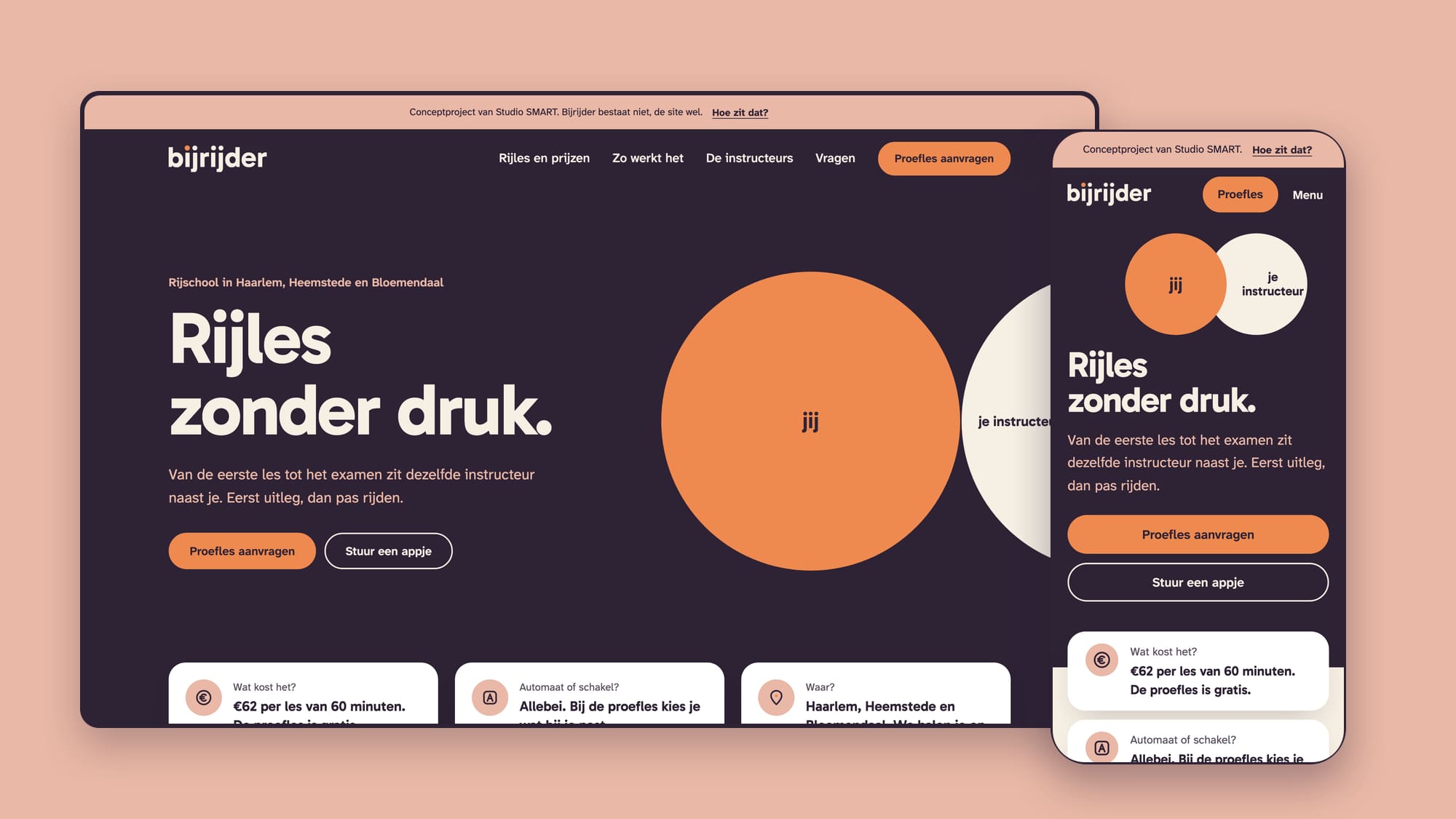
Bijrijder, de verzonnen rijschool uit het concept Compleet merk, krijgt een bedrijfswebsite: zes pagina's, één knop en beweging die iets uitlegt. Gemaakt zoals bij een echte klant, van onderzoek en wireframes tot de livegang.
Bijrijder, the made-up driving school from the Complete brand concept, gets a business website: six pages, one button and motion that explains something. Made the way I would for a real client, from research and wireframes to launch.
In het kortIn short
- VraagQuestion
- Een bedrijfswebsite voor Bijrijder, de verzonnen rijschool uit het concept Compleet merk, waarop elke pagina één vraag van leerlingen en ouders beantwoordt, te beginnen bij de prijs.A business website for Bijrijder, the made-up driving school from the Complete brand concept, where every page answers one question from learners and parents, starting with the price.
- AanpakApproach
- Tien rijschoolsites nagemeten, zes pagina's met elk één zoekwoord, lo-fi en mid-fi, en twee hi-fi rondes waarin het merk zelf het beeld werd.Ten driving school sites measured, six pages with one keyword each, lo-fi and mid-fi, and two hi-fi rounds in which the brand itself became the visual.
- ResultaatResult
- Live als demo. Op de telefoon 100 voor snelheid, toegankelijkheid en best practices op alle zeven pagina's, met 87 tot 193 KB per pagina.Live as a demo. On the phone 100 for speed, accessibility and best practices on all seven pages, at 87 to 193 KB per page.
- PakketPackage
- BedrijfswebsiteBusiness website
01De opdrachtThe brief
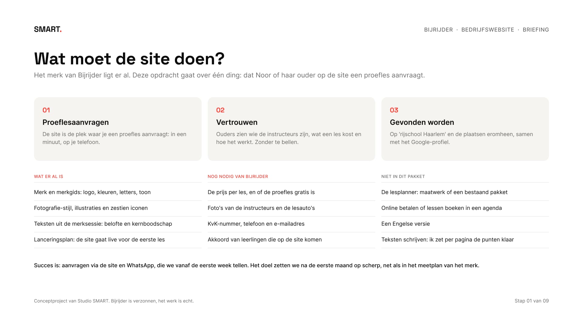
Het merk lag er al. In het concept Compleet merk bedacht ik Bijrijder: een rijschool in Haarlem met twee instructeurs, een logo met twee stippen en de belofte rijles zonder druk. Nu krijgt die rijschool een website, met één doel: dat Noor van 17, of haar ouder, op de telefoon een proefles aanvraagt.
The brand was already there. In the Complete brand concept I made up Bijrijder: a driving school in Haarlem with two instructors, a logo with two dots and the promise of driving lessons without pressure. Now that school gets a website, with one goal: that Noor, 17, or her parent, requests a trial lesson on their phone.
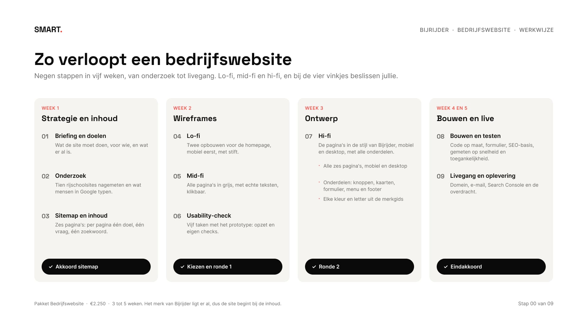
Bedrijfswebsite is het pakket voor tot zes pagina's, met een ontwerp op maat, een aanvraagformulier, de SEO-basis en hulp bij domein, e-mail en livegang. Dat zijn negen stappen in vijf weken, met lo-fi, mid-fi en hi-fi, en vier momenten waarop de klant beslist. De prijs koos ik voor dit concept zelf: €62 per les van zestig minuten, met een gratis proefles.
Business website is the package for up to six pages, with a custom design, a request form, the SEO basics and help with domain, e-mail and launch. That's nine steps in five weeks, with lo-fi, mid-fi and hi-fi, and four moments where the client decides. I chose the price for this concept myself: €62 per sixty-minute lesson, with a free trial lesson.
02Eerst metenMeasuring first
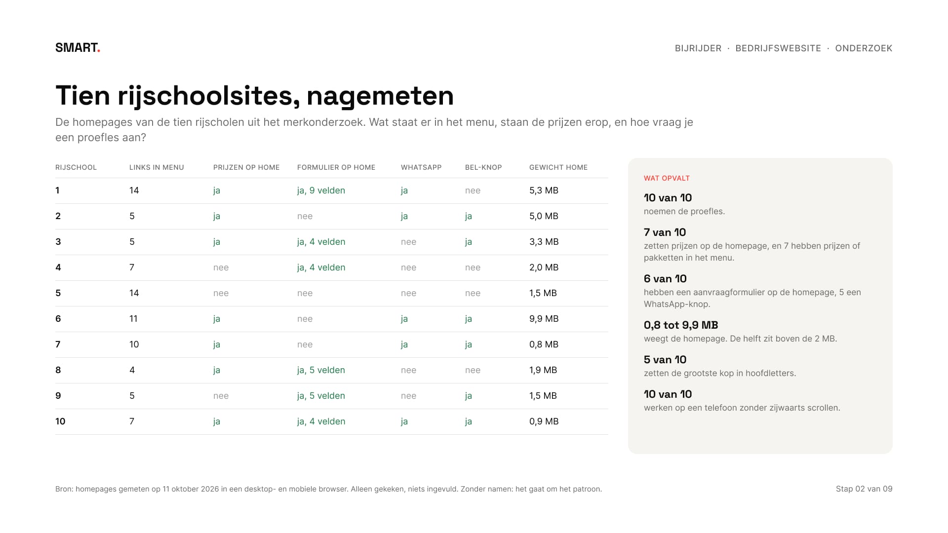
Ik mat de homepages van de tien rijscholen uit het merkonderzoek na, op 11 oktober 2026. Alle tien noemen de proefles, zeven zetten prijzen op de homepage en zes hebben daar een aanvraagformulier. De homepages wegen 0,8 tot 9,9 MB, en de helft zit boven de 2 MB.
I measured the homepages of the ten driving schools from the brand research, on 11 October 2026. All ten mention the trial lesson, seven put prices on the homepage and six have a request form there. The homepages weigh 0.8 to 9.9 MB, and half of them are over 2 MB.
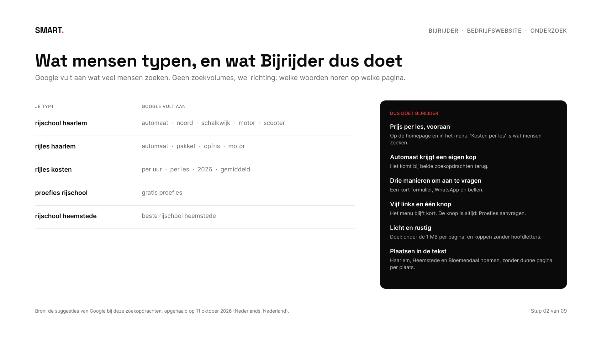
Wat mensen in Google typen, gaf de richting: na 'rijschool haarlem' komt 'automaat', en bij rijles gaat het vooral over de kosten per les. Daaruit volgden de regels voor de site: de prijs vooraan, automaat met een eigen kop, vijf links en één knop, en onder de 1 MB per pagina.
What people type into Google set the direction: after 'rijschool haarlem' comes 'automaat' (automatic), and for lessons it's mostly about the cost per lesson. That led to the rules for the site: the price up front, automatic with its own heading, five links and one button, and under 1 MB per page.
03Zes pagina's, één knopSix pages, one button
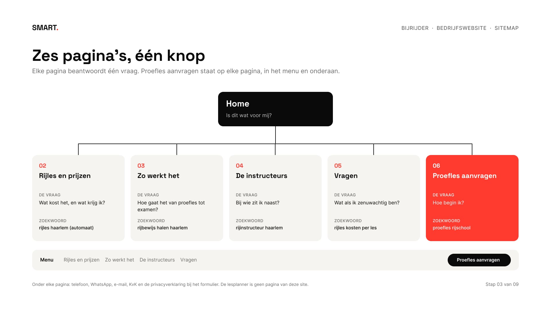
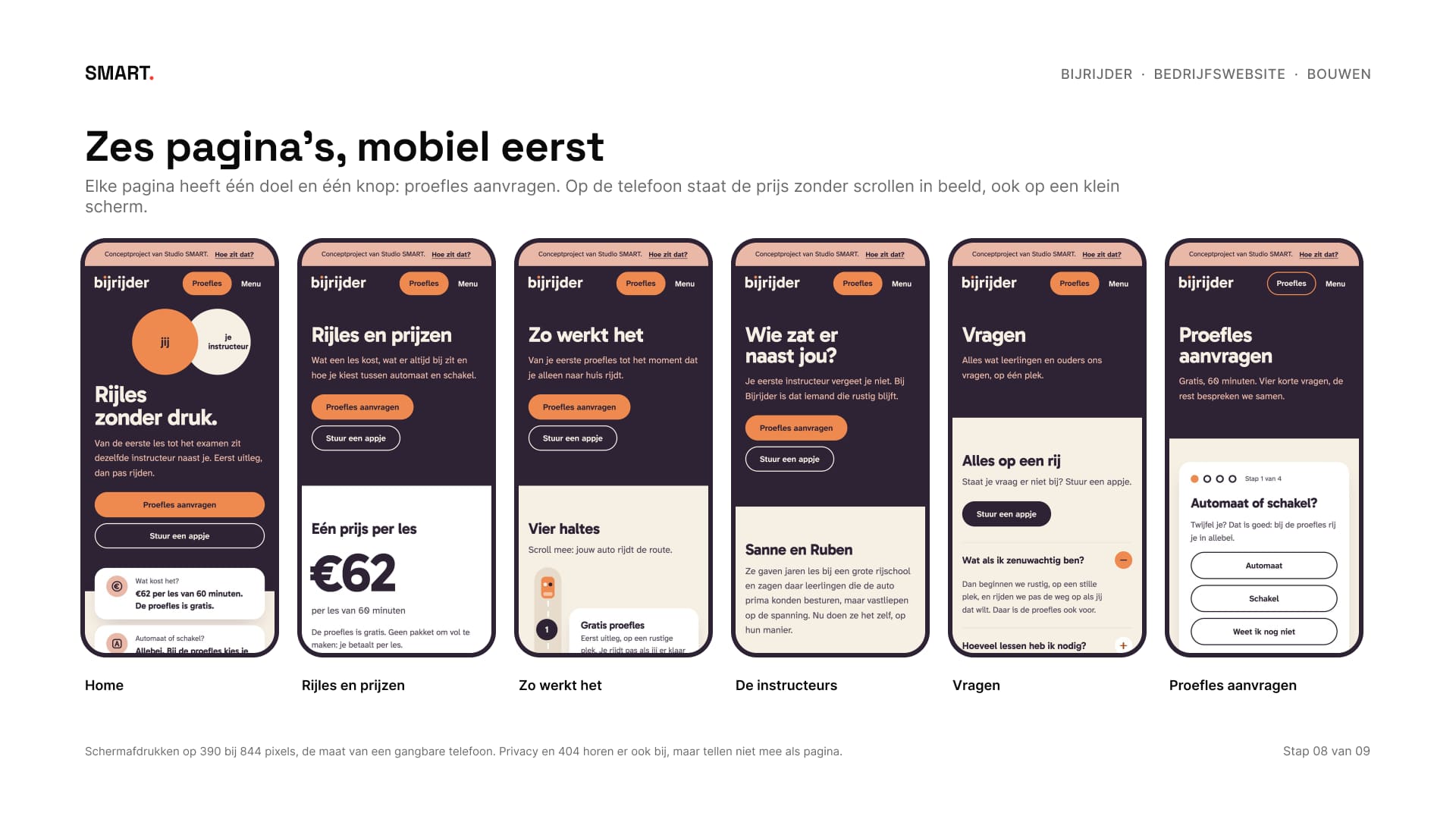
Elke pagina beantwoordt één vraag, met één zoekwoord: wat kost het, hoe gaat het van proefles tot examen, bij wie zit ik naast, en wat als ik zenuwachtig ben. Proefles aanvragen staat op elke pagina, in het menu en onderaan. Een lesplanner, online betalen en een Engelse versie horen niet bij dit pakket, en dat staat vooraf in de briefing.
Every page answers one question, with one search term: what does it cost, how does it go from trial lesson to exam, who sits next to me, and what if I'm nervous. Request a trial lesson is on every page, in the menu and at the bottom. A lesson planner, online payment and an English version aren't part of this package, and the brief says so up front.
04Lo-fi en mid-fiLo-fi and mid-fi
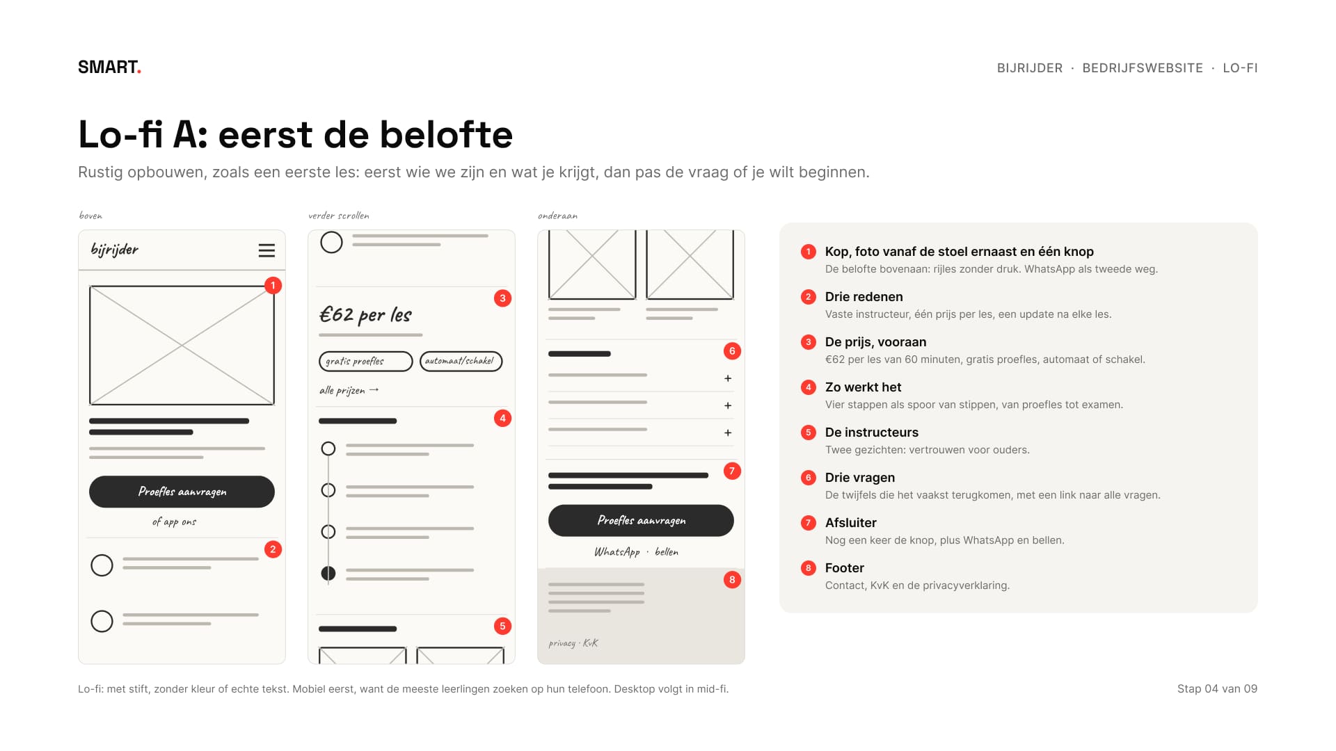
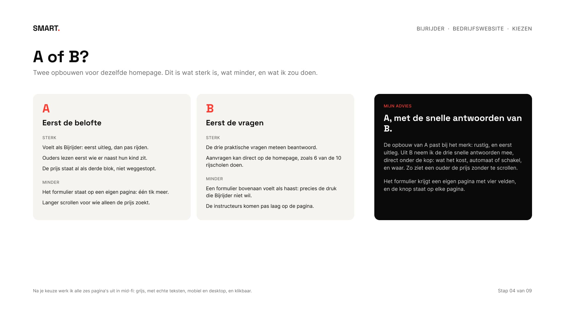
Met stift schetste ik twee opbouwen voor de homepage, mobiel eerst. A begint met de belofte en legt eerst uit, B begint met de praktische vragen en een formulier. Mijn advies was A, met de drie snelle antwoorden van B direct onder de kop: wat het kost, automaat of schakel, en waar. Zo ziet een ouder de prijs zonder te scrollen. Zo werd het ook.
With a marker I sketched two layouts for the homepage, mobile first. A opens with the promise and explains first, B opens with the practical questions and a form. My advice was A, with B's three quick answers right under the heading: what it costs, automatic or manual, and where. That way a parent sees the price without scrolling. That's how it went.
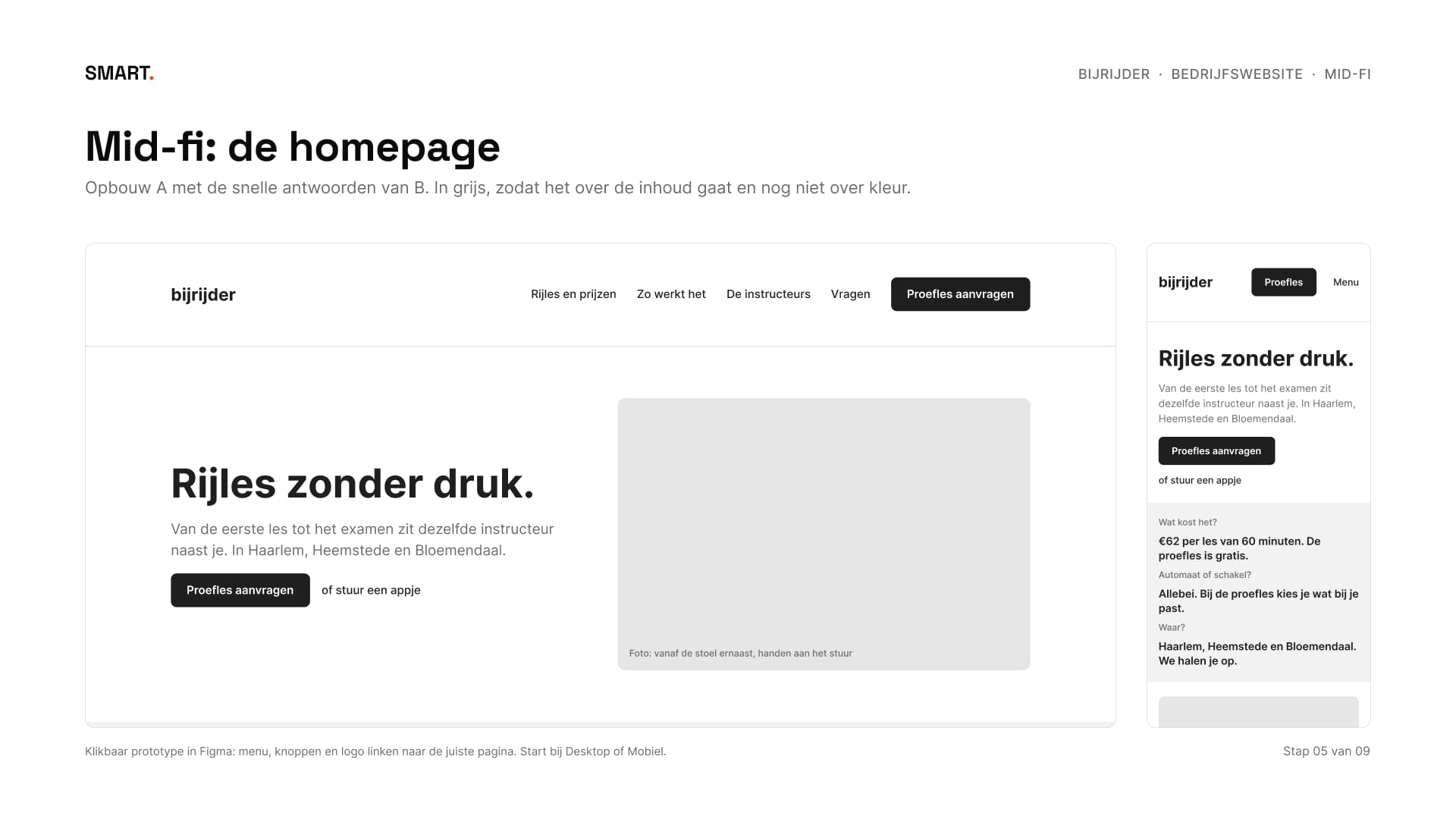
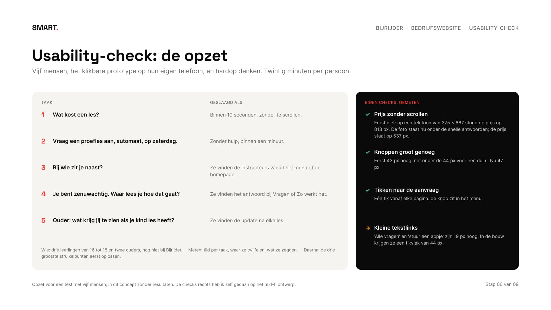
Daarna alle pagina's in mid-fi: grijs, met echte teksten en klikbaar. Voor een usability-check staan vijf taken klaar, zoals 'vraag een proefles aan, automaat, op zaterdag'. Zonder echte testpersonen laat ik daarvan alleen de opzet zien. Wat ik zelf kon meten, deed ik wel: op een telefoon van 375 bij 667 pixels stond de prijs eerst op 813 pixels, onder de rand van het scherm. Na het verplaatsen van de foto stond hij op 537.
Then every page in mid-fi: grey, with real copy and clickable. For a usability check there are five tasks ready, such as 'request a trial lesson, automatic, on a Saturday'. Without real test participants I only show the set-up. What I could measure myself, I did: on a 375 by 667 pixel phone the price first sat at 813 pixels, below the edge of the screen. After moving the photo it sat at 537.
05Twee rondesTwo rounds
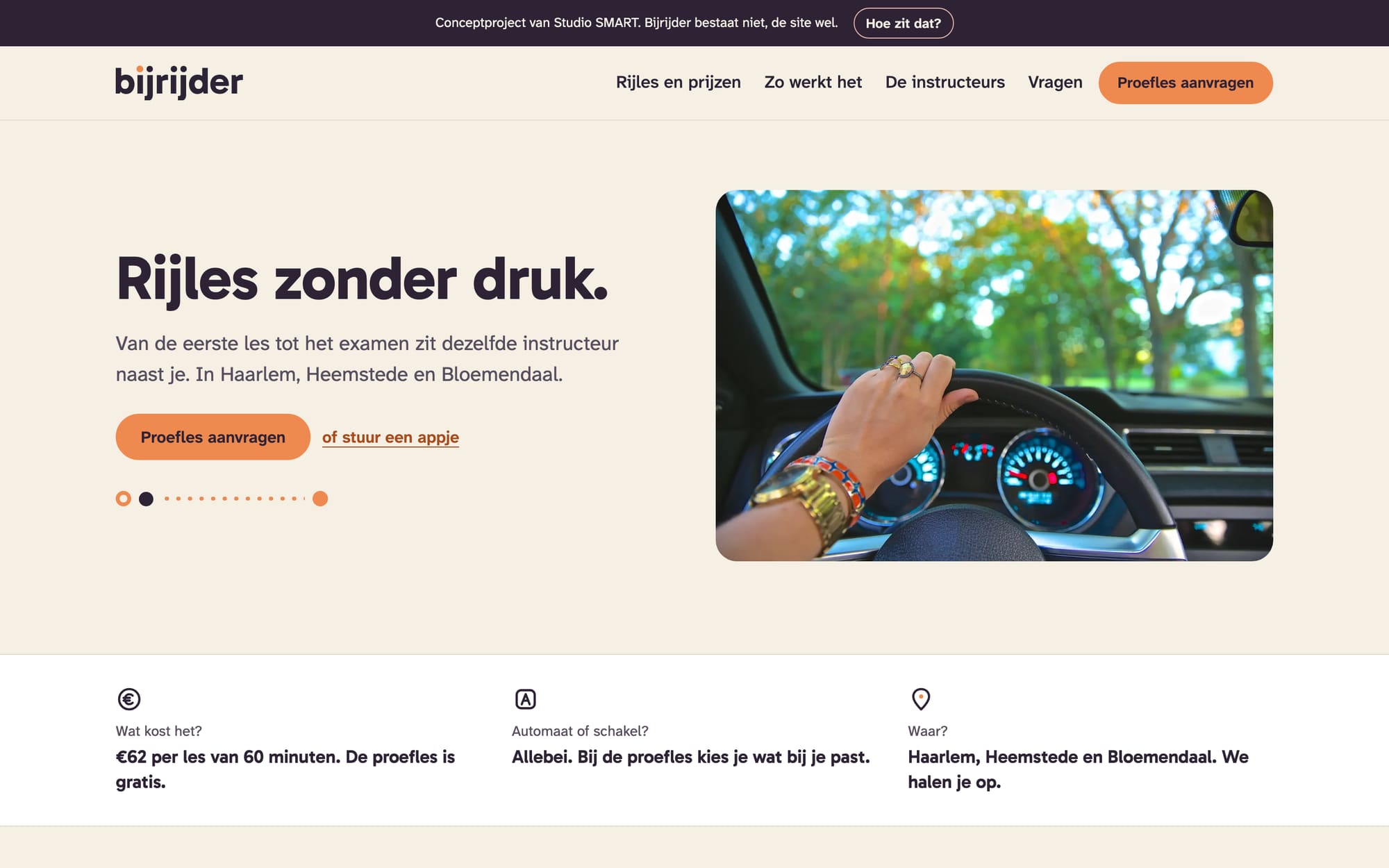
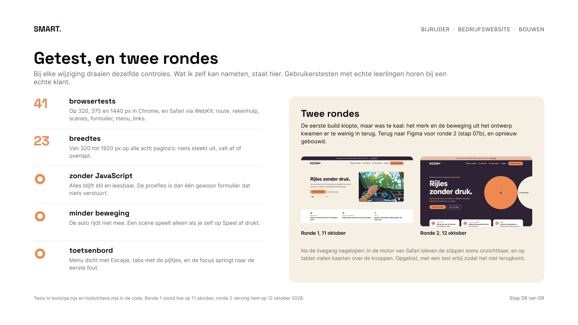
Het eerste hi-fi ontwerp en de eerste build waren netjes en snel, maar te kaal: een foto bovenaan, witte vlakken en weinig van het merk. Een rustige rijschoolsite, maar niet herkenbaar als Bijrijder.
The first hi-fi design and the first build were tidy and fast, but too bare: a photo at the top, white areas and little of the brand. A calm driving school site, but not recognisably Bijrijder.
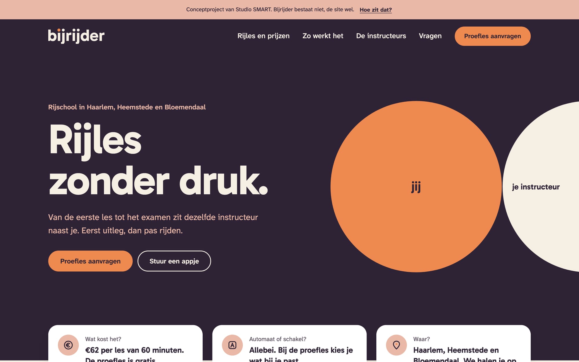
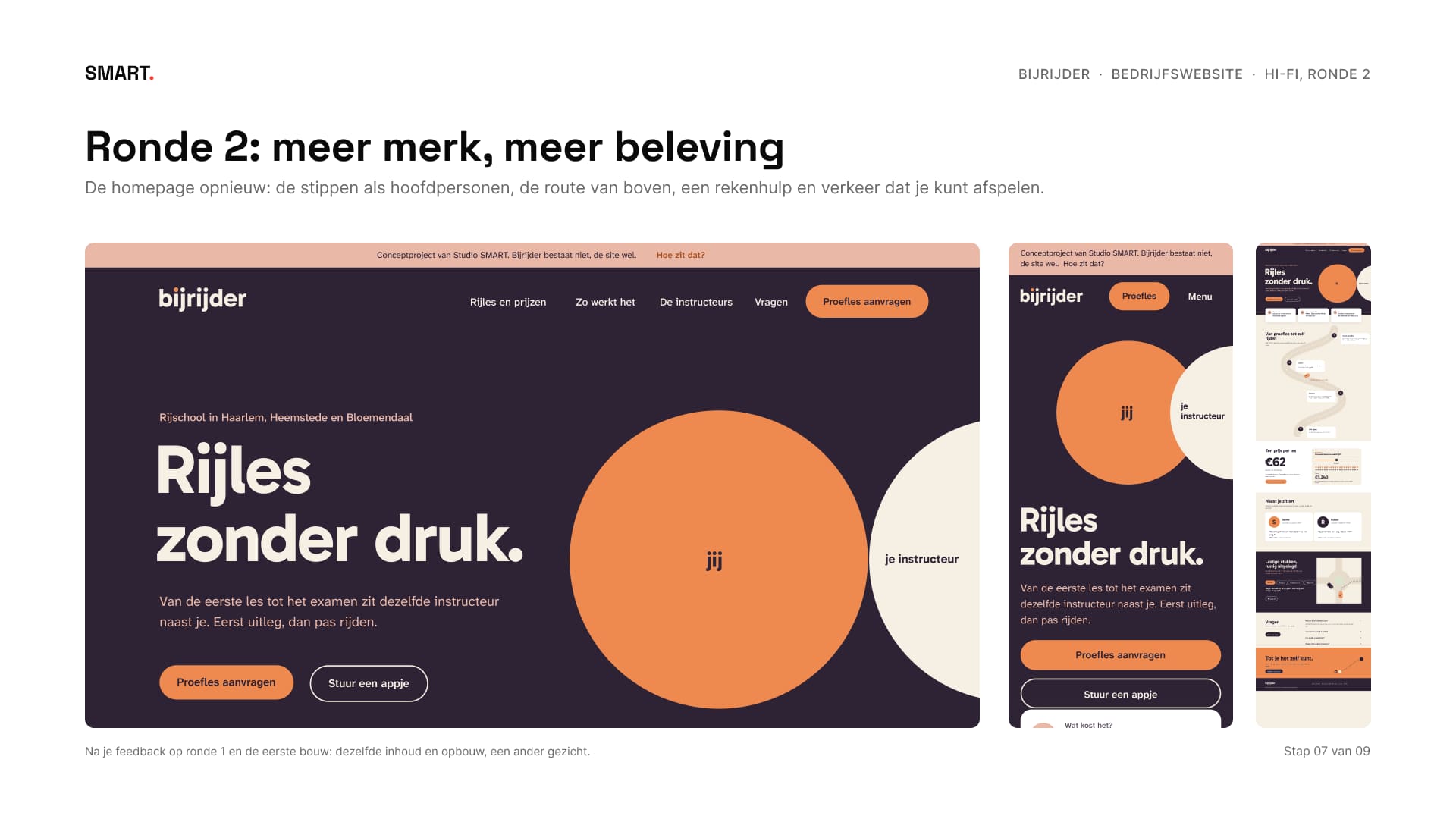
Dus terug naar Figma voor een tweede ronde, waarin het merk zelf het beeld werd. Bovenaan staan de twee stippen uit het logo, jij en je instructeur, groot en afgesneden. De snelle antwoorden zijn kaarten die over de kop vallen, en drie onderdelen bewegen omdat ze iets uitleggen. Ronde 1 stond op 11 oktober live, ronde 2 verving hem een dag later.
So back to Figma for a second round, where the brand itself became the image. At the top are the two dots from the logo, you and your instructor, large and cropped. The quick answers are cards that overlap the header, and three parts move because they explain something. Round 1 went live on 11 October, round 2 replaced it a day later.
 VoorBeforeNaAfter
06Beweging die iets verteltMotion that tells you something
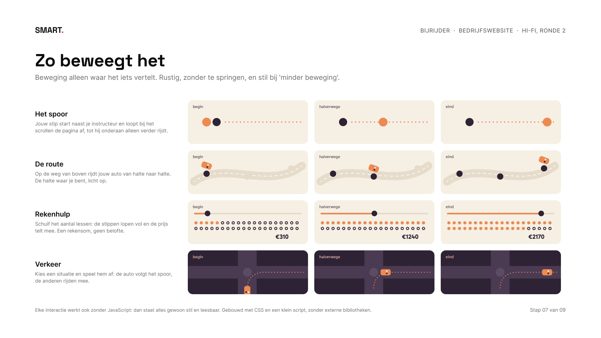
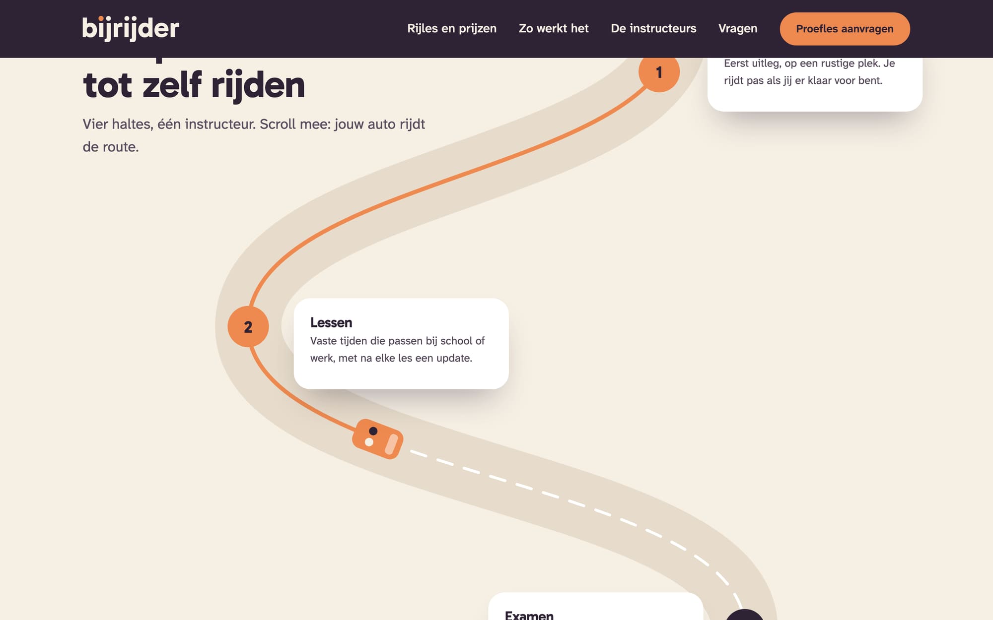
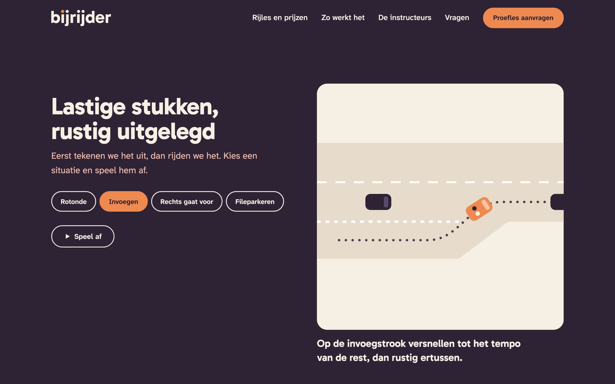
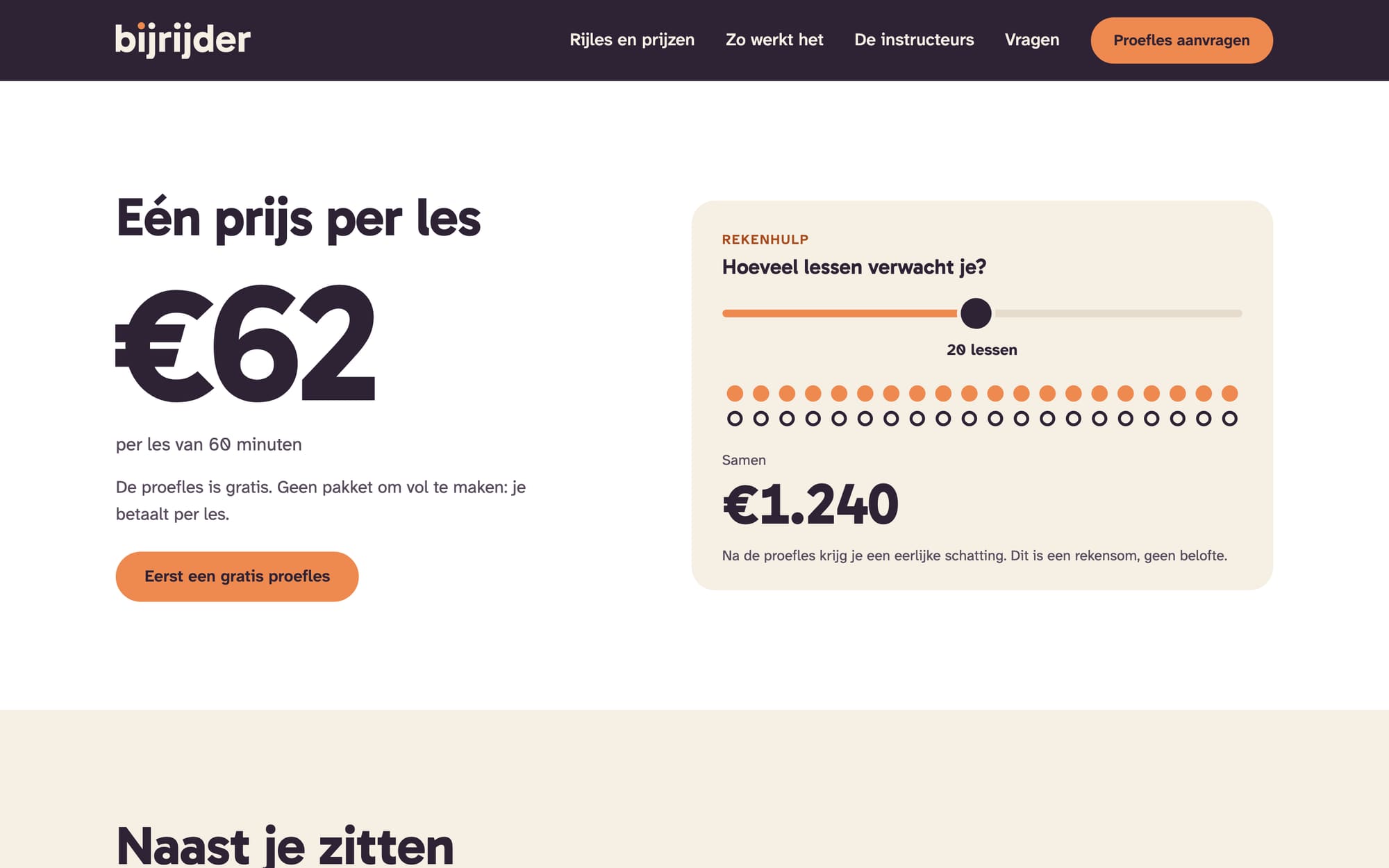
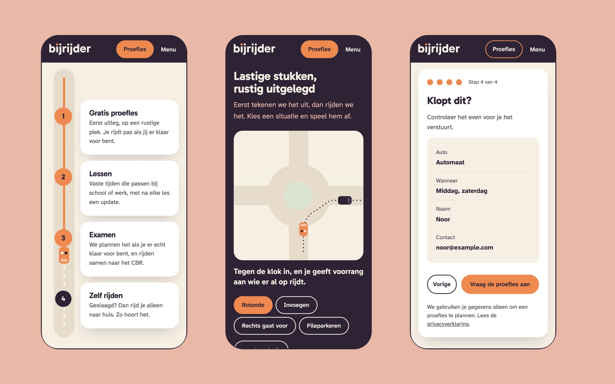
Op de route van proefles tot zelf rijden rijdt jouw auto mee als je scrollt, en de halte waar je bent licht op. In de rekenhulp schuif je het aantal lessen: veertig stippen lopen vol en het totaal telt mee, met de zin erbij dat het een rekensom is en geen belofte. En de lastige stukken uit de merkgids kun je afspelen: een rotonde, invoegen, rechts gaat voor en fileparkeren. Jouw auto volgt het spoor, de anderen rijden mee.
On the route from trial lesson to driving alone, your car drives along as you scroll, and the stop you've reached lights up. In the price helper you slide the number of lessons: forty dots fill up and the total counts along, with a line saying it's a sum, not a promise. And you can play the tricky bits from the brand guide: a roundabout, merging, giving way to the right and parallel parking. Your car follows the trail, the others drive along.
Alles is SVG met een klein eigen script, zonder bibliotheken. Zonder JavaScript staat alles stil en leesbaar. Met de instelling minder beweging rijdt de auto niet mee en speelt een scène alleen als je zelf op Speel af drukt.
It's all SVG with a small script of my own, no libraries. Without JavaScript everything stands still and stays readable. With the reduced motion setting the car doesn't drive along, and a scene only plays when you press Play yourself.
07Proefles in vier stappenTrial lesson in four steps
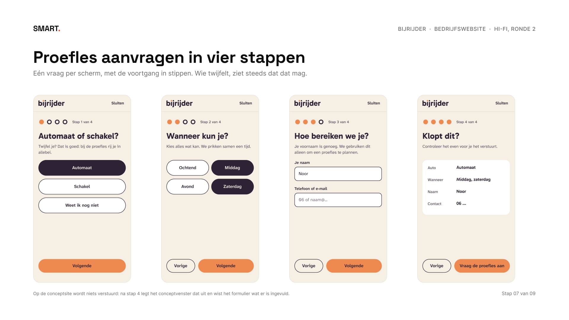
Het formulier vraagt één ding per scherm: automaat of schakel, wanneer je kunt, hoe we je bereiken, en dan of het klopt. Wie twijfelt, ziet steeds dat dat mag, en 'weet ik nog niet' is een goed antwoord. Omdat Bijrijder niet bestaat, verstuurt het niets: na stap 4 legt een venster uit dat het een concept is en wist het formulier wat je invulde. Zonder JavaScript is het gewoon één formulier.
The form asks one thing per screen: automatic or manual, when you can, how we reach you, and then whether it's right. If you're unsure, you keep seeing that that's fine, and 'not sure yet' is a good answer. Because Bijrijder doesn't exist, it sends nothing: after step 4 a window explains it's a concept and the form clears what you entered. Without JavaScript it's simply one form.
08Gemeten en getestMeasured and tested
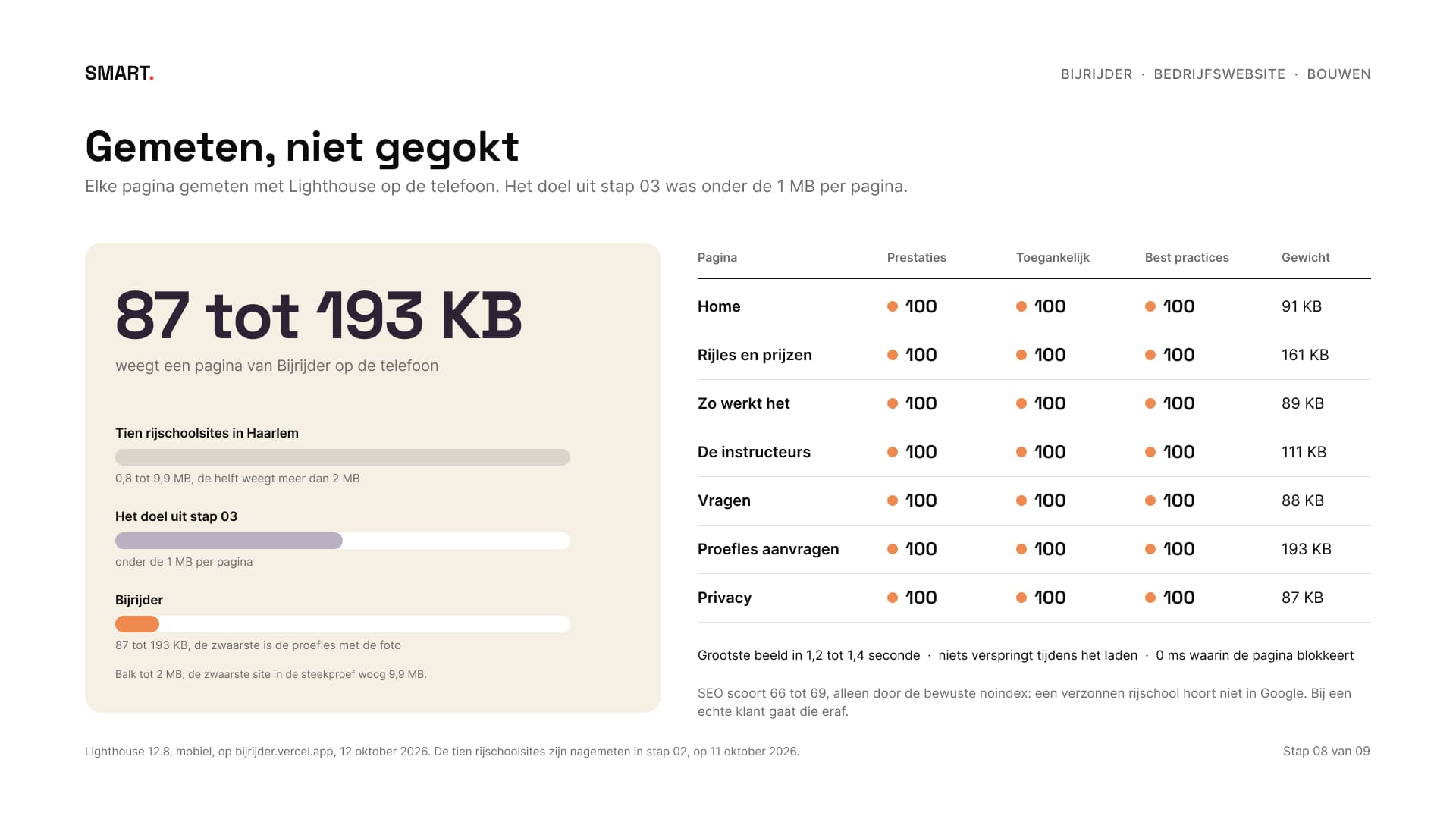
Lighthouse op de telefoon geeft alle zeven pagina's 100 voor snelheid, toegankelijkheid en best practices. Een pagina weegt 87 tot 193 KB, tegen 0,8 tot 9,9 MB bij de tien rijschoolsites. SEO scoort lager, alleen door de bewuste noindex: een verzonnen rijschool hoort niet in Google.
Lighthouse on mobile gives all seven pages 100 for performance, accessibility and best practices. A page weighs 87 to 193 KB, against 0.8 to 9.9 MB for the ten driving school sites. SEO scores lower, only because of the deliberate noindex: a made-up driving school doesn't belong in Google.
Bij elke wijziging draaien 41 browsertests op drie breedtes, ook in Safari. Na de livegang liep ik alles na op 23 breedtes, van 320 tot 1920 pixels. Daar kwamen nog twee fouten uit: in de motor van Safari bleven de stippen soms onzichtbaar, en op tablets vielen kaarten over de knoppen. Allebei opgelost, met een test erbij zodat ze niet terugkomen.
Every change runs 41 browser tests at three widths, Safari included. After launch I went through everything at 23 widths, from 320 to 1920 pixels. That turned up two more bugs: in Safari's engine the dots sometimes stayed invisible, and on tablets cards overlapped the buttons. Both fixed, with a test added so they don't come back.
09Livegang en opleveringLaunch and handover
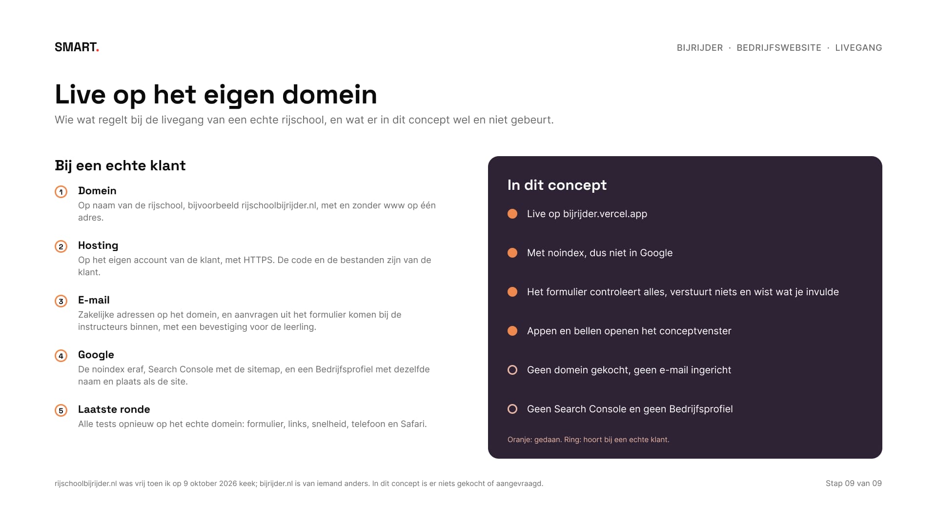
Bij een echte klant komt de site op het eigen domein en het eigen account van de klant, met zakelijke e-mail, een formulier dat echt aflevert, Search Console en een Bedrijfsprofiel. In dit concept gebeurt dat bewust niet: Bijrijder staat op bijrijder.vercel.app met noindex, en appen en bellen openen het conceptvenster.
With a real client the site goes on the client's own domain and account, with business e-mail, a form that really delivers, Search Console and a Business Profile. In this concept that deliberately doesn't happen: Bijrijder lives at bijrijder.vercel.app with noindex, and messaging and calling open the concept window.
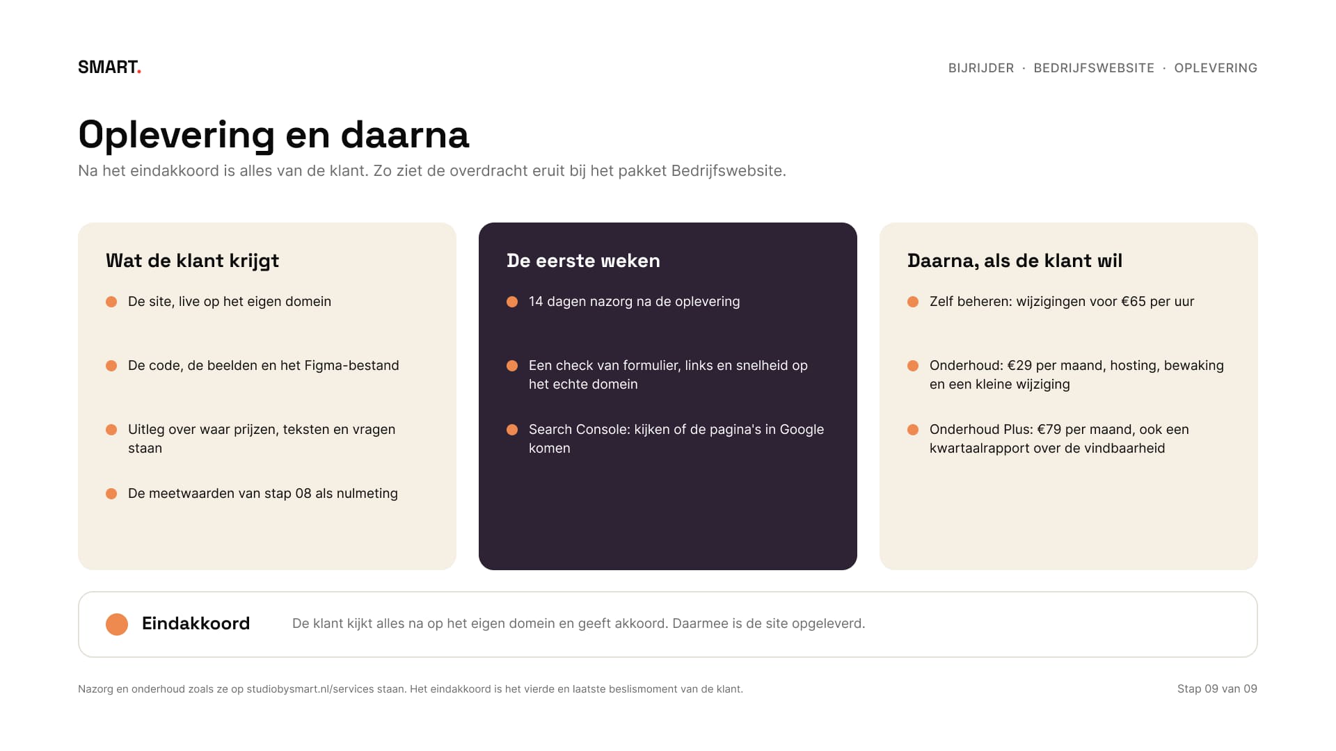
Na het eindakkoord is alles van de klant: de site, de code, de beelden en het Figma-bestand. Daarna volgen veertien dagen nazorg, en wie wil, laat de site daarna door mij bijhouden.
After final approval everything belongs to the client: the site, the code, the images and the Figma file. Then come fourteen days of aftercare, and if they like, I look after the site from there.
10ResultaatResult
Een rijschoolsite die eruitziet en beweegt als het merk: rustig, met de prijs vooraan en één knop. Bijrijder bestaat niet, de site wel, en je kunt hem zelf bekijken. Zo ziet het pakket Bedrijfswebsite eruit: negen stappen, van onderzoek via lo-fi en mid-fi naar een hi-fi site die gemeten en getest live staat. Foto's op de site: de lesauto van Mic from Reading (kenteken afgedekt), een polder van PAUL (Van de Velde) Fotografie en een gebaar van Ian Sane, alle drie CC BY 2.0. De foto in ronde 1 is van Daniela Cuevas (CC0).
A driving school site that looks and moves like the brand: calm, with the price up front and one button. Bijrijder doesn't exist, the site does, and you can visit it. This is what the Business website package looks like: nine steps, from research via lo-fi and mid-fi to a hi-fi site that's live, measured and tested. Photos on the site: the lesson car by Mic from Reading (number plate covered), a polder by PAUL (Van de Velde) Fotografie and a gesture by Ian Sane, all three CC BY 2.0. The photo in round 1 is by Daniela Cuevas (CC0).
Wil je een site die net zo duidelijk zegt wat je doet en wat het kost? In een gratis kennismaking kijken we wat jouw bedrijf nodig heeft.
Want a site that says just as clearly what you do and what it costs? In a free intro call we look at what your business needs.